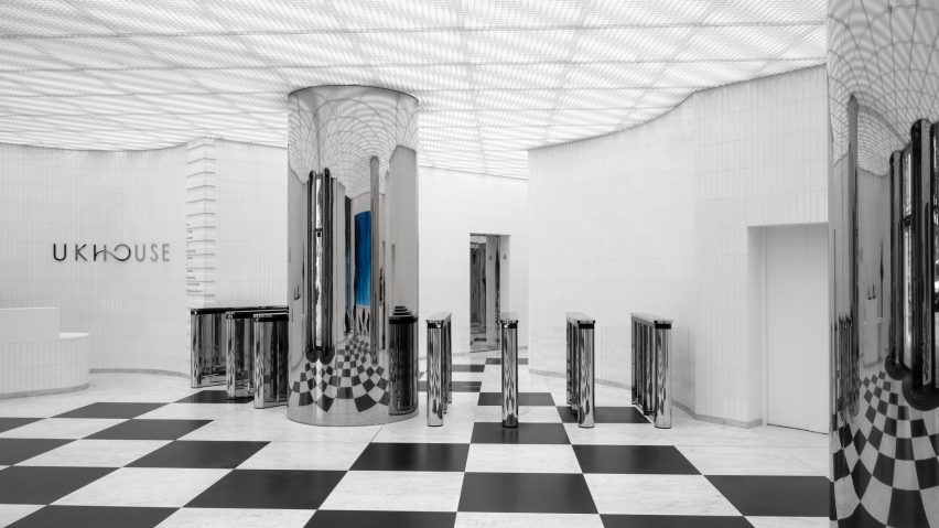
Swiss studio Christ & Gantenbein has completed its upgrade of UK House on Oxford Street, adding a baroque-influenced lobby informed by the building's history.
The renovation of the Grade II-listed building aims to respond to the need for communicative corporate architecture. Designed to be a welcoming "place of arrival", the new lobby combines the baroque themes from the existing building with modern elements.
"We conceived this lobby as a location full of hospitality, with a unique mix of baroque and techno-futuristic elements," said Christ & Gantenbein's founding partner Emanuel Christ.
"The result is a creative spatial identity and generous sequence of rooms that offer high-quality experiences for the tenants and visitors alike."
Christ & Gantenbein's renovation expands upon the building's conversion into an office block during the 1970s. The structure still features two of its original baroque facades, which partially inspired the design of the new lobby.
"We worked with this history to generate our vision of corporate architecture in the 21st century: bold, futuristic, open, communicative, yet steeped with history," said the studio.
Large windows framed by bronzed metal at the front of the building draw upon the surrounding retail facades of Oxford Street. The lobby is accessed through a pair of revolving glass doors with frames of chromed stainless steel, which offer views of the mirrored columns inside.
Inside the lobby Christ & Gantenbein placed a front desk and a coffee point, along with an ancillary space that can be used for meetings. A work by artist Wolfgang Tilmans features on the right wall of the space.
A marbled floor made from black and white stone spans the space, forming a checkered pattern which references the history of the building.
A metal grill ceiling divided into a more subtle grid mirrors the checkered pattern of the floor, spanned by linear lighting elements that illuminate the lobby.
With "apse-like" endings that project slightly into the lobby, the walls mimic the original baroque forms of the building. The walls are covered in neutral ceramic tiles which act as a subtle backdrop to the space.
Mirrored columns reflect the patterns from the floor through the lobby, while polished chrome elements, including the elevator doors, feature throughout the space.
Beyond the lobby, the addition of new staircases and elevators has connected the entry hall to a basement space featuring a separate lobby for cyclists and a multi-level bike storage space. Black and white patterns on the epoxy floor mark the route to the bike store, transitioning into a circular pattern to mark the entry to the changing space.
Other facilities on the level include showers and lockers, along with hyper-modern elements designed by the studio which have been arranged throughout the functional space.
Founded by Emanuel Christ and Christoph Gantenbein in 1998, architecture studio Christ & Gantenbein was named Architect of the Year in Dezeen Awards 2018.
Other projects recently completed by the studio include a multifunctional workspace in Germany and a museum for chocolate brand Lindt.
The photography is by Thomas Adank.

