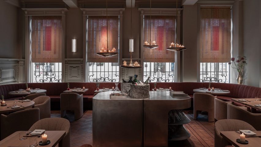
Dezeen's top 10 restaurant and bar interiors of 2022
For the latest roundup in Dezeen's review of 2022, we have selected 10 restaurant and bar interiors published this year, including a coastal cocktail bar in Italy and a space-themed cafe in South Korea.
This year's roundup 0f restaurant and bar interiors also features a European-influenced eatery in a palatial hotel in Salt Lake City, a bar with floors that were designed to look like the flooded streets of Venice and a monochromatic Chinese restaurant.
Read on for 10 restaurants and bars we covered in 2022:
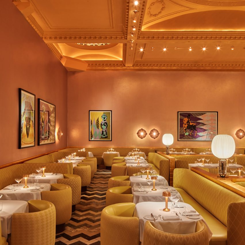
Sketch, UK, by Yinka Shonibare and India Mahdavi
Artist Yinka Shonibare and architect India Mahdavi replaced the famous pale pink interior of London restaurant Sketch with warm, golden yellows and textured materials.
"I didn't want everybody to ask me what the new colour at the gallery is and therefore, I really worked on textures and materials that are evocative of the richness of Africa," said Mahdavi. "Warmth is the new colour at Sketch."
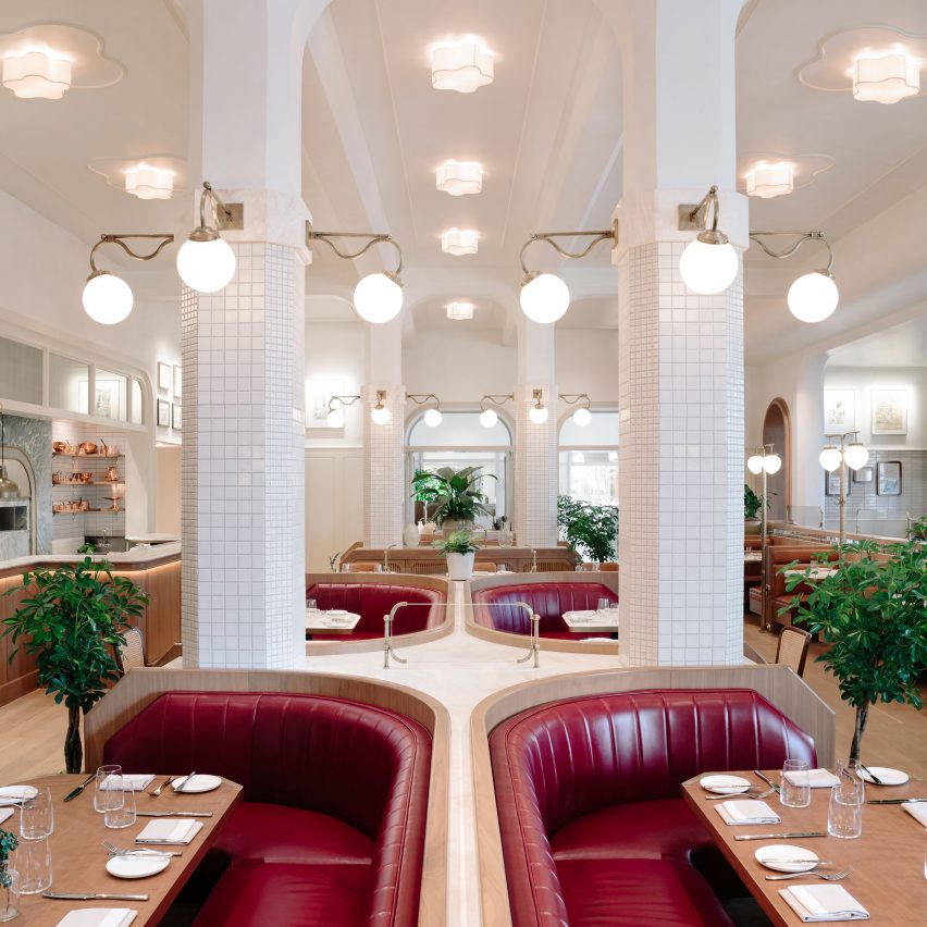
Laurel Brasserie and Bar, US, by Home Studios
Designed by Brooklyn-based architecture and interiors practice Home Studios, the Laurel Brasserie and Bar is a restaurant inside Salt Lake City's The Grand America Hotel.
The hotel was built in a palatial style and includes interiors based on classic European designs. Home Studios retained the brasserie's European influences but added a contemporary look, incorporating bold and colourful areas to suit family-style dining.
Find out more about Laurel Brasserie and Bar ›
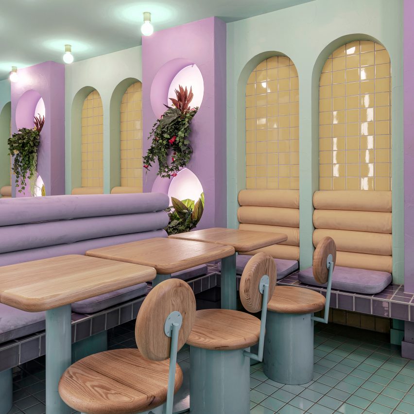
Piada, France, by Masquespacio
Spanish interior design studio Masquespacio used design elements from traditional Italian restaurants to inform the interior of this Italian eatery in the French city of Lyon.
Booth seating in hues of lilac and nude line the restaurant between wooden tables, chairs and tiled mint-green walls and floors.
Blueness, Belgium, by Space Copenhagen
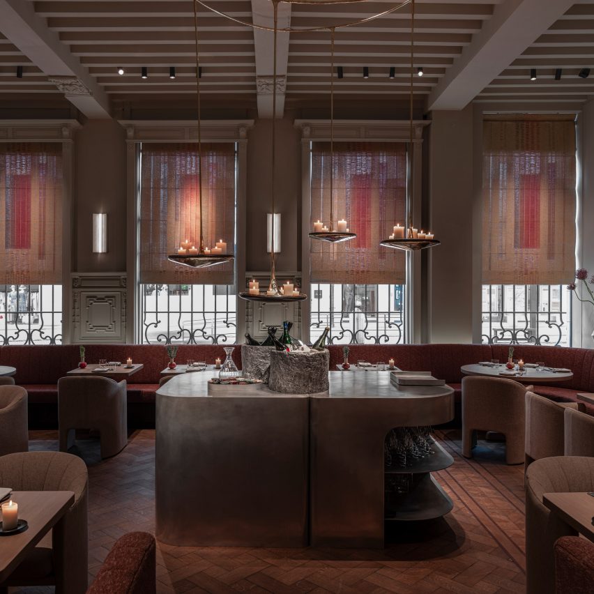
In Antwerp, interior design studio Space Copenhagen combined original carved sandstone and marble columns with contemporary Scandinavian furniture to decorate Blueness, a French and Japanese-influenced restaurant.
A custom bar crafted from red walnut wood by Brussels and Antwerp-based design studio Destroyers Builders was inserted into the space and paired with brushed steel surfaces, dark wooden barstools and a cast aluminium waiter's station.
Find out more about Blueness ›
Civico 29, Italy, by Gae Avitabile
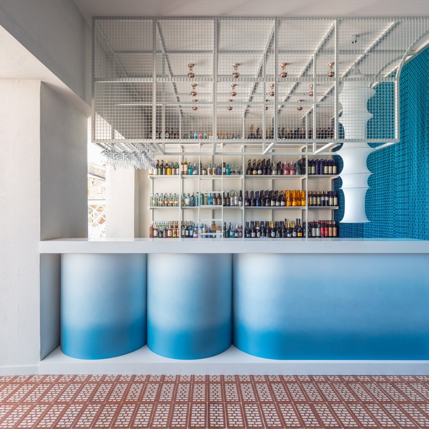
Ocean blues, wave-like forms and nautical materials fill the interior of Civico 29, a coastal cocktail bar by architect Gae Avitabile in the seafront town of Sperlonga in Italy.
An aluminium mesh curtain that moves as wind blows through the bar lines two walls of the space and complements a waving, blue-to-white gradient bar that references the nearby ocean and sits at the centre of the space on top of dark red-and-white floor tiles.
Find out more about Civico 29 ›
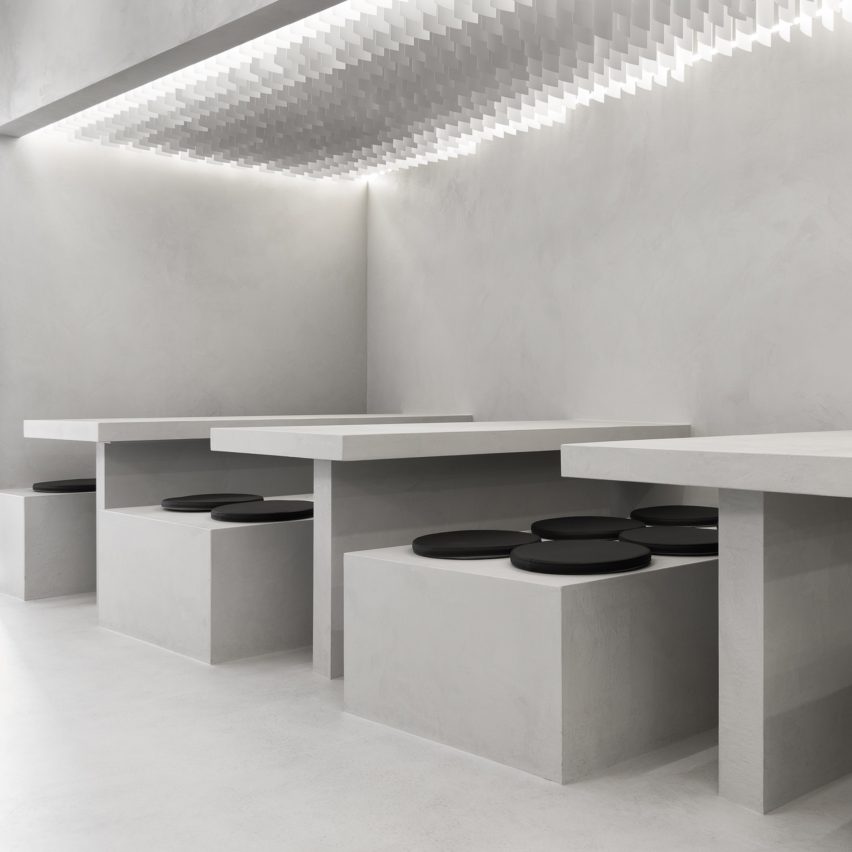
Canadian design firm StudioAC used a skewed perspective to draw visitors' eyes to the open kitchen at the rear of this micro-cement-lined Chinese restaurant.
Cubic and rectilinear tables and benches were similarly clad in micro-cement and line the walls of the restaurant beneath rows of vertical vinyl blinds that were concealed within bulkheads but visible enough to provide a shimmering, sequin-like look.
Syrena Irena, Poland, by Projekt Praga
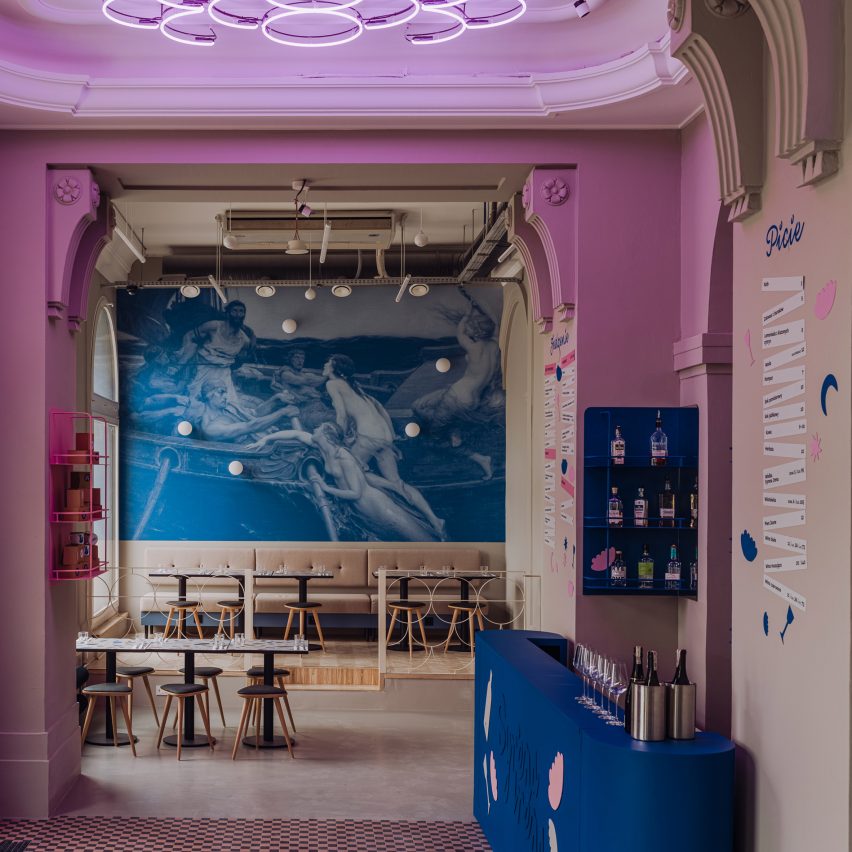
Set within a 1950s building in the centre of Warsaw, Syrene Irena bistro designed by Polish architecture firm Projekt Praga combines contemporary and mid-century features.
The self-serve restaurant uses mid-century design references such as terrazzo-style tables, neon signs and frosted glass sconces to nod to the building's history as well as the restaurant's nostalgic menu.
Find out more about Syrena Irena ›
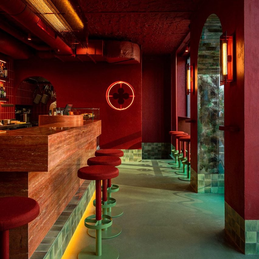
Va Bene Cicchetti, Poland, by Noke Architects
Designed by Polish architecture and design studio Noke Architects, Va Bene Cicchetti is an Italian bar in Warsaw informed by Venice that serves drinks and small plates.
The bar is accessed via an arched doorway that is lined with antique mirrors. Inside a monolithic, red travertine bar is surrounded by hues of red and gold in a nod to the colours of the Venetian flag. The floors of the bar and the bases of chairs were coloured in a sea-like shade of turquoise that aimed to recreate the look of the flooded streets of the Italian archipelago.
Find out more about Va Bene Cicchetti ›
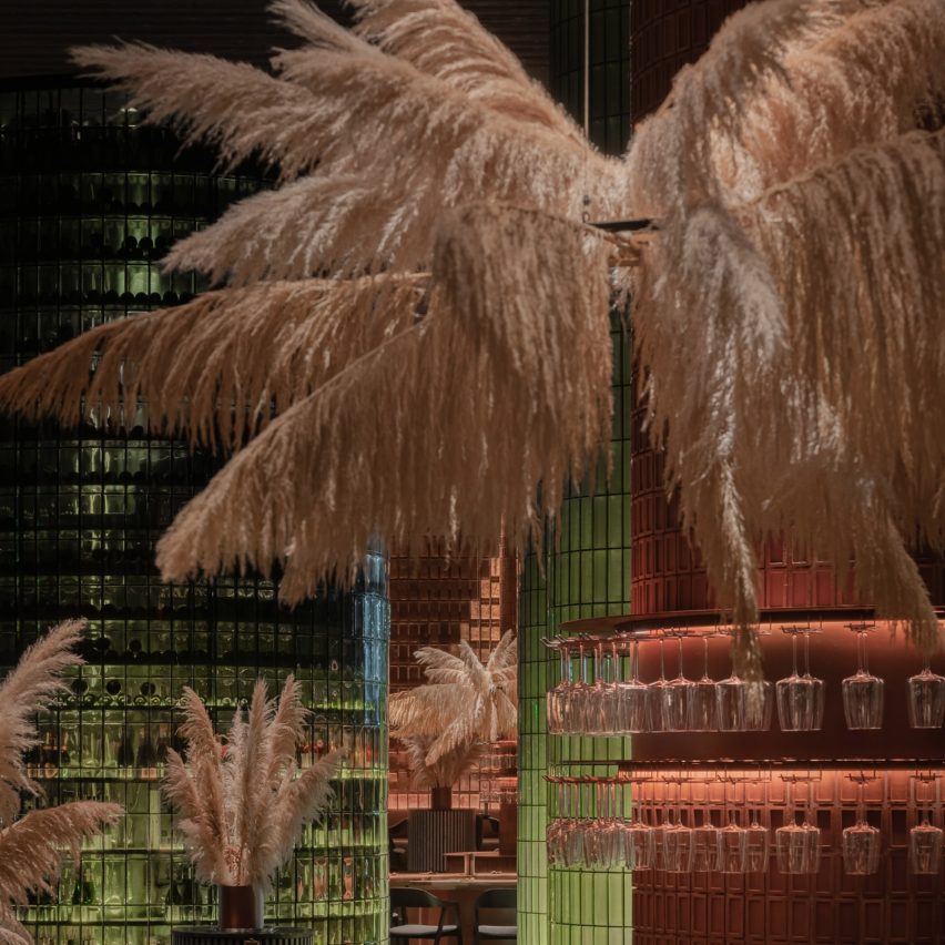
Glass bricks, large columns, terracotta tiles and coppery hues define this restaurant interior in Vynnyky, Ukraine, designed by YOD Group. Named Terra, the restaurant borrows its colour and material palette from the surrounding rolling hills and lake.
"We aimed to extract colours, textures and impressions from the landscape to translate them into the interior design language," said the studio. "Like the eyedropper tool in Photoshop, but on a real-life scale, we designed the space to mirror its surroundings."
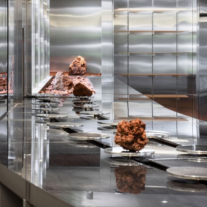
Sik Mul Sung, South Korea, by Unseenbird
Sik Mul Sung is a space-age-themed cafe in downtown Seoul, South Korea. Designed by South Korean studio Unseenbird, it incorporates sheets of stainless steel wrapped across the walls, countertops and fixtures.
The metallic surfaces are contrasted against a red pebble floor and spacey decorative rocks, while a glass-fronted vitrine is a focal point at the cafe and is used to grow vegetables in a vertical farming system.
Find out more about Sik Mul Sung ›