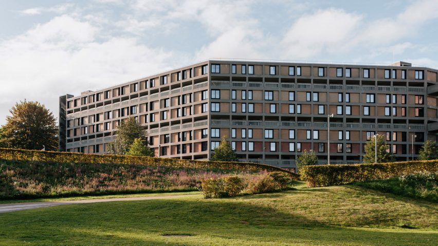
A palette of green, blue and purple animates the latest phase of the redevelopment of Park Hill estate in Sheffield, recently completed by Stirling Prize-winning studio Mikhail Riches.
London architecture studio Mikhail Riches has created 195 contemporary homes within four flanks of the brutalist Grade II*-listed building while preserving as much of the original fabric as possible.
Constructed between 1957 and 1961, Park Hill is a former social housing estate that was designed by architects Ivor Smith and Jack Lynn for Sheffield City Council. It is best known for its "streets in the sky" typology and gridded concrete structure.
Following years of decline, property developer Urban Splash won a contract to renovate it in 2004. This process began with Phase 1, designed by studios Hawkins\Brown and Studio Egret West, which opened in 2013 and was shortlisted for the Stirling Prize in the same year.
Phase 2 by Mikhail Riches sits beside the brighter first phase, which saw three flanks updated with bold-coloured panels that aimed to "change public perception of the estate".
The success of this approach allowed Mikhail Riches to opt for a more "light touch approach" focused on celebrating and restoring the original building fabric and design.
"[Phase 1's] success has allowed us to faithfully restore the building by keeping as much of the existing fabric as possible," said Mikhail Riches associate Alim Saleh.
"It was important to us to not only restore the original beauty of the brickwork and concrete frame but to work with the existing fabric sustainably with targeted repairs to improve the longevity of the upfront embodied carbon," Saleh told Dezeen.
Alongside preserving the original building fabric, one of Mikhail Riches' key aims for refurbishment was to improve its energy performance and mitigate thermal bridging through insulation.
However, Saleh said this was difficult due to the protected status of the concrete shell, as well as the constraints of the existing building, such as its very low ceilings and its existing grid that "is not as repetitive as it appears".
"The biggest challenge has been reducing cold bridging whilst working within the constraints of a very specific design," Saleh explained.
"Its Grade II*-listed status means that overcladding the concrete, which acts as a massive cold bridge, is not an option," he continued. "We needed to insulate both sides of the concrete in each room."
One of the main areas that required insulation is the balcony reveals, which were found to be one of the worst building elements for uncontrolled heat loss in a thermal study of Phase 1.
To combat this, the studio introduced insulated panels to the balconies. These are finished in colours that were selected from a "mid-century palette of blues, greens and purples", chosen to complement the earthy tones of the existing brickwork that slots between the concrete frame.
While helping to insulate the building, these coloured panels also aim to add a unique identity to each of the flats, informed by the ways in which past and current residents have adapted their homes over the years.
"We noticed that people had started to paint their own balcony reveals to give a sense of identity back to the flats," said Saleh. "We wanted someone to be able to point at the block and say that blue one is my flat."
The overall fabric upgrades have improved the building's energy efficiency enough to make electric power economically feasible for the whole building.
Additionally, its annual operational carbon footprint has been reduced from 151 to 20 kilograms of carbon dioxide per square metre – an 87 per cent improvement – according to a whole-life carbon assessment by Useful Simple Trust.
Building upon the coloured balcony reveals, Mikhail Riches also provided each home with a coloured front door and a doormat to bring "life and colour to the streets in the sky".
The front door colour matches the balcony reveals, while the patterned mats reference original 1960s patterned linoleum laid by previous residents to personalise their flats.
"The mats give a sense of identity back to the flats whilst giving each home their own entrance threshold as you would have on a typical street," Saleh explained.
Each home also has one or two full-height windows by their front door, helping residents to personalise their doors even further.
Saleh added that this also is an attempt to promote "a safer environment and sense of neighbourliness, whilst bringing natural light into the flat".
Inside, Phase 2 contains 36 different flat types ranging from one-bed flats to generously-sized three-bed flats, maisonettes and townhouses, replacing the original layouts that "did not meet modern space standards".
"All the flats now have generous open-plan living spaces, orientated to take advantage of the best views," Saleh explained.
"The result is 195 new homes with varying floor plates and a mixed tenure offering that caters to a broad range of residents, giving more people a place in which they can live, work and play."
There is also approximately 2,000 square metres of commercial space. The interior design is consistent throughout Phase 2 and intended to pay homage to the original 1960s building.
This includes dusky-green joinery that adds warmth to the exposed concrete frame while complementing the mid-century colour palette of the doors and balconies.
In the bathrooms and kitchens, small square tiles have been used as a nod to the mosaics found across the estate – such as where the old pubs and public toilets used to be.
Finishing touches include black metalwork, used for details including window frames, stairs and Juliette balconies, unifying the inside and outside of the building.
Park Hill is Europe's largest listed structure and its restoration has been divided into five phases. Phase 3 has also been recently completed by Whittam Cox Architects, which involved transforming five flanks into student housing with a Le Corbusier-informed colour palette.
The next development will be Phase 4, which will involve a Carmody Groarke-designed art gallery and suite of studios.
The photography is by Tim Crocker.

