Dezeen's top 10 rebrands and logo redesigns of 2022
From German car manufacturer Audi adopting a flat logo to the unveiling of King Charles III's royal monogram, Dezeen selects 10 rebrands from the year as part of our review of 2022.
Custom typefaces and modernised symbols feature in this year's roundup of rebrands and logo designs, which also includes a brand font informed by classical stone inscriptions and an aerodynamic car marque.
Read on for 10 standout logos and rebrands we covered in 2022:
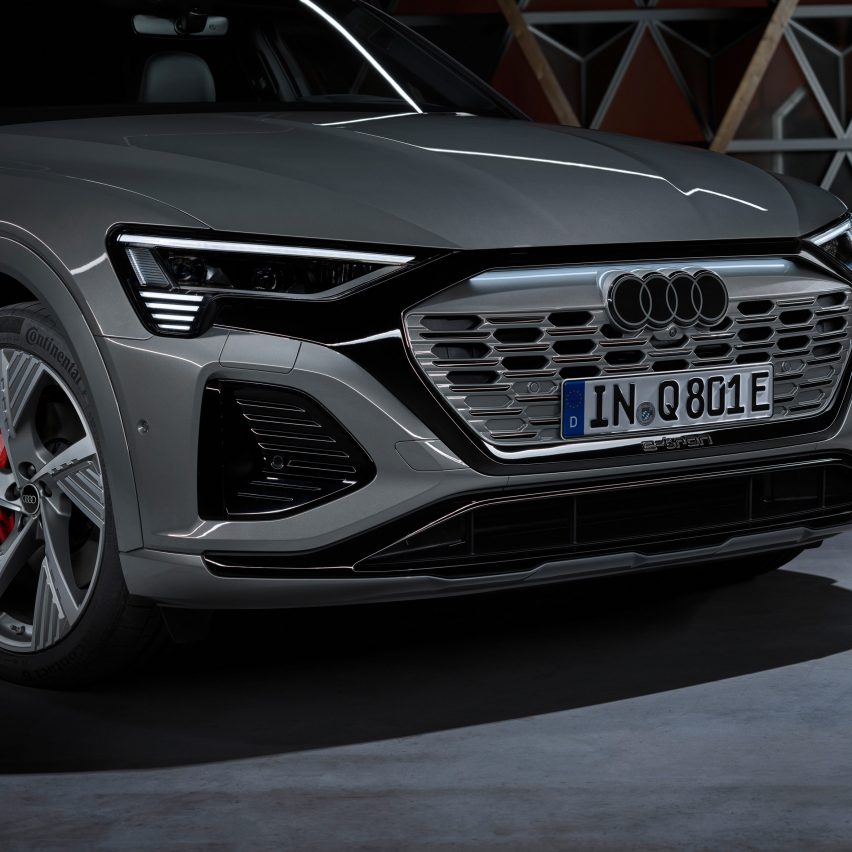
German car manufacturer Audi became the latest car brand to flatten its logo when it unveiled a simplified version of its distinctive four rings earlier this year.
Although the ring formation has remained unchanged in every logo throughout the brand's 90-year history, this updated version sees the rings stripped of their glossy chrome colour and rendered in either white or grey with a thin black border.
Find out more about the Audi rebrand ›
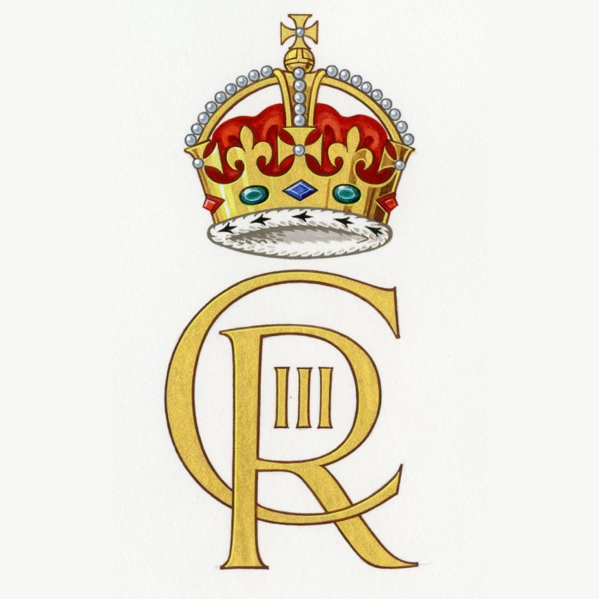
King Charles III royal cypher by College of Arms
Following King Charles III's accession to the throne in September, the design was revealed for his royal cypher, which will be used on the UK's official buildings, postboxes and passports.
It consists of the letters C, which stands for Charles, and R for Rex, the Latin word for king. The number III was placed within the R's counter – its enclosed section – while the Tudor Crown has been placed above the letters.
Find out more about the royal cypher rebrand ›
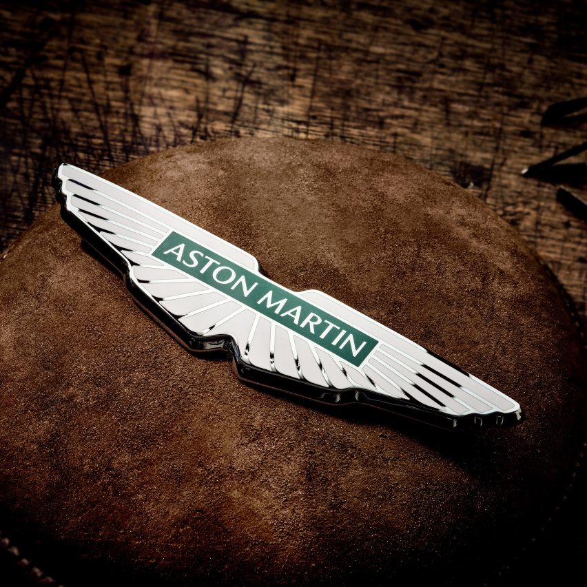
Aston Martin logo by Peter Saville
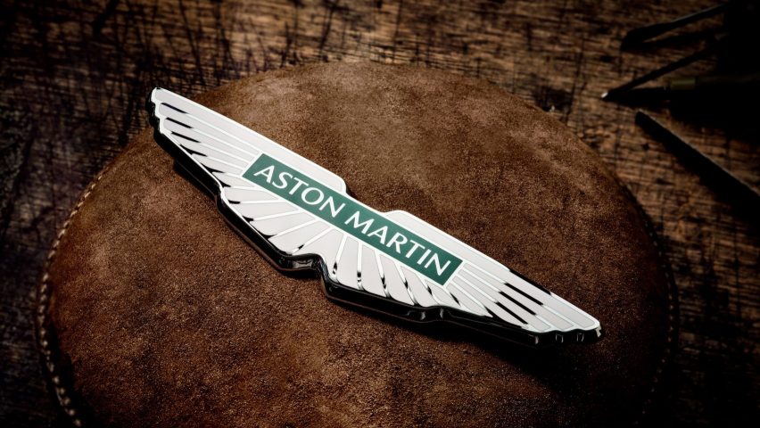
The second of four car manufacturers to feature in this list is British luxury automaker Aston Martin. The Warwickshire-based company enlisted British designer Peter Saville to update its winged logo in its first marque update since 2003.
Saville described the redesign as "subtle but necessary". The winged logo remains very similar to the previous one, with the most noticeable change being the removal of a curved line that crosses through the wings.
Find out more about the Aston Martin rebrand ›
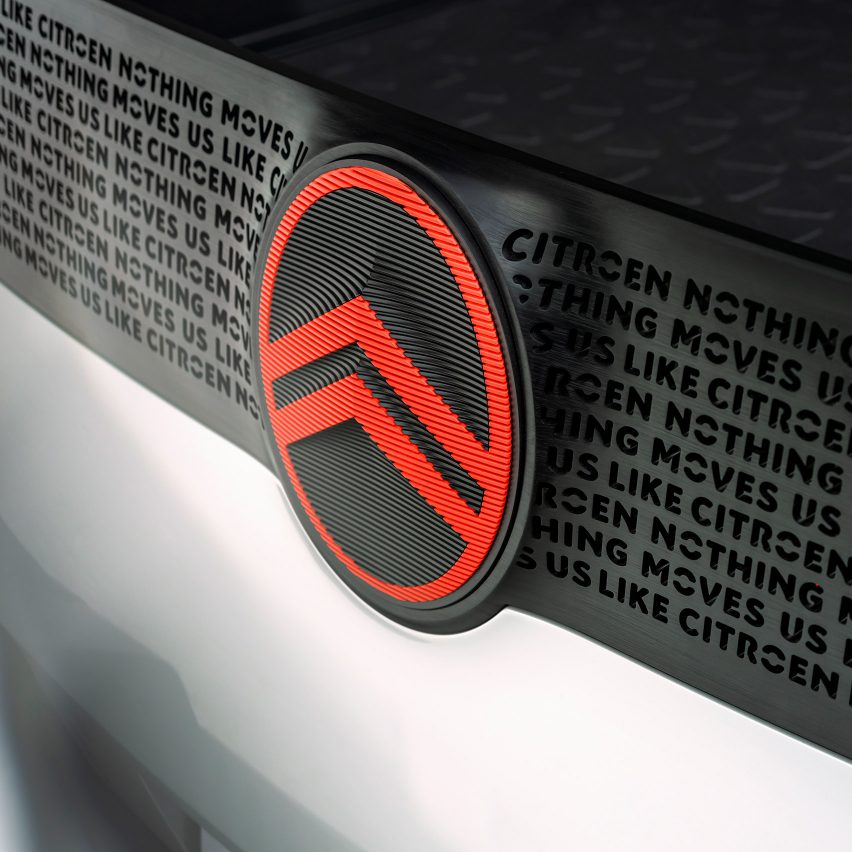
Citroën by Citroën and Stellantis Design Studio
As part of its efforts to make its electric vehicles more accessible, French car manufacturer Citroën collaborated with design agency Stellantis Design Studio to produce a logo that recalls the brand's original 1919 badge.
The automaker's deux chevrons – two upside-down Vs that recall chevron herringbone patterns – are once again framed by an oval.
The deux chevrons were made thicker and "more prominent" than in the original, while the oval has been softened and stretched.
Find out more about the Citroën rebrand ›
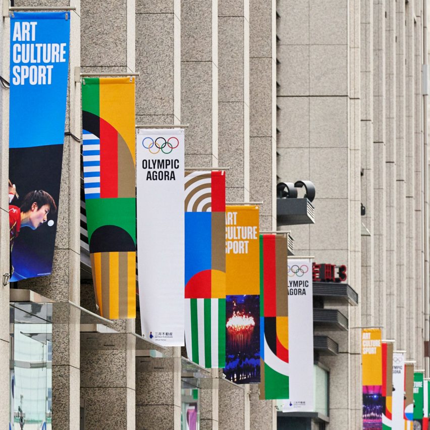
Olympics by International Olympic Committee and Hulse & Durrell
Three custom typefaces, a series of graphics and 17 illustrations were developed by the International Olympic Committee and creative agency Hulse & Durrell for the Olympic Games, making it the first time a global identity has been created for the sporting tournament.
Although some aspects such as the custom-designed typefaces Olympic Headline, Olympic Sans and Olympic Serif have already been launched, the full brand rollout is expected to be completed in time for the Paris 2024 Olympic Games.
Find out more about the Olympics rebrand ›
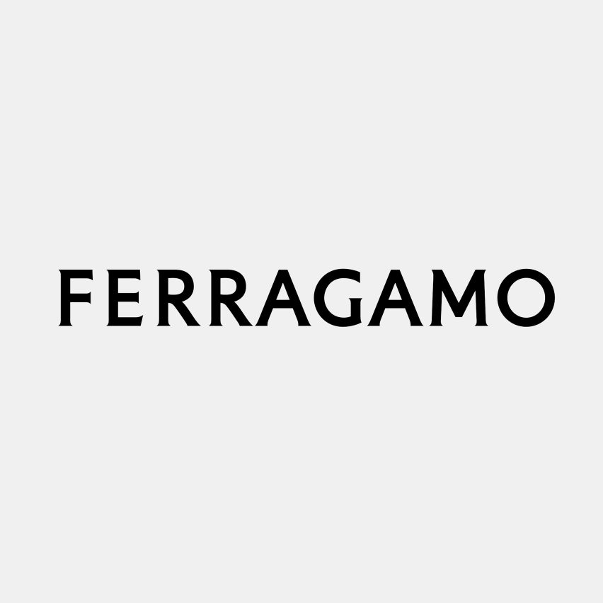
Saville makes this list again with his brand identity for Italian fashion house Ferragamo, designed to mark the brand's name change from Salvatore Ferragamo to Ferragamo.
The graphic designer transformed the former handwritten logo into a custom serif typeface that takes cues from classical stone inscriptions.
Find out more about the Ferragamo rebrand ›
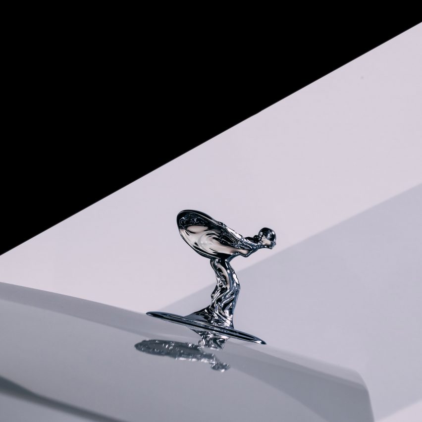
British car brand Rolls-Royce updated the female figurine that adorns its bonnets by making it slimmer and shorter with a lower bend in both knees. The brand hopes that the streamlined redesign will make its vehicles more aerodynamic.
The figure, called the Spirit of Ecstasy, depicts a woman leaning forward in a position that is not dissimilar to a courtesy. Her robes blow in the slipstream behind her, suggesting she is travelling at speed.
Find out more about the Rolls-Royce rebrand ›
After the death of architect and Rogers Stirk Harbour + Partners co-founder Richard Rogers at the tail end of 2021, the British architecture studio rebranded to RSHP.
"The focus on the letters is a move to underline the fact it's a collaborative effort, it's less about the individual and more about the collective and the team," RSHP partner Stephen Barrett told Dezeen.
Find out more about the RSHP rebrand ›
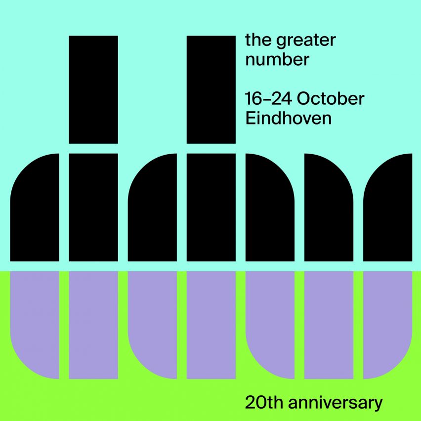
The typography used in a seminal poster designed by the late Wim Crouwel informed the branding of northern Europe's largest design event, Dutch Design Week.
Created by Dutch studio Thonik, the brand identity features Crouwel's renowned Fernhout typeface – a combination of 13 chunky grid-based letters formed using quarter circles and rectangles – to spell out the acronym DDW.
Find out more about the Dutch Design Week rebrand ›
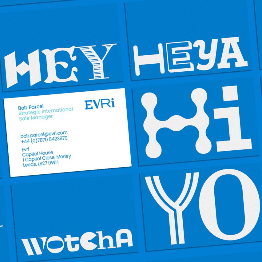
Evri by Superunion and Monotype
In a near total rebrand, UK delivery company Hermes changed its name to Evri and updated its logo, brand strategy and visual identity at the same time.
Creative agency Superunion collaborated with type foundry Monotype to design a multi-font logo with thousands of variations where each character is stylistically distinct. The only feature remaining from its former branding is the signature blue hue, which can be seen across all touchpoints.
Find out more about the Evri rebrand ›