Ten pop-up shop interiors featuring memorable designs
Our first lookbook of 2023 collects 10 pop-up shop interiors from around the world, from a swimming-pool-style store by fashion brand Jacquemus to a playful supermarket stocked with groceries made of felt.
Pop-up shops are temporary retail spaces created as locations for brands to sell their products, generally installed for only a matter of weeks or months.
Due to their fleeting nature, these stores often feature statement interior designs to capture the attention of their audiences, especially if their aim is to promote new or limited-edition goods.
Showcasing a variety of material and colour palettes, here are 10 pop-up shops featured on Dezeen.
This is the latest in our lookbooks series, which provides visual inspiration from Dezeen's archive. For more inspiration see previous lookbooks featuring suspended fireplaces, homes with sliding doors and interiors informed by Bauhaus principles.
Le Bleu, UK, by Random Studio and Simon Jacquemus
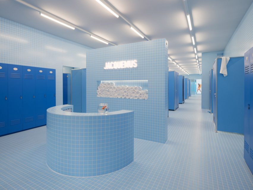
Experience design firm Random Studio created a series of pop-up installations at London's Selfridges department store that served as temporary shops for French fashion label Jacquemus between May and June last year.
Titled Le Bleu, the surrealist installations included a pale blue tiled space that was informed by swimming pool changing rooms, complete with dark blue lockers and cubicles holding a series of smaller installations within them.
A Better Place to Think, Norway, by Snøhetta
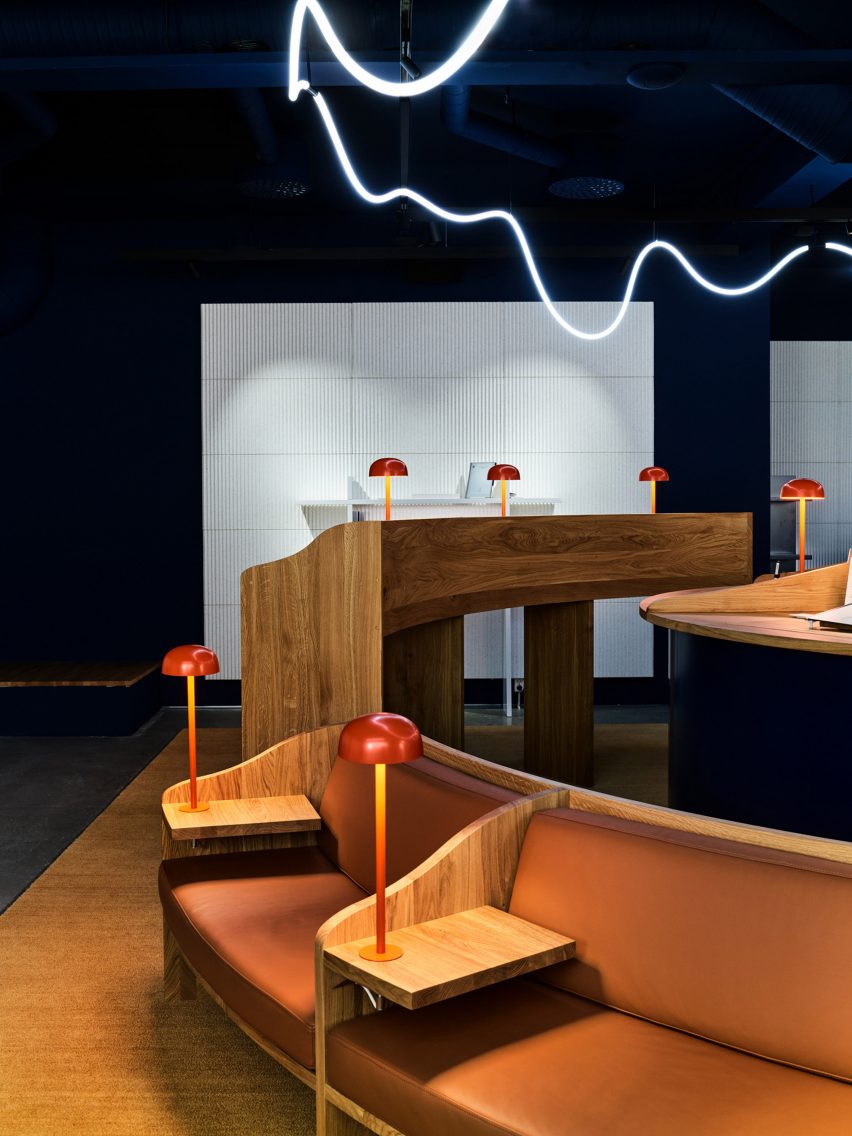
A Better Place to Think was an Oslo pop-up store designed by architecture studio Snøhetta for tablet brand reMarkable, which looked to the tranquility of libraries for its interior design.
Warm-hued reading lamps positioned on divided wooden desks illuminated curved leather banquettes where visitors were invited to sit and read. A squiggly neon overhead light took cues from the shape and energy of handwriting.
Find out more about A Better Place to Think ›
The Sparrow Mart, USA, by Lucy Sparrow
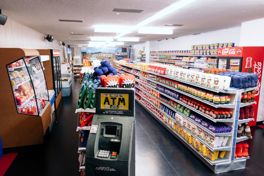
Sushi rolls, pork chops and a playful ATM machine all made entirely out of felt featured in a makeshift supermarket installation in Downtown Los Angeles by British artist Lucy Sparrow.
The Sparrow Mart was stocked with 31,000 purchasable plush renditions of grocery staples, which were arranged along aisles in colourful rows that took cues from 1980s American supermarkets.
"As a child, I was obsessed with the exotic, turbo-charged technicolour glow emanating from across the Atlantic," the artist told Dezeen.
Find out more about The Sparrow Mart ›
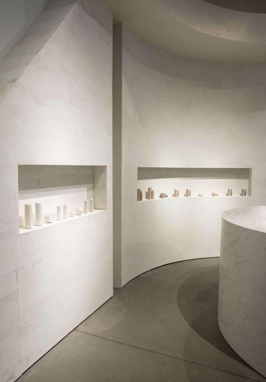
SKKN pop-up shop, USA, by Perron-Roettinger
Design studio Perron-Roettinger adopted a minimalist colour and material palette when creating the first pop-up shop for SKKN, Kim Kardashian's skincare and homeware brand.
Located in a Los Angeles shopping mall until the end of last year, the store's curved alcoves and sculptural counters were clad in raw plaster and cement, which acted as shelving for the reality TV star's pared-back products.
Kardashian opened another pop-up shop in 2021 to promote her underwear brand SKIMS, featuring glossy display units designed by Willo Perron.
Find out more about this SKKN pop-up store ›
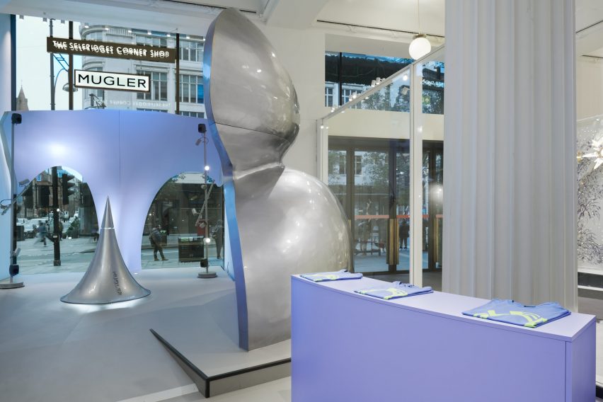
Mugler Bodyscape, UK, by Random Studio
Random Studio recently dressed the interior of Corner Shop, Selfridges' ever-changing retail space, with chrome-effect fragments designed to mimic women's body parts. The pieces formed an installation celebrating 30 years of fashion brand Mugler's fragrances.
Called Bodyscape, the striking large-scale fragments were made from painted wood, while a drop-shaped sculptural centrepiece dispensed Mugler scent intermittently, and also produced undulating lighting when visitors approached it.
"Seen from the street, the sculptural installation forms an abstract side view of a woman elegantly reclining," said Random Studio.
Find out more about Bodyscape ›
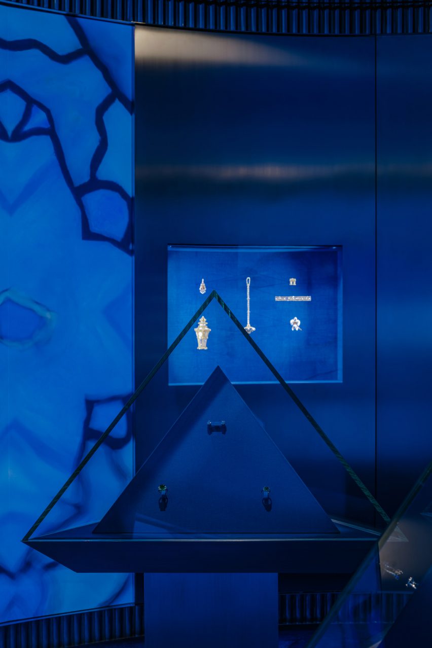
Tiffany & Co pop-up shop, France, by OMA
Pieces from jeweller Tiffany & Co's 185-year history are currently on display at a pop-up shop in Paris designed by architecture studio OMA, which will be edited throughout this year until its dismantling in May.
The labyrinthine store includes a dramatic blue rotunda showcasing designs from Tiffany's extensive archive, which are encased within pyramidal glass plinths mirrored by gigantic images of the jewellery – blown up to give visitors a closer look at the pieces' delicate features.
Find out more about this Tiffany & Co pop-up shop ›
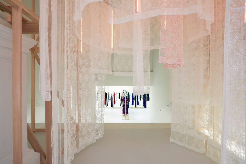
Self-Portrait pop-up shop, USA, by Storey Studio
Luxury fashion brand Self-Portrait showcased its ready-to-wear Autumn Winter 2019 collection at a New York pop-up store in the city's SoHo neighbourhood designed by Storey Studio.
An immersive setting was created by hanging drapes of translucent pink-and-white lace that the studio attached to a concentric circular wooden structure, while suspended tubes of LED lighting illuminated the interior.
Find out more about this Self-Portrait pop-up store ›
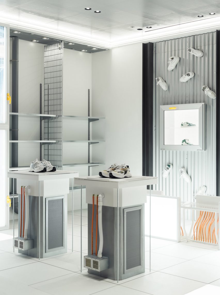
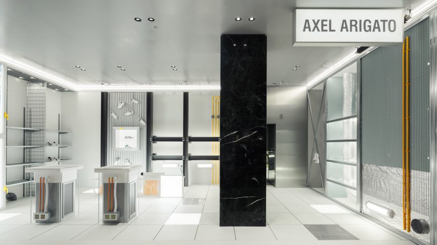
"Upside-down" Axel Arigato pop-up shop, UK, by Avoir
Axel Arigato footwear is currently for sale at this "upside-down" pop-up shop in Selfridges, designed for the streetwear brand by French studio Avoir to recall an inverted office.
Trainers fitted with magnets stick to the walls of the space, which features familiar polystyrene grid ceilings and other office-like materials such as strip lighting and exposed wires.
"The concept was to flip the script both physically and figuratively on what customers expect from a pop-up, turning all elements upside down through an industrial office lens in which the ceiling becomes the floor and vice versa," said Axel Arigato.
Find out more about this "upside-down" pop-up shop ›
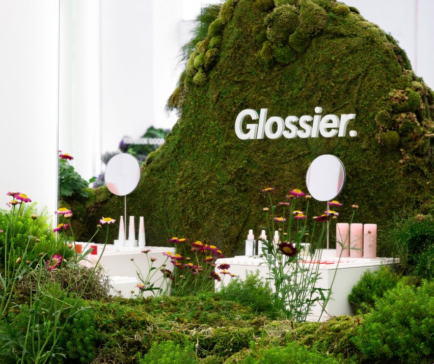
Glossier pop-up shop, USA, by Studio Lily Kwong
Landscape designer Lily Kwong looked to the topography of Capitol Hill, Seattle, to create a local pop-up shop for beauty brand Glossier.
Conceived in collaboration with Glossier, the store contained moss-topped mounds referencing rolling hills and covered with the region's native plants.
Pink and purple accents featured throughout the space and nodded to the brand's brightly coloured make-up collection, which was displayed on white plinths.
Find out more about this Glossier pop-up shop ›
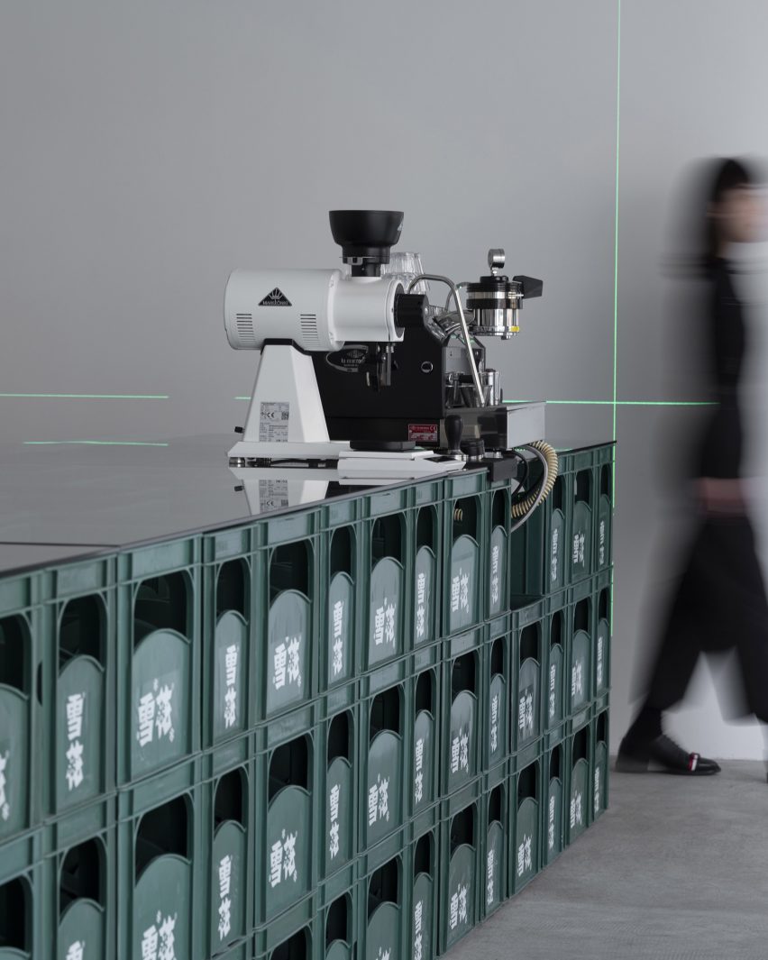
Fatface Coffee, China, by Baicai
Fatface Coffee was a pop-up coffee shop designed by architecture studio Baicai and presented for a month at Shenyang's Window Gallery in China.
The focal point was 300 forest-green beer crates forming a central rectilinear bar and cork-seated stools – an installation that intended to blend the city's fondness for beer with a local coffee culture that is emerging.
Bacicai opted for this central seating area to create an open space encouraging free circulation and challenged the conventional floor plan of a cafe.
Find out more about Fatface Coffee ›
This is the latest in our lookbooks series, which provides visual inspiration from Dezeen's archive. For more inspiration see previous lookbooks featuring suspended fireplaces, homes with sliding doors and interiors informed by Bauhaus principles.