Hacker overhauls "fortress-like" brutalist library in Oregon
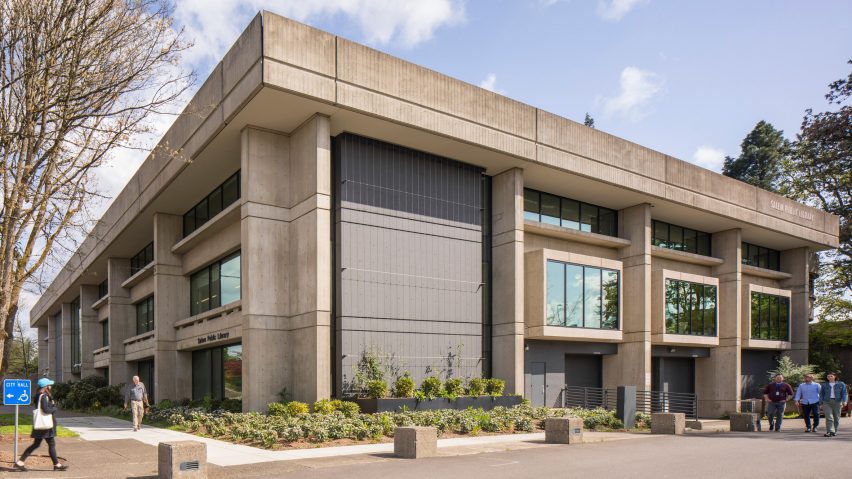
Colourful furnishings and large stretches of glass feature in a 1970s library building that has been updated by US studio Hacker Architects.
The three-storey, concrete library is located next to City Hall in downtown Salem, the capital of Oregon.
Encompassing 96,000 square feet (8,919 square metres), the building was originally designed by American architect George Rockrise and Donald Richardson, and opened in 1972. An expansion was completed in 1990.
Several years ago, the library embarked on a renovation project in order to update the ageing facility and improve its structural systems, particularly in regard to seismic resilience.
"With almost no wiggle room in a utilitarian budget, the design team needed to get creative finding ways to make every dollar spent do double-duty," said Hacker Architects, an Oregon firm with offices in Portland and Bend.
"Through a deep partnership with the library team, a vision was established to create a space that is welcoming, safe and flexible while enriching a connection between people and their community."
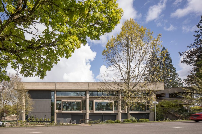
To improve the seismic design, the team added shear walls on three sides of the building and replaced out-of-date windows.
Expanded glazing ushers in daylight and gives the building a more transparent quality.
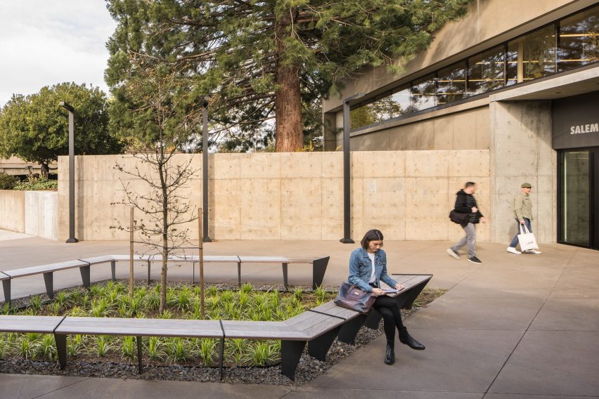
"The design brings daylight into the core of the large, fortress-like building, transforming an inward-facing, brutalist-era building into a bright, voluminous space that invites the community in," the team said.
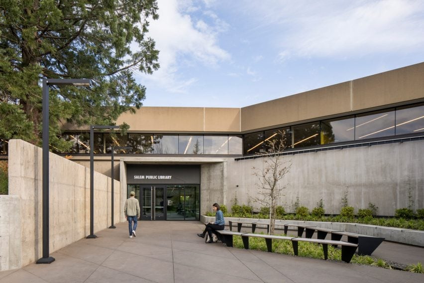
The building's main entrance – once covered by a tunnel-like canopy – was redesigned to be more inviting and provide a stronger connection to the surrounding context. The library is now fronted by a plaza with landscaping and benches.
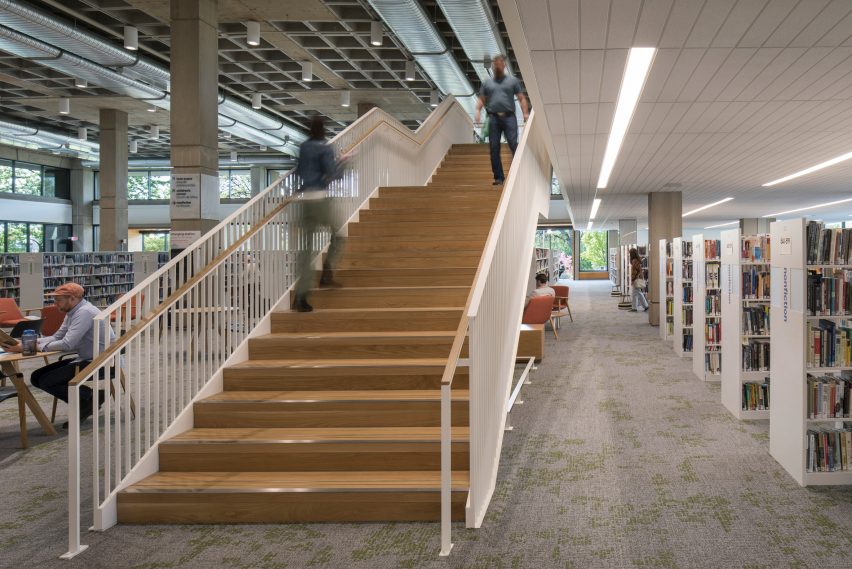
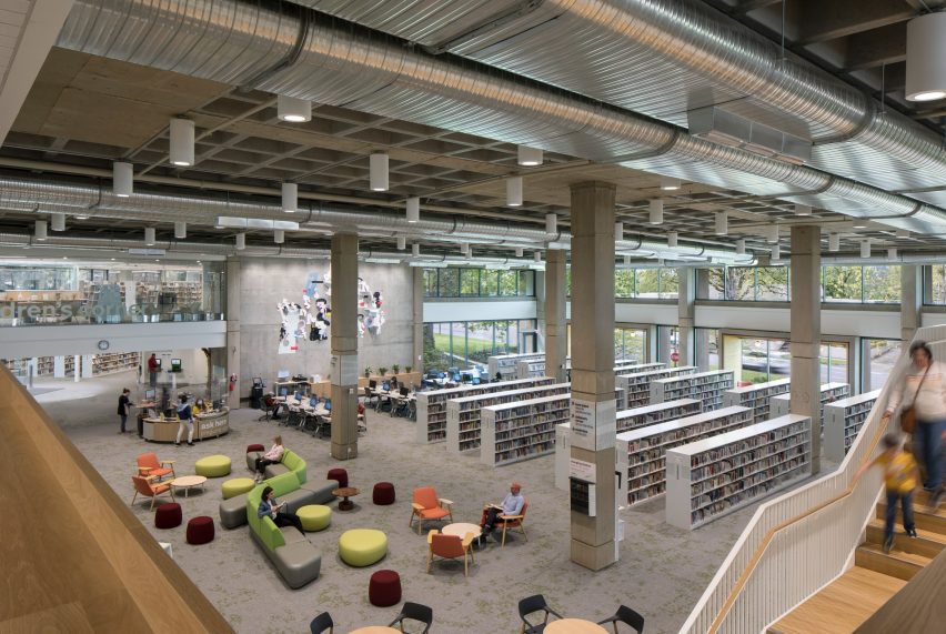
Within the building, a central, double-height space was made wider, taller and brighter. Dropped tiles were removed to reveal a waffle-slab ceiling and ductwork. A new staircase was created to connect the library's two upper levels and clarify wayfinding.
Programmatic zones were shifted around and modified.
On the entry level, the team placed book stacks, reading tables, computer stations, lounge areas and study rooms.
Youth spaces, which were formerly spread across the library, are now co-located on the top floor.
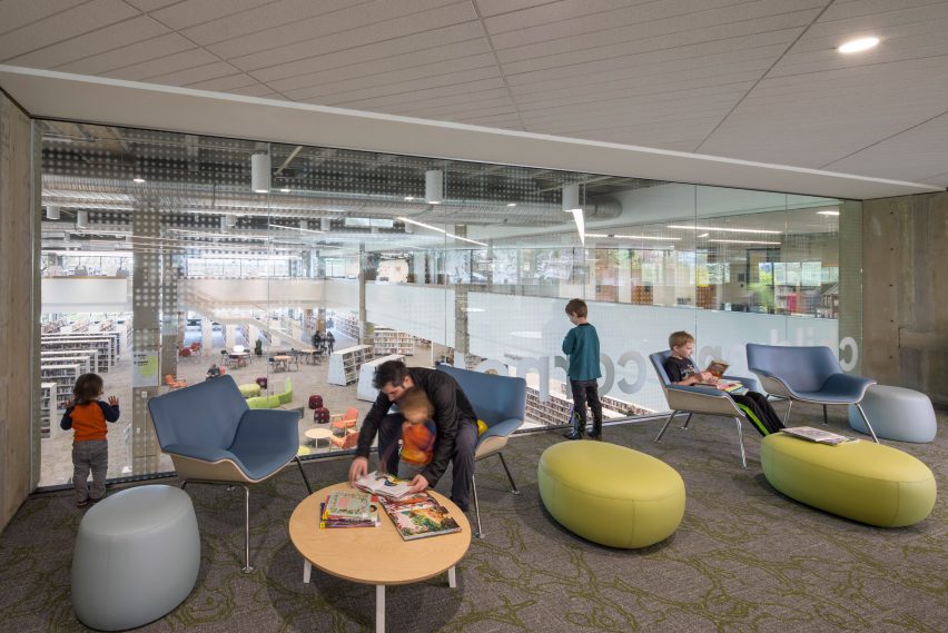
Staff and back-of-house areas are mostly found on the bottom level, allowing for "greater efficiency and functionality", the team said. The bottom level also holds a maker lab, a community room and meeting space.
Interior elements include light-toned carpeting, exposed concrete, wooden accents and colourful furnishings.
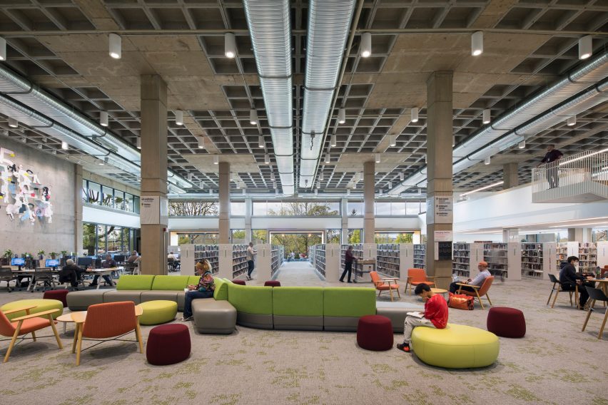
To create a more open feeling and provide views of the outside, 7.5-foot-high (2.3-metre) bookcases were replaced with shorter versions. In the children's area, curved reading nooks are incorporated into shelving units.
Other recent library projects in the US include a Brooklyn library by WORKac that its housed inside a former torpedo factory and the renovation of a Washington DC library that was designed by Mies van der Rohe shortly before he died in 1969.
The photography is by Lara Swimmer.
Project credits:
Architecture and interiors: Hacker
Hacker team: Laura Klinger (project manager and principal-in-charge); David Keltner (design principal); Jennie Fowler (interior design principal); Daniel Childs (project architect); Anya Smith, Whitney Jordan, Tracey Olson and Mayumi Nakazato (interior design team); Nick Pectol, Caleb Couch and Lewis Williams (architectural team); Matt Sugarbaker (project QA/QC)
Design-build contractor: Howard S. Wright
Landscape: Ground Workshop
Civil engineer: Westech Engineering
Structural engineer: KPFF
Mechanical and plumbing engineer: PAE
Electrical engineer: PAE
Lighting: O-
Acoustical engineer: Listen Acoustics
Signage/wayfinding: The Felt Hat
Code consultant: Code Unlimited
Client: City of Salem