Tiny Glasgow apartment transformed into playful pied-à-terre
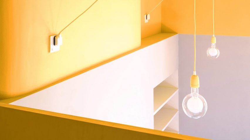
Architect Lee Ivett, designer Simon Harlow and developer Duncan Blackmore have turned a 25-square-metre apartment in Glasgow into a brightly coloured space that doesn't contain any freestanding furniture.
Blackmore worked closely with Ivett and Harlow to plan the interior of the ground-floor tenement flat, which he uses as a base while visiting his other projects in the city's Govanhill area.
When Blackmore purchased the property it comprised a cramped hallway, a compact shower room, a kitchen and a sleeping area, which were separated by partition walls.
The main idea for the redesigned space was to enable circulation throughout and to utilise its verticality in addition to the square-shaped floor area.
"I wanted to be able to walk around in the flat, even though it's tiny," said Blackmore. "I also wanted the majority of the space to be flexible in terms of use, rather than defining areas for certain activities."
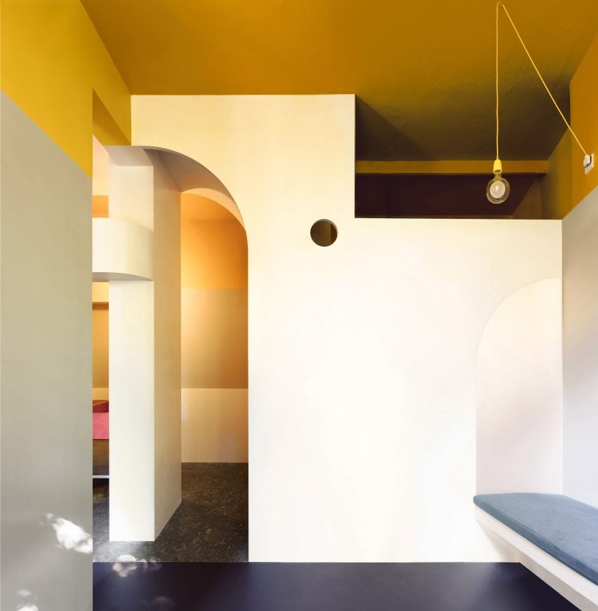
Work began with the removal of internal walls and the raising of existing structural openings closer to the 3.4-metre ceilings. A series of volumes designed in three dimensions were then inserted to fulfil various functional needs.
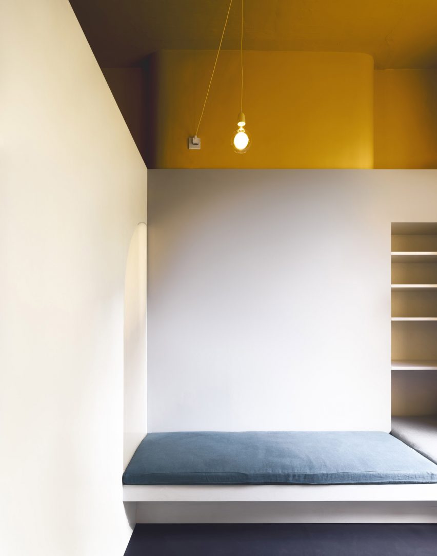
The apartment's entrance area leads into an open space containing a fixed bench for sitting, lounging or sleeping. A shelf that functions as a desk is inserted next to one of two large, south-facing windows that flood the interior with natural light.
Key functions, including washing, sleeping, cooking and the entrance, are pushed to the edges of the plan, freeing up the rest of the space so it can be used in a variety of different ways.
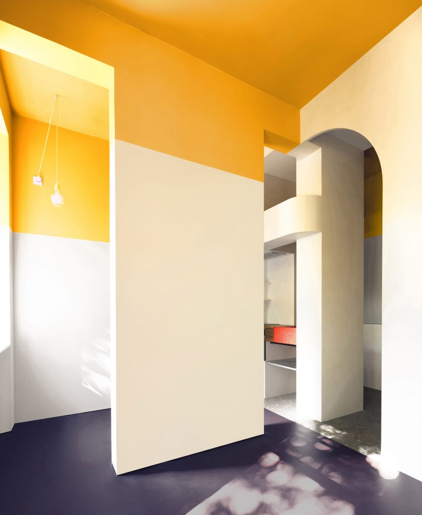
"I was keen to avoid having a typical living space with a sofa, a coffee table and a television," Blackmore told Dezeen.
"The main space is entirely unprogrammed and uncluttered and has almost nothing in it. You can use it for a meeting or a party or just as somewhere to sit and think. I like how versatile and unfussy it is."
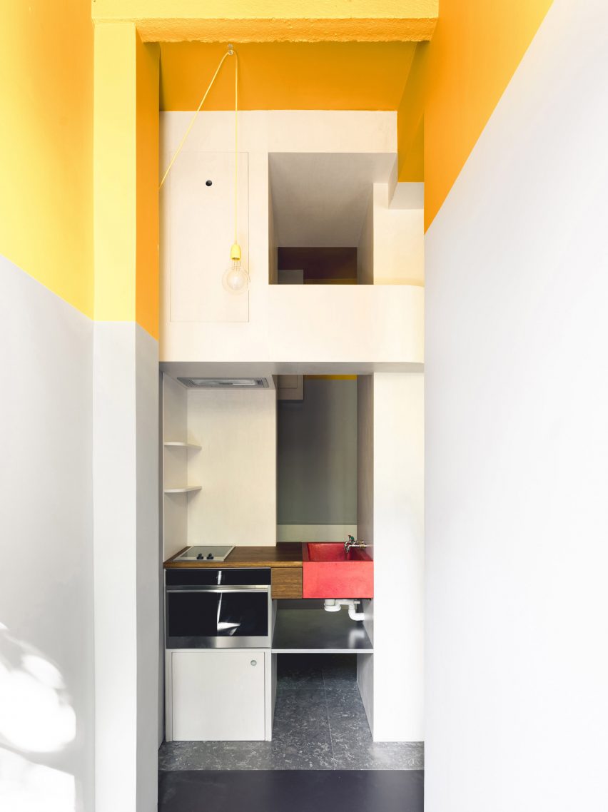
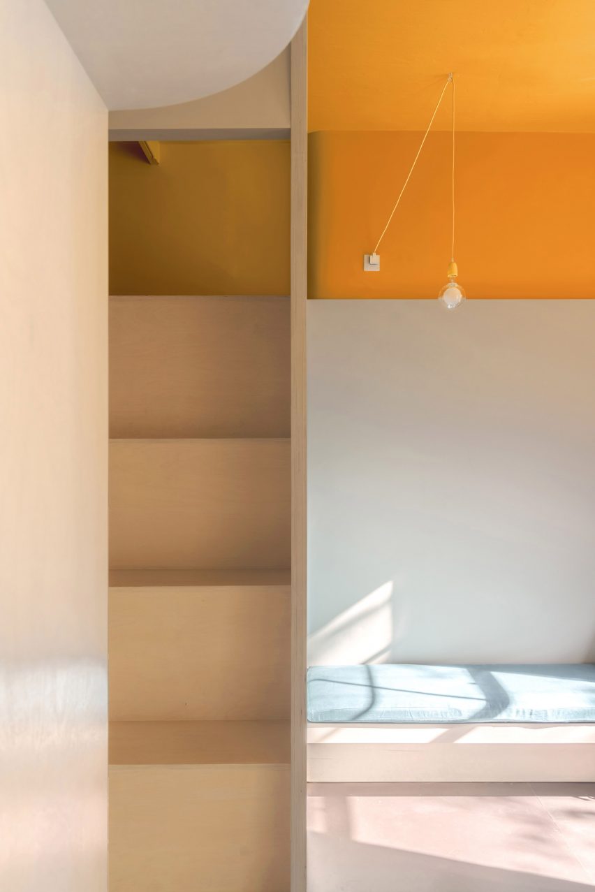
A mezzanine sleeping platform is slotted in above a compact shower room, taking advantage of the vertical space and preventing the room from feeling disproportionately high.
The bed is reached via a set of wooden steps, with a small circular hole seen from the living area providing somewhere to place a hand while manoeuvring into position.
The new interventions are built around the retained structure and feature forms that playfully disguise which walls, columns or beams retain their original functionality.
"Lee came up with the shapes based on the connection between existing openings and the geometry we imposed on the space," Blackmore pointed out.
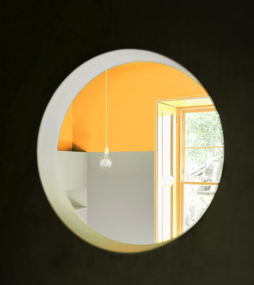
"Where we needed to bridge differences in height or gaps between certain elements, the surfaces meet each other with a curve or a step," he added, "so the decoration is derived from the resolution of these structural glitches."
The project takes its name, Ferguson, from the found nameplate of a previous occupier and the design borrows from the architectural heritage of its surroundings.
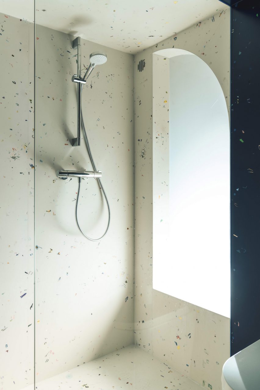
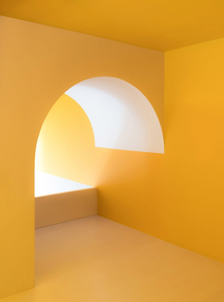
The remnants of a nearby building that burned down informed the arched shape above the stairs up to the sleeping area, as well as an opening that allows daylight to filter through to the shower room.
Coloured cushions on the bench reference the doorway of a nearby building, while the bright-yellow datum that extends around the space is a reversal of the painted walls in the tenement's shared stairwell.
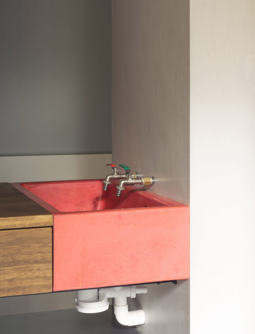
The kitchen contains the minimum amenities needed to obtain a building warrant. Its oversized red cast-concrete sink is accessible for hand washing on arrival from the entrance hall – a legacy of the Covid-19 pandemic during which the project was built.
Behind the apartment's only internal door, the shower room is fully lined in two colourways of a decorative solid surface material made by Simon Harlow's company Mirrl. A custom-made sink extends the use of bright yellow seen elsewhere in the interior.
The entire project was fabricated by Harlow and artist's technician Simon Richardson, resulting in a level of craftsmanship and intuitive creative detailing that lends it a strong sense of personality.
Blackmore is keen to emphasise that the apartment should not be viewed as an example of tiny living, as he only ever spends brief spells of time there.

"I'm absolutely not suggesting that people should live like this," he said. "The space is really personal and tailored to my needs, which are a nice bed, a hot shower with good water pressure and decent WiFi."
"If you were living there permanently you would design it very differently, but as a place for me to stay and work or relax it's perfect."
Blackmore is the co-founder of developer Arrant Land, which creates projects led by an interest in architecture, built heritage and the social dynamics of the UK's towns and cities.
Previous projects backed by Arrant Land include a red-brick house with playful tiled detailing in south London and an apartment building in the seaside town of Whitstable featuring black brick walls that evoke the nearby wooden fishing huts.
The photography is by Pierce Scourfield.