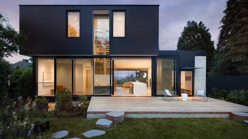
Local studio Splyce Design has designed a light-filled, angled house with glazed corners and a sculptural staircase overlooking the Burrard Inlet in Vancouver, British Columbia.
Completed in 2021, the 5,700-square-foot (530-square-metre) residence, known as Yield House, is oriented east-west and responds to the varied setting in both directions.
The front of the house – functioning like stacked viewing platforms with wall-to-wall, floor-to-ceiling windows – looks to the city, mountains and ocean, while the restrained rear side frames views of Douglas firs and western red cedars in the coastal rainforest.
Settled in a quarter-acre site, the house sits 17 feet (five metres) above the sidewalk, lifting it up from the street's sightlines. A concrete retaining wall with a cantilevered stair defines the pedestrian path to the entry.
Nigel Parish, founder of the Vancouver-based Splyce Design, described the topography and the home's relationship to the street as a defining challenge of the project.
"How to bring people up from the road to the front door in a meaningful, experiential way sets the tone for what is to come in the house," he said.
The glazed front is characterized by a deep triangular covering with a thin structural shell, while "a continuous dark band of cementitious panels defines the silhouette of the east elevation," Parish added.
Inside, the house is organized around a delicate central stair that divides public and private zones, serving as both a circulation method and a sculptural focal point.
"It is visually weightless and open, bathed in light from an operable skylight and deck access above, and a double-height window to the west that frames views to the trees beyond," Parish told Dezeen.
"A thin steel ribbon supports the outer edge of the floating wood treads, while discreet vertical cables serve as the guard," he continued.
On the main level, the kitchen, dining and living rooms cluster together, fading to the exterior through the slanted window wall with concealed window frames that extend the panoramic view.
Polished concrete floors and white walls create a subtle colour palette, while a timber ceiling warms the living room and allows the space to flow outdoors.
The supporting spaces are discretely connected. Millwork gives way to a prep kitchen, the mudroom hides behind the main room and a home office sits off the living room.
The niching of secondary spaces continues on the upper level with a library and seating nook that serves as the landing. In the primary suite, the entire corner of the room is glazed and the pristine whites defer to a bold black bathroom.
The back side of the main level opens to a deck through sliding glass doors, offering transparency through the design.
"The porosity and openness of the project from east to west – front to back – is unique in that you can get two very distinct views and natural lighting conditions and experiences, simply being in one spot," Parish said.
Also in Vancouver, Splyce Design designed a wood-wrapped house with an asymmetrical roof and stacked a series of glass boxes to create a waterfront residence.
The photography is by Ema Peter.
Project credits:
Architecture: Splyce Design (Nigel Parish, Tomas Machnikowski, Nick Macleod, Ewing Choi)
Builder: Adisa Homes
Landscape: Cyan Horticulture
Structural Engineer: Aspect Structural Engineers
Styling: Marcela Trejo

