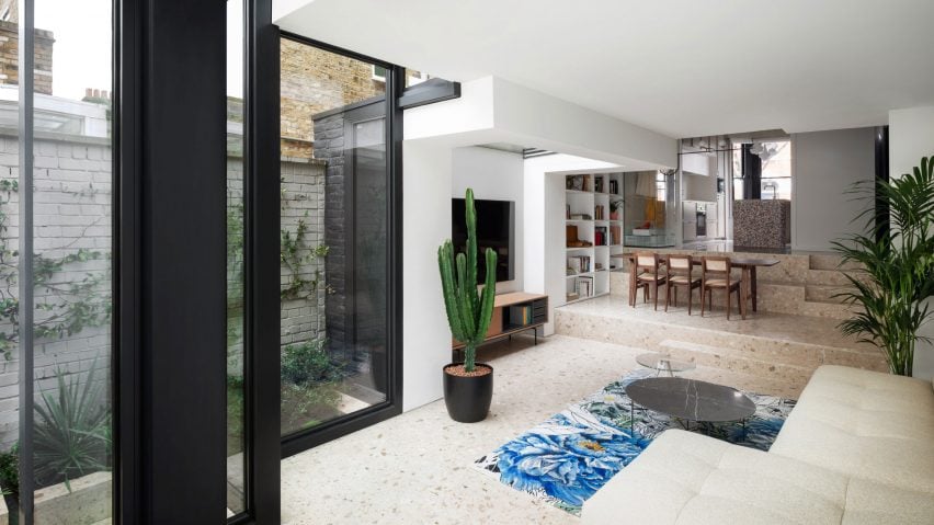
Our latest lookbook collects eight homes that feature split-level living areas, from a humble apartment in Mexico to a vast brutalist-style house in Bali.
Split-level areas are often seen in residential homes, where architects separate different spaces using short flights of steps to make interiors feel expansive and interesting, whatever their size.
Listed below are eight examples of the technique from around the world.
This is the latest in our lookbooks series, which provides visual inspiration from Dezeen's archive. For more inspiration see previous lookbooks featuring homes with broken-plan layouts, atriums and sliding doors.
Haus am Hang, Germany, by AMUNT
Designed by German architecture office AMUNT, this cross-laminated timber house on a hillside in the Black Forest is organised to maximise internal sunlight.
The ground floor is split into three levels, with an entrance space on the top level, a kitchen and dining space on the middle level, and a lounge tucked into the lowest area.
Find out more about Haus am Hang ›
A Brutalist Tropical Home, Indonesia, by Patisandhika and Daniel Mitchell
The 512-square-metre A Brutalist Tropical Home in Bali, by architect Patisandhika Sidarta and designer Daniel Mitchell, has a double-height living room flanked by split levels that were modelled on Ray Kappe's modernist Kappe Residence in Los Angeles.
"To be able to see spaces from angles that you could not in a conventional house with walls gives a completely different sense of space and feeling," Mitchell said.
The multi-level layout displays books, records and a speaker system and leads down into an open-plan kitchen/dining area.
Find out more about A Brutalist Tropical Home ›
Casa Tres Árboles, Mexico, by Direccion
Mexican studio Direccion replaced walls with split levelling to make the social spaces of this weekend retreat in Valle de Bravo feel more connected in a renovation project.
The black microcement floor of the double-height entrance hall – itself sunken from the street – gives way to soothing wooden floorboards via a single step down into the lounge, dining and kitchen space.
Find out more about Casa Tres Árboles ›
Frame House, UK, by Bureau de Change
The ground floor of Frame House cascades down terrazzo steps, from the kitchen at the front of the home to a dining area and onto the lounge at the rear.
London studio Bureau de Change aimed to "create a coherent journey through all spaces" in its renovation and extension of the Victorian terraced home in south London.
Find out more about Frame House ›
Villa E, Denmark, by CF Møller
This family home in Aarhus designed by CF Møller Architects sits on a sloping site, so it was divided into four distinct blocks separated by short flights of steps.
A kitchen and dining room leads onto a sitting room, which in turn is adjacent to the utility areas, hobby room and garage, all connected by the same herringbone oak flooring.
"The concept of dividing the building into 'four small houses' that could be moved between each other offered the solution and at the same time divided the villa into different family and living zones," said the studio.
House in Takatsuki, Japan, by Tato Architects
Tato Architects's House in Takatsuki takes the concept of split levels to the extreme. The three-storey Japanese home is spread across 16 different floors that residents traverse via wooden blocks, shelves and other pieces of furniture instead of staircases.
"The idea is to create a sense of expansion inside a small house, so that you would find yourself on top of a rooftop in one moment, and tucked beneath a floor in another," explained studio founder Yo Shimada.
Find out more about House in Takatsuki ›
Knightsbridge mews house, UK, by Echlin
Three simple steps divide the living room from the kitchen and dining area in this west London mews house that was remodelled by local firm Echlin into a broken-plan layout.
A generously sized, built-in L-shaped sofa helps to demarcate the separation, while a low wall that continues along one side of the sitting area from the kitchen floor helps to emphasise that sunken feeling.
Find out more about this Knightsbridge mews house ›
Domus Peepem, Mexico, by Kiltro Polaris, WEWI, and JC Arquitectura
Apartments inside this block, designed by Kiltro Polaris, WEWI, and JC Arquitectura and located in a traditionally working-class area of Cancún, have a compact layout that sees the kitchen, living and dining area separated from the sleeping area by a tall wooden step.
The step stands out as a softer element among the polished concrete finishes of the walls and floors.
Find out more about Domus Peepem ›
This is the latest in our lookbooks series, which provides visual inspiration from Dezeen's archive. For more inspiration see previous lookbooks featuring homes with broken-plan layouts, atriums and sliding doors.

