Nokia unveils angular logo as part of its first rebrand in 45 years
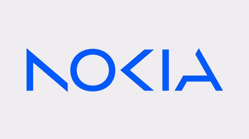
In a move to present itself as a technology brand encompassing more than just mobile devices, Nokia has rebranded and refreshed its logo with a simplified and angular design.
The updated logo was developed with consulting firm Lippincott as part of Nokia's wider rebranding strategy to reflect itself as "a B2B technology innovation leader realising the potential of digital in every industry".

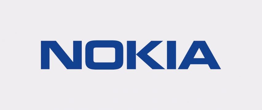
The blocky design of the previous logo, which was designed in 1979, was simplified to make it more minimalist and angular with slender characters.
The recognisable deep, subdued Nokia blue hue was updated to a brighter shade.

The diagonal strokes of the K in the previous logo were kept in an arrowhead shape in the redesign, but the upright stem of the letter was removed.
Strokes from the letters N and A were also removed to create an abstract, modernised appearance. The O in the logo also changed from a rounded square to a circular shape.
"The company's new logo is emblematic of an energised, dynamic and modern Nokia, demonstrating its values and purpose," said the brand.
"The new brand asserts the value Nokia brings in networking expertise, technology leadership, pioneering innovation and collaborative partnership," Nokia continued.
"It has been designed as a symbol of collaboration, which Nokia believes to be critical for realising the exponential potential of networks, unlocking gains in sustainability, productivity, and accessibility."
Other redesigned logos recently featured on Dezeen include beverage company PepsiCo's "uplifting" rebrand of soft drink 7Up and an updated logo for British heritage brand Burberry that references a motif created for the brand over 100 years ago.
The images are courtesy of Nokia.