Norm Architects devises understated HQ for children's lifestyle brand Liewood
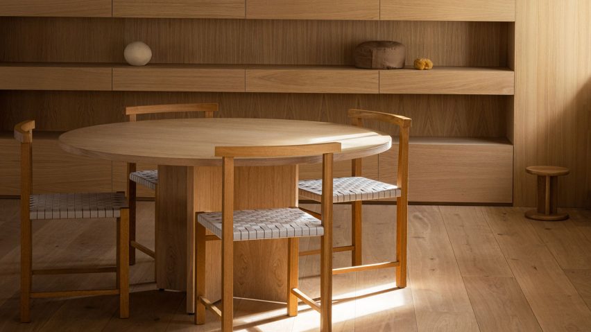
A refined palette of oak, plaster and steel defines the interior of the Liewood headquarters in Copenhagen, Denmark, designed by local practice Norm Architects.
The pared-back 2,200-square-metre office was conceived to give prominence to Liewood's colourful, Scandi-style children's clothes, toys and homeware.
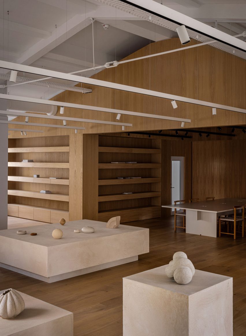
"With the ambition to create a comfortable space with a somewhat understated character, we worked to let the space obtain its significance through the thoughtful use of tactile elements such as textured plaster walls and contrasting elements like oakwood and steel," explained Sofie Bak, an architect at the practice.
Staff enter the five-floor office via an airy light-filled lobby that is anchored by a rounded counter, roughly washed with sandy-beige plaster.
Cone-shaped pendant lights are strung along the ceiling while oversized stone tiles are laid across the floor, helping to "emphasise the grandeur" of the space.
A pre-existing staircase curves up to the first floor, which accommodates a showroom. This part of the building formerly served as a production hall, with a vast scale that could easily feel empty and unwelcoming, according to Norm Architects.
To counter this, the practice constructed what it describes as a "warm wooden core" – a house-shaped oakwood volume with built-in shelves for showcasing Liewood's products.
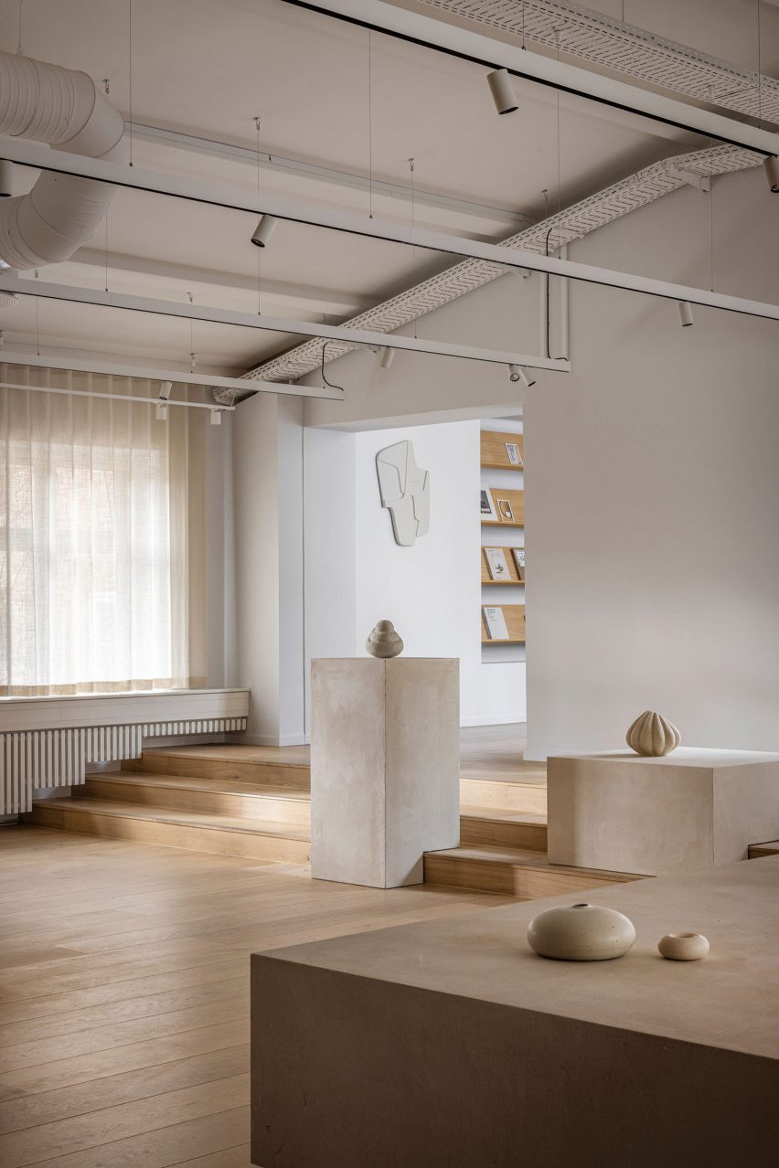
Large, plaster-coated display plinths are dotted across the rest of the room. At the back is a short flight of wide, wooden stairs where staff can sit and chat throughout the day.
More products can also be presented here on bespoke podiums that, thanks to cut-outs at their base, are able to slot onto the steps.
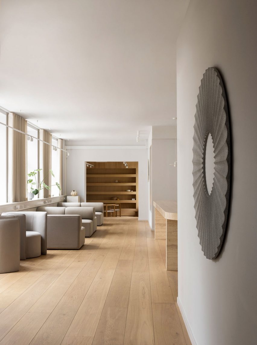
The building's first floor also contains The Parlour – a kitchen and dining area where Liewood employees can enjoy meals together. It features a large travertine table, a series of plump grey sofas and graphic art pieces by the Danish designer Sara Martinsen.
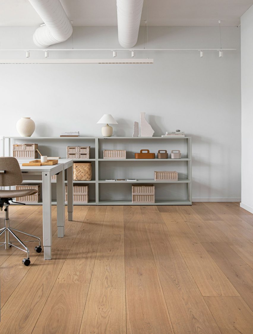
Work areas throughout the rest of the HQ are furnished with practical desks and storage units that match the off-white walls, while meeting rooms are fronted with panes of glass to foster a sense of openness.
As the building's original staircase didn't extend all the way to the fifth floor, Norm Architects installed a spiralling set of white-steel steps.
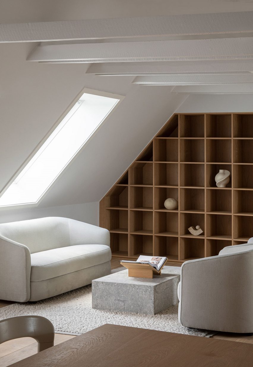
These grant access to a space the practice refers to as The Apartment: a secondary showroom designed to have a more intimate, homely feel.
Elsewhere, Norm Architects recently took its minimalist aesthetic off-shore when designing the interiors of the Y9 sailing yacht, decked out with supple suede furnishings and wood-panelled surfaces.
The photography is by Jonas Bjerre Poulsen of Norm Architects.