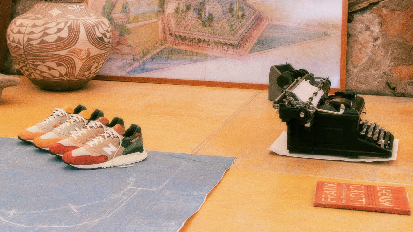
In this week's comments update, readers discussed recently released trainers informed by Frank Lloyd Wright sketches.
Kith released a pair of New Balance trainers informed by Frank Lloyd Wright sketches, but commenters weren't convinced by the connection to the 20th-century architect's work.
"Nothing to do with Frank Lloyd Wright"
Mark Favermann considered the trainers "seem like quite a weird stretch to capture the design aesthetic of FLW".
Paul was more forthright in asserting "these sport shoes have nothing to do with FLW. Stupid marketing."
"If these had been made of wood and stone, with water-flicking technology that generates little waterfalls at various angles, I might have been convinced," joked dc2bcn.
Snessnyc conjured a fun mental image when they asked "can anyone imagine FLW wearing sneakers?" But Layla thinks "these are fuego".
On fire or Frank Lloyd flop? Join the discussion ›
"A very finely done, right-scale, well-planned building"
London practice Archio has completed white brick housing block for London Community Land Trust overlooking a new public square. "Extremely well done," commented JZ. "Love the scale of the intervention, the planning, materials and detailing."
Melon thought that "the modelling and shadows already add interest, and when the residents start to occupy the balconies with planting, parasols and personal touches that white will form a nice canvas."
"Bravo, said Marius. "Another example of a subsidised housing project designed by architects with care and effort."
They continued "this is a very finely done, right-scale, well-planned building – kudos. It is tight, yet thought-through in detail, and it dignifies the experience of living there. White brick is a great choice. London can take some brighter tones."
However Alfred Hitchcock thought "the white brick makes it look rather institutional and characterless." Gytis Bickus echoed the sentiment when they said it "looks like a bit of a blank canvas at the moment".
Brilliant white or blank canvas? Join the discussion ›
"Cuteness in architecture"
North Arrow Studio completed a corrugated metal accessory dwelling unit in Austin, Texas, featuring a custom, circular pivot window that is reminiscent of the round opening in a birdhouse. Commenters debated its merits.
IDracula thought it was "Cuteness in architecture, love this little structure."
"Interesting plan and fun windows," agreed Otto ADU. "Especially curious about the garage door in the living room. Did that have to be permitted as a garage space in Austin?"
Butnotreally wanted answers as well, asking "what is the purpose of the garage door in the living room?"
"The exterior resembles a roadside auto repair shop, while the interior beams have the sterility of an operating theatre," commented Cmabe55. "Nice touch to give it the impression of an avian dwelling, as I can't imagine humans wanting to live in such a silly yet dull space."
Beautiful birdhouse or bird-brained dull space? Join the discussion ›
"Maybe this is what happens when you get so big and in demand"
Dutch studio MVRDV has released visuals of Van Gogh Homeland, an architecture and sustainability biennale launching in the Netherlands named after Dutch painter Vincent van Gogh, which will attempt to shine a light on the environmental pressures and flood risks currently facing North Brabant's landscapes.
Commenters were cynical about what Van Gogh had to do with any of it.
HeywoodFloyd was upvoted for saying the project "can most charitably be described as confusing".
"With the exception of some remarkable recent projects, MVRDV's approach to architecture continues to become increasingly jokey, erratic and superficial," reflected Architect Incognito. "So many talented people work there, but to me, the output appears more and more frantic and in search of the next big formal gesture."
"Maybe this is what happens when you get so big and in demand, and clients basically assume your genius and look to you for confirmation: too few people tell you that what you propose is just pure sh*t," they continued.
Tom Roberts joined in, lamenting "a lot of ugly, while the artist created such dynamic beauty."
Some were reminded of another similar MVRDV project in London that was recently a bit of a disaster. "Another dry grass pile of scaffolding coming to your town," said Max.
Vincent van great or van godawful? Join the discussion ›
Comments update
Dezeen is the world's most commented architecture and design magazine, receiving thousands of comments each month from readers. Keep up to date on the latest discussions on our comments page and subscribe to our weekly Debate newsletter, where we feature the best reader comments from stories in the last seven days.

