"Art does not have to be 'useful' but it should carry some meaning" says commenter
In this week's comments update, readers discussed Asif Khan and Theaster Gates' Liverpool Docks transformation plans.
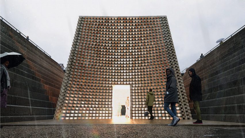
A pyramidal pavilion for contemplation is set to be introduced to the Liverpool waterfront as part of a transformation project led by architect Khan and artist Gates.
Dezeen commenters debated the artistic goals and functionality or "usefulness" of art projects like this.

"Too cryptic to mean anything"
Don Bronkema called it "bizarrely uncanonical" and Gavin Smitsdorp echoed them when they commented "great visual aspect, but too cryptic to mean anything!"
"How important or useful is that to the community?" asked Marks Sundays. "Why not propose a floating public pool? I'm sure public money would be better spent," they added.
Jim Angrabright responded "so now art has to be 'useful'? Sounds like end-stage capitalism."
Clichy continued the debate by replying "art does not have to be 'useful' but it should carry some meaning, however tangential. A truncated, perforated pyramid for 'contemplation' strikes one as meaningless within the context."
What's it to you? Join the discussion ›

"What is it about US government contracts that often bring out the worst in firms?"
BIG, Gehry Partners and Perkins&Will are among the five studios that have been selected as finalists in a contest to design the future National Museum of the US Navy. Dezeen readers reacted to the announced finalists and it was Gehry's design that was most discussed in the comments section.
"Gehry Partners proposal is surely the most economical, which is something you don't always get to say about Gehry designs," observed Frank.
Danlazop joked "it's a weird world when Gehry is the conservative entry".
Wil Worthington liked the proposal, exclaiming "Bravo, Frank Gehry!" but JZ thought "the Gehry solution is quite curious".
However other commenters weren't enamoured with any of the designs. Hbnj asked "what is it about US government contracts that often bring out the worst in firms? These renderings and designs already look 20 years old".
Tom Roberts agreed saying "it takes a great deal of effort and insight to create great spaces. None of these qualify."
What do you think? Join the discussion ›
"If the idea was to have it look like a shed, mission accomplished"
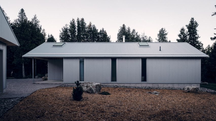
Commenters debated Canadian practice StudioAC's corrugated metal barn-like home, disguised as an agricultural building on the Bruce Peninsula near Toronto.
Kemarino wasn't convinced, saying "I don't think it's a very successful disguise".
"If the idea was to have it look like a shed, mission almost accomplished," commented Marius.
Apsco Radiales contributed that the "corrugated metal siding is not a bad choice, however, there is a bit too much of it and tends to remind me of metal storage sheds found in almost every Canadian backyard," to which Lewis Dostine responded "I think the goal of looking like a storage shed was apart of the gesture."
Sasz thought it was an "interesting project".
Shed or home? Join the discussion ›
"Foster + Partners have mastered this concept"
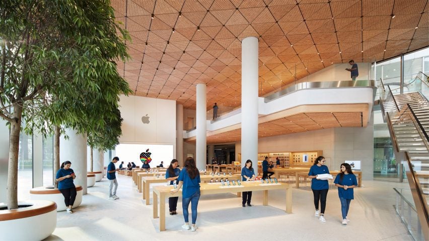
UK studio Foster + Partners has unveiled the first flagship Apple Store in India, which has a ceiling made from 450,000 pieces of oak. Commenters had a split reaction.
"I honestly thought these were renderings," said Rd. "F+P are so good at these details, it's just perfection. Very nice store and atmosphere again, and it sits nicely in the larger building as well. What can you say? They just mastered this concept."
Prado Sellinder agreed: "Foster is getting so good at these perfect details like where the different materials meet. Seamless."
"Why are Apple stores always so big, when they contain so little?" asked Alfred Hitchcock. "Waste of space and natural resources."
Nature For All was also concerned about resources, questioning "how may oak trees had to be destroyed? This store is yet another example of man-made consumerism, which drives destruction."
What do you make of the plans? Join the discussion ›
Comments update
Dezeen is the world's most commented architecture and design magazine, receiving thousands of comments each month from readers. Keep up to date on the latest discussions on our comments page and subscribe to our weekly Debate newsletter, where we feature the best reader comments from stories in the last seven days.