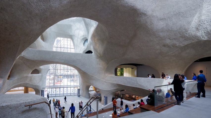
Chicago-based architecture firm Studio Gang has designed the Gilder Center in Manhattan to prioritize connectivity, creating a massive cavernous atrium meant to provoke a sense of exploration and discovery.
The Richard Gilder Center for Science, Innovation, and Education is a new addition to the American Museum of Natural History off Central Park that unites, visually and functionally, the 26 buildings constructed there since its opening in the late 19th century.
Placed between two Romanesque buildings, the structure has a stone facade made with a mega-panel system that references the geometry of the adjacent buildings.
This uses the same stone as the primary entrance building – Milford pink granite sourced from the original quarry, which reopened for the occasion.
The six-storey building is tucked away from the street, between the other buildings, which led Studio Gang founder Jeanne Gang to call it an "inny building".
The studio focused on internal experiences and connections to the rest of the museum's buildings, instead of trying to make the new addition an "object" building.
"Architects in the last few years have been doing object buildings: it looks like something from the outside, a fancy shape or something like that," Gang told Dezeen.
"But that's not at all what we were doing here because we really started by making the museum more connective," Gang added.
"So it ended up being the interior structure that was the most important architectural element."
She added that while the building and its exploration are great for children, it is meant to bring out joy in everyone.
"To be an architect is to extend your childhood throughout your entire life," she said. "It's about the joy of exploring a space."
The interior revolves around the Kenneth C Griffin Exploration Atrium, a five-storey structure with cave-like walls and overhead bridges.
Studio Gang tapped engineering firm Arup to design the space, which was created with rebar and shotcrete, a method for pouring concrete foundations that sprays the wet concrete.
This removes the need for formwork and allows for non-repetitive shapes.
The atrium, which is topped by circular skylights and features a large stair and seating configuration at its centre, was hand-finished.
Besides being the organisational centre of the structure, it is also the structural centre, as it supports the rest of the building.
Its appearance was informed by the caves and canyons of the American Southwest and the subway infrastructure underneath Manhattan, for which the shotcrete method is generally used.
"It's a contemporary space that is evocative of discovery, and I think that's something it has in common with natural landscapes like caves, grottoes and cenotes," Gang told Dezeen.
"It's not about pure transparency. I can't see everything all at once."
The exterior also has an interesting visual language, with a complex series of panels that step up in an organic way, with asymmetric, bird-friendly glazing.
The entrance to the structure is a massive wall of glass that extends almost the full height of the atrium.
The team, along with the museum officials, wanted the Gilder to be a place that "invites people in" and promotes a "greater understanding and appreciation of science".
For Gang, the project is an example of "actionable idealism", which she explained as design that works "towards addressing these urgent challenges that are facing us today".
Gang pointed to the lack of formwork in the shotcrete design and the promotion of science learning in general.
Light was an important aspect of the design, with the atrium, classrooms and other public areas such as the cafe being located near the front of the museum and the gallery spaces tucked inside.
The project saw the addition of a number of galleries such as an insectarium, the multi-media Invisible World permanent exhibition, and 40,000 square feet (3,716 square metres) of renovation work.
Also included is the Reading Room on the fourth floor, which has a massive concrete support system that looks like a mushroom.
The topmost two floors of the structure are dedicated to research and collections, housing specialized laboratories.
The interiors of the galleries are minimal, with wood and white-painted walls and plentiful lit-glass panels opening them up to the corridors, which have concrete flooring and exposed mechanical systems overhead.
The centre's opening sees the completion of nearly 10 years of work from the studio and its collaborators, which included landscape design studio Reed Hilderbrand and Ralph Applebaum Associates, which handled the exhibition design.
Other recent projects by Studio Gang include the Arkansas Museum of Fine Arts, which also connects a series of historically and physically disparate buildings.
The photography is by Iwan Baan unless otherwise stated.
Project credits:
Design architect: Studio Gang
Executive architect: Davis Brody Bond
Landscape architect: Reed Hilderbrand
Engineering: Arup, Buro Happold, Langan Engineering
Other collaborators: Atelier Ten, Bergen Street Studio, Design & Production Museum Studio, Event Network, Hadley Exhibits, Ralph Applebaum Associates, Tamschick Media+Space, AECOM Tishman, Venable LLP, and Zubatkin Owner Representation.

