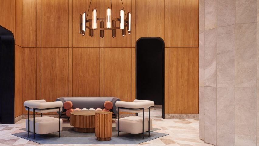
New York designer Krista Ninivaggi has completed the lobby design of the Brooklyn Tower, a supertall skyscraper that is the tallest in the New York City borough.
Ninivaggi was commissioned for the interior spaces – including lobbies, amenities spaces and furniture – for the SHoP Architects-designed skyscraper, which is completing this year. So far, it has completed the two entrances that will usher residents into the lobby.
The tower itself rises from the historic Dime Saving Bank in Downtown Brooklyn, so Woods Bagot needed to navigate the historic design as well as the "future landmark".
"Together with the architect we looked to the future rather than focus on a nostalgia for the past," Ninivaggi, now a principal of international design studio Woods Bagot, told Dezeen.
"Ironically, [American architect] Hugh Ferriss's work and dedication to retro-futurism influenced our designs," she added.
"We very much wanted the interiors to be in dialogue with the ethos of the exterior of the building, so that it felt like a complete work and continued the vision of the exterior. The goal was for the inside and outside to be unified as a total work."
The solution was to create this unification was to focus on small details, such as the wood panelling in the main lobby, which was milled at one-half the scale of the exterior facade extrusions.
The design included both of the two residential entrances to the tower, one of which passes through the Dime Savings Bank building on Fleet Street.
Both entrances have oak panelling and cream-coloured hexagonal flooring that was based on the original flooring for the bank.
The Flatbush Avenue Extension entrance, through the extension built for the tower, acts as the primary lobby and has a concierge desk positioned in front of a recess.
Gold and bronze detailing and custom furniture designed by Ninivaggi – such as a built-in stone bench – were arranged around the desk and the wood panelling is backlit.
From here, a passageway with arches clad in stone connects the main lobby with the Fleet Street entrance. Also accessed from the main lobby is the elevator bank.
This area has a vaulted ceiling clad in liberty dimes, another reference to the bank, and the elevators are framed by gold detailing.
"We also used an abstracted mercury dime face as the signage for the ATM tucked away in the lobby," said Ninvaggi.
"Though we wanted to reference the bank we intentionally incorporated wood, which was not found in the bank's original material palette. This warmed the space and gives it a more residential feel and the lighter wood tone compliments the stone."
"Overall, we made strides to abstract our references for a modern-day audience," she added.
The Brooklyn Tower is scheduled to be completed in the next few months, with most of its black facade already having been installed.
The photography is by Adrian Gaut.

