Recent pins on our packaging design board are some of the most popular on Dezeen's Pinterest. We round up the seven most colourful and playful projects.
Advances in technology and the rising popularity of social media have increased the need for brightly coloured and distinctive packaging designs to attract customers.
Studios including Morrama and Pentagram have had to adapt their approach to keep up with ever-changing design trends.
Scroll down to see seven packaging designs currently trending on Dezeen's Pinterest and browse our popular packaging design board to see more.
Houseplant by MA-MA and Pràctica
Design studios MA-MA and Pràctica teamed up to revamp Canadian cannabis company Houseplant's product packaging.
The studios designed cube-shaped cannabis containers which are stackable and come in three colours. They also designed a custom typeface and line illustrations for the brand.
Find out more about Houseplant ›
Kankan by Morrama and Two Times Elliot
Kankan enlisted London-based studios Morrama and Two Times Elliot to upgrade the packaging of its soap-in-a-can brand.
Morrama designed a recycled plastic pump that clips onto the can and is reusable. Whilst Two Times Elliot created a new brand identity that references the shape of the can as well as its fragrances.
The Mystery Item programme by Harry's
Razor brand Harry's looked to 1950s influences when designing the graphics and packaging for its Mystery Item programme.
The comic-strip packaging comes in two sizes and a variety of colours including teal blue and olive green.
Find out more about the Mystery Item programme ›
Here Design drew inspiration from collections of miniature books when designing an brand identity for Italian seed company Piccolo.
The brand used sans-serif typography and infographics to appeal to its modern and urban audience. Each packet features a illustration of the seed which it contains.
Find out more about the Piccolo ›
Dimple invited Australian studio Universal Favourite to design brightly coloured branding for its contact lens subscription service.
The company was tasked with creating branding that appeals to its young target audience and stands out on social media.
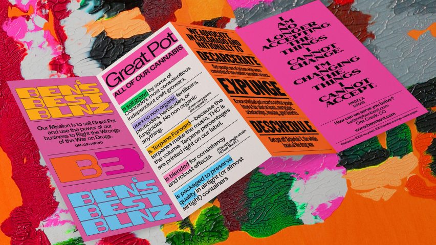
Ben's Best Blnz cannabis company by Pentagram
Design studio Pentagram designed the branding for cannabis company Ben's Best Blnz (above and also lead image).
The packaging and brand identity was carefully designed to bring awareness to the number of Black people incarcerated for cannabis-related offences. It features fonts and quotes from famous African and African-Americans, such as Nelson Mandela.
Find out more about Ben's Best Blnz ›
Dark Igloo designed the branding and packaging for psilocybin dispensary PLANT.
The studio used medicinal amber glass packaging and wiggly sunshine-yellow typography in hopes to challenge negative stereotypes attached to the drug.
Follow Dezeen on Pinterest
Pinterest is one of Dezeen's fastest-growing social media networks with over 1.4 million followers and more than ten million monthly views. Follow our Pinterest to see the latest architecture, interiors and design projects – there are more than four hundred boards to browser and pin from.
Currently, our most popular boards are museums and adaptive reuse.

