Dutch architect Anne Holtrop has used rippled sheets of acrylic to create a water-like partition inside this Parisian boutique by jewellery designer Charlotte Chesnais.
The store is set along Boulevard Saint Germain and is the second retail location that Anne Holtrop has devised for the brand.
Like the inaugural branch – which features a striking acrylic display table – Chesnais wanted this space to present her jewellery in a way that fosters a "unique spatial experience".
Holtrop's answer was to use acrylic again – but this time to construct a towering partition wall.
"In the first store, we included a very large table that is almost the full size of the space," he told Dezeen. "In the second store, we flipped this concept as the existing space has a great height and small floor area."
The translucent partition runs across the middle of the store and was CNC milled to have a rippled, almost watery surface texture. The divider is also inbuilt with tiered shelves and drawers, meaning any rings, necklaces or bracelets showcased inside seem to float.
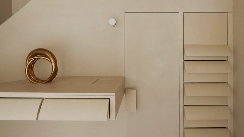
The rest of the store's interior was largely kept simple. Walls surrounding the partition were washed with beige marmorino plaster and decoration was restricted to a curvaceous gold sculpture that mimics the form of Chesnais' designs.
There is also a trompe l'oeil infinity mirror and a small wooden stool.
A doorway in the acrylic partition guides customers to a curved flight of stairs at the rear of the store.
These lead up to a mezzanine-level room that's dedicated to showcasing the brand's fine jewellery collection.
Acrylic was used here again to make an expansive wall-mounted display unit. Other surfaces were coated with glossy forest-green epoxy paint.
A plump sofa was set into the room's back wall and a thick jade-coloured carpet was been laid across the floor.
"We wanted to give it a different, more intimate atmosphere, in which you sit and relax like in a little cocktail bar," Holtrop said.
This isn't the first time that Anne Holstrop has designed a space for a fashion brand.
In 2021, the architect remodelled Maison Margiela's London store, where he inserted a series of gypsum walls that resemble fabric cuttings.
The photography is by James Nelson.

