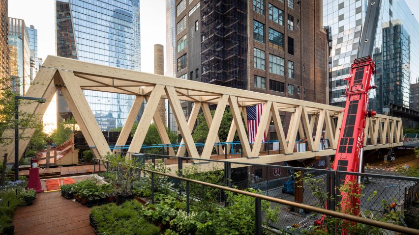
"Finally some warm colours in this neoliberal dystopia" says commenter
In this week's comments update, readers discussed a block-long timber truss bridge that connects Manhattan's High Line to the renovated Penn Station and other top architecture and design stories.
The 300-foot (92-metre) long bridge is part of the Moynihan Connector, which connects Manhattan's elevated High Line walkway to the Moynihan Train Hall transit hub.
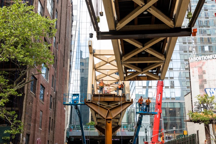
"A great-looking addition to the city"
In Marius's opinion, the "elegant highline that carried trains did not need this" adding the footbridge is "fat and ungraceful."
The commenter's views were shared by Ekin Sahin, who argued that the structure is "not architecturally pleasing, not an engineering marvel or not contemporary design in any way." They continued by claiming that "it's not sustainable" just because timber was used.
With a more positive outlook, Ken Steffes found the bridge a "great-looking addition to the city" but wondered whether it "should be covered in a city with winter weather like New York."
"Finally some warm colours in this neoliberal dystopia," agreed Trewus with a hint of sarcasm.
Do you like the bridge? Join the discussion ›
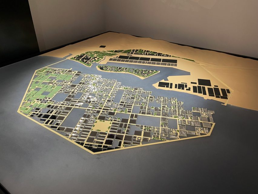
"Zero morality urbanism"
Readers debated the fact that Danish studio BIG has been named the masterplanner of the floating port city of Oxagon, which is part of the Neom development in Saudi Arabia.
"They should feel utterly ashamed of themselves," said Jell. "For participating in this awful, inhumane endeavour and, frankly, for producing such rubbish and gimmicky design."
"Food for the critics, but the city moves on despite those naysayers," argued Mr J. They wondered whether it "will end up better than the housing plague currently enveloping our shire counties", adding that "only the future will reveal that."
Prole made it short but clear: "Zero morality urbanism."
What are your thoughts? Join the discussion ›
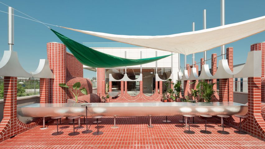
"That would have been fun to design"
Readers were generally impressed by the Parconido Bakery Cafe in South Korea, which is made from red bricks and features playful curved shapes and rounded walls designed to create an illusion-like effect.
Z-dog noted that the project "seems upside down" and that the "brick arches inverted to their natural position could have created a wonderful division of the spaces." They continued by praising the project and said that it "has been executed beautifully."
Idractula, on the other hand, found the project "too fussy" and was of the opinion that the "curves at foot level present a hazard."
"That would have been fun to design," commented Jb.
Would you visit this cafe? Join the discussion ›
"Architecture without modernist architects is certainly desirable"
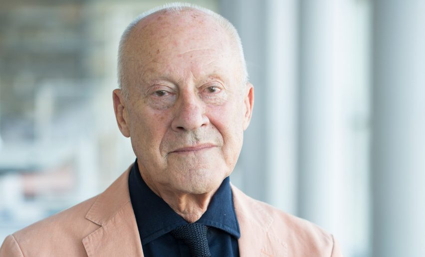
Readers reacted to an exclusive interview with Normal Foster at the Venice Architecture Biennale during which he said that the simplest structures, such as tents and huts, can teach architects lessons.
"I know many houses in Europe, and North America that have never seen an architect, yet they are gems in terms of style, materials, and planning," agreed Apsco Radiales.
"Architecture without modernist architects is certainly desirable," commented Jb.
"Interesting and unfortunately indispensable in the 'damaged' or war-torn parts of the world," added Pa Varreon.
Did you read the interview? Join the discussion ›
Comments update
Dezeen is the world's most commented architecture and design magazine, receiving thousands of comments each month from readers. Keep up to date on the latest discussions on our comments page and subscribe to our weekly Debate newsletter, where we feature the best reader comments from stories in the last seven days.