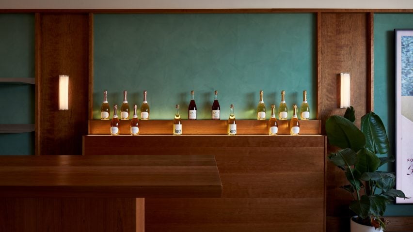
Studio Paul Chan references Wes Anderson at Boisson bottle shop in LA
The opening scene from a Wes Anderson film provided a starting point for the interior of this bottle shop in Los Angeles, by locally based Studio Paul Chan.
The first LA location for Boisson combines elements of mid-century Hollywood design and art deco in a 1,160-square-foot (108-square-metre) space to showcase a selection of non-alcoholic beverages.
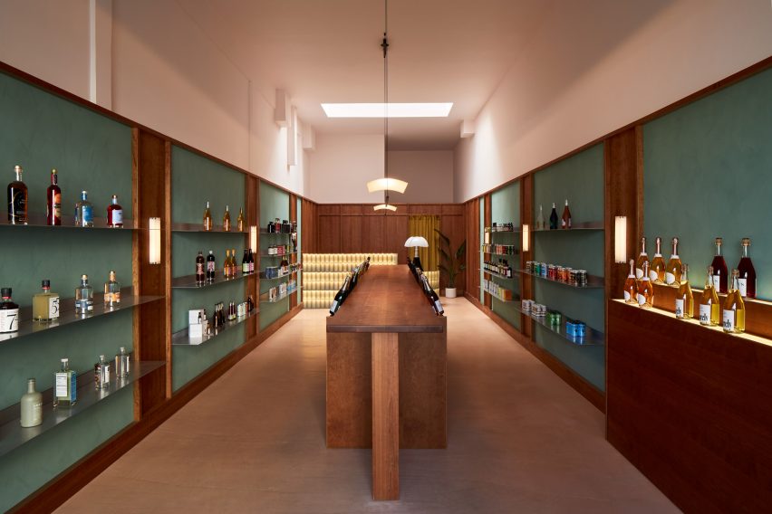
"Inspired by great storytelling and glassware in Wes Anderson's French Dispatch opening scene, where a server scales five flights of stairs to deliver a tray of aperitifs, absinthe, dry white wine, a coke, and an affogato to a meeting of editors, we endeavoured to create a space for the aesthete," said studio founder Paul Chan.
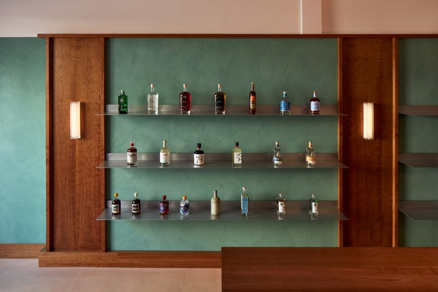
The studio installed walnut-stained wooden wall panelling with areas of "calming" dusty green lime wash spaced evenly in between.
These materials are contrasted by thin stainless steel shelves upon which the products are displayed along both side walls.
"The layered narrative mixes artisanal materials with machine-made elements, creating a conceptual parallel between non-alcoholic drinks and traditional wine," Chan said.
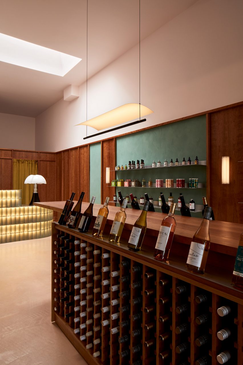
A long narrow wooden table runs through the centre of the space, creating another spot for presenting the bottles on top, and adding storage in the form of open racks below.
Chan also took cues from Maison de Verre, a modernist house completed by Pierre Chareau and Bernard Bijvoet in 1932, for elements of his design.
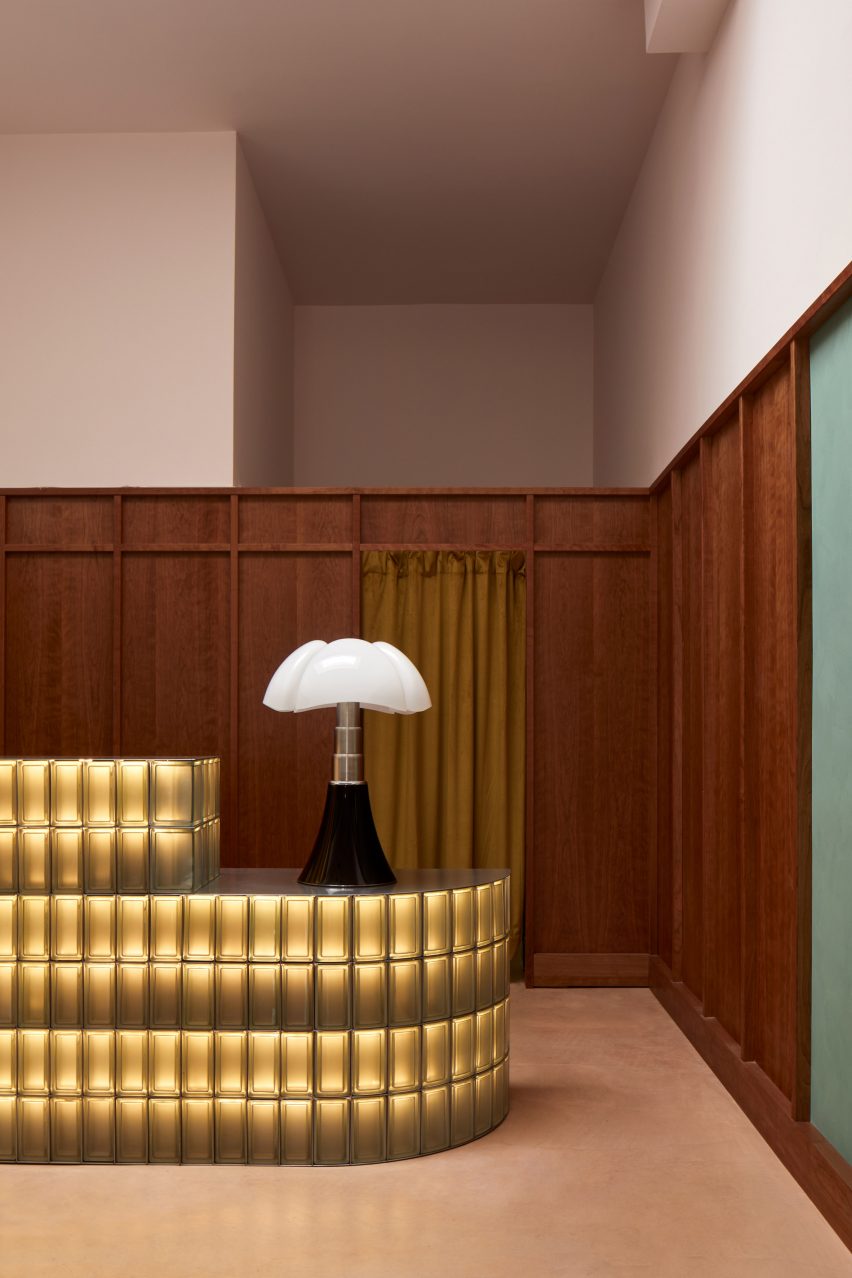
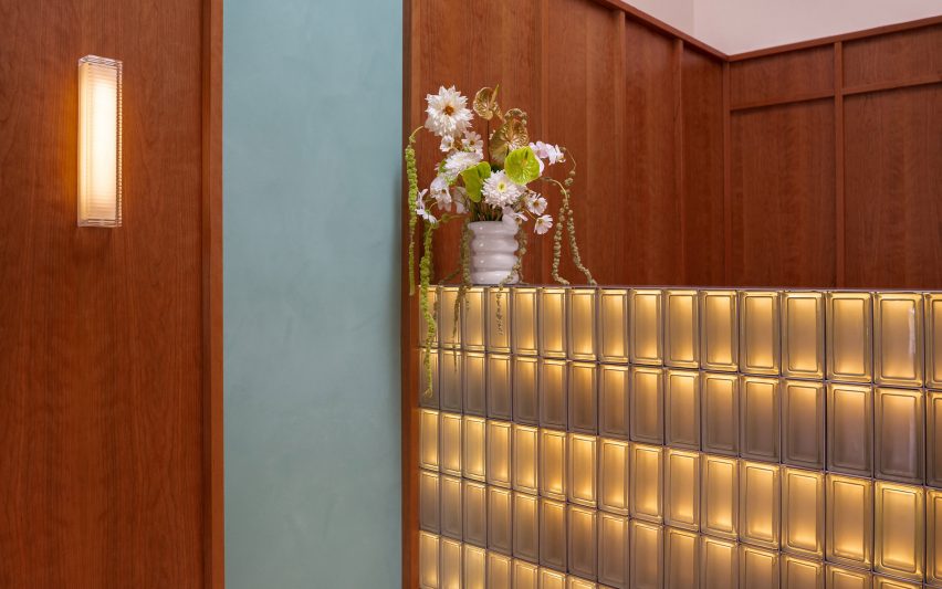
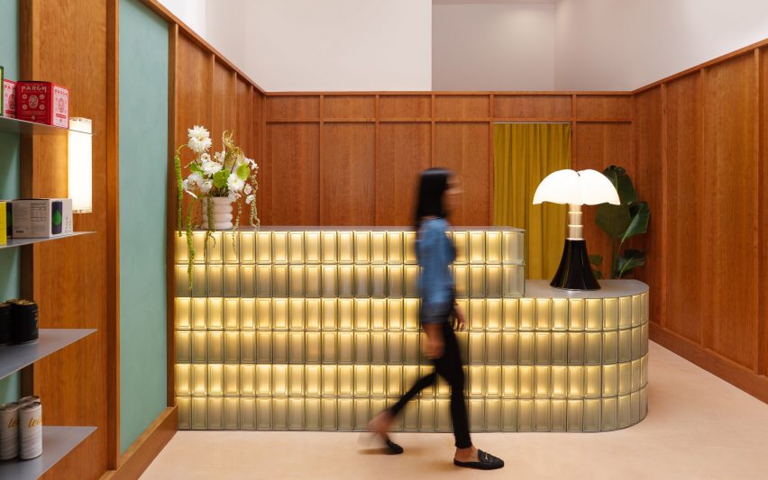
At the back, illuminated glass bricks are stacked within a steel structure to form a curved counter, upon which a curvaceous Pipistrello Table Lamp by Italian architect Gae Aulenti is placed.
Sconces that echo the shapes of the glass blocks are positioned on the walls, together creating a warm glow within the space.
"There is delight in using the ordinary in extraordinary ways, and I like the element of surprise," said Chan.
"Light and shadow can become materials too and as if by magic, heavy things can become unexpectedly weightless."
The popularity of non-alcoholic wines, beers and spirits has risen significantly over the past few years, and designers have been tapped to imagine both spaces and packaging to market these goods.
For example, Barber Osgerby created the packaging for a non-alcoholic drink invented by wine writer Matthew Jukes in 2020, while University of Huddersfield graduate Holly Thomas imagined a venue for the consumption of these beverages.
The pastel colours and symmetry in films by visionary director Wes Anderson have influenced many interiors around the world, from a restaurant in Moscow to cafes in Melbourne and Stockholm.
The director himself also designed a bar inside the Fondazione Prada in Milan, based on old landmarks and cafes in the city.
The photography is by Ye Rin Mok unless stated otherwise.