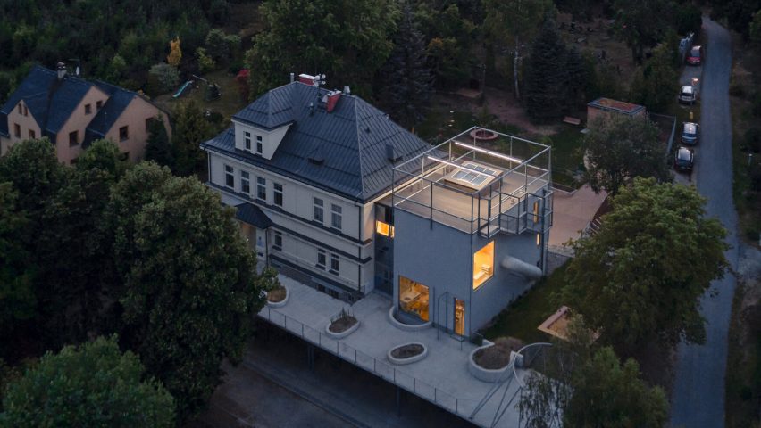
Mjölk Architekti aimed to embed Montessori ideals of learning through play and self-determined activity in this nursery extension in Jablonec nad Nisou, Czech Republic.
Built in the small town of Jablonec nad Nisou, the project was designed by Prague-based Mjölk Architekti in collaboration with Projektový atelier David.
Mjölk Architekti founding partner, Jan Mach, carefully considered his own recollections of preschool and what it represents in a young child's life when designing the extension.
"Kindergartens are buildings where small children develop the most fundamental relationships with the world," Mach told Dezeen.
"Unlike home, it is a place where one is on one's own for the first time, outside the safety of family and where one makes individual connections with people and the environment, often for the first time in one's life," he continued.
"We believe that kindergartens should be extraordinary buildings whose primary function is to give children a sense that the world is a wonderful and fun place to live in."
Mjölk Architekti upgraded the original building, a large early 20th-century former rectory set over four floors, and added an extension.
The studio also created an outside play area at upper ground floor level that wraps around the old and new buildings, linking the two buildings, while creating a covered parking area at lower ground level.
Linked to the main building by passageways across two floors, Mjölk Architekti designed the extension as a cuboid "simple prism" that echoes the proportions of the main building while creating a contrast through its pared-back, ultra-minimal form.
"We were looking for a suitable shape to match the mass of the original nursery building, using monolithic reinforced concrete," Mach told Dezeen.
The block-like form was punctuated by several protrusions including the tubular structure of a stainless steel slide that children can use to descend down through the space, and a glass-fronted cantilevered box jutting out on the second floor, creating a unique play area.
"We connected the floors inside the kindergarten with a slide, which the children use to leave the building for a moment without asking and then return to it giggling," said Mach.
At the top of the building, an outdoor play area is contained within a framework of metal poles that continues the lines of the building.
"We wanted to make it possible to climb out of the extension onto a large concrete terrace, where the children are safe and at the same time have as much freedom as possible," said Mach.
The stainless steel mesh that encloses this area is extended to wrap around the whole extension.
"This net creates a transparent softer surface around the hard prism of the building. In the future, the net will be used to support climbing plants, growing to around half the height of the building," Mach continued.
"The mesh surrounds the building and defines places where the children can go out of the nursery on their own and are in a safe environment where they cannot fall anywhere and can play in peace."
Inside, rising above the main ground floor space is a central void, surrounded by a series of mezzanine levels, each one rising half a flight of stairs from the last.
The layout aims to encourage child-driven exploration enabling the child to place themselves in the environment that feels right for them.
"The interior space is in fact one large room split vertically into four levels," said Mach.
"On the intermediate floors, there are spaces for children to spend time, each intermediate floor has a different atmosphere and form, to stimulate the children's minds in a different way."
The interior material palette features raw concrete walls that are offset by a yellow linoleum floor that casts a warm glow in each space, along with birch ply elements that introduce a sense of tactility.
"In the interior, we used concrete simply to help the children make friends with it from a young age. Because the Montessori system uses a lot of different things to teach, we designed the interior to be a simple background to that," said Mach.
"For the floors, we chose a rich yellow natural linoleum which, when lit, lights up the openings in the façade with a golden colour."
Occupying the central void and defining that volume, a cluster of differently-sized white globe lights, one of which has planetary rings, creates an abstract version of a constellation and references the endless fascination that many children have for space.
Likewise, another playspace features a map of the world moulded directly into the concrete wall, to encourage learning through both sight and touch.
Mach consulted with his young children to find out what they thought would be best for themselves.
When designing for children, you need to have done your homework in terms of safety, efficiency, and everything else, but remember that the only reason to design is to encourage the children to play.
"At the time we were designing the kindergarten, my two children were aged three and five and we consulted with them," added Mach.
"The better the design, the more you allow them to do and the harder they can play."
Mjölk Architekti recently created a gabled mass-timber headquarters for a Czech timber company that has solar panels fitted to its roof. In 2022, the studio also built an animal-like lookout on the Stráž mountain.
The photography is by BoysPlayNice

