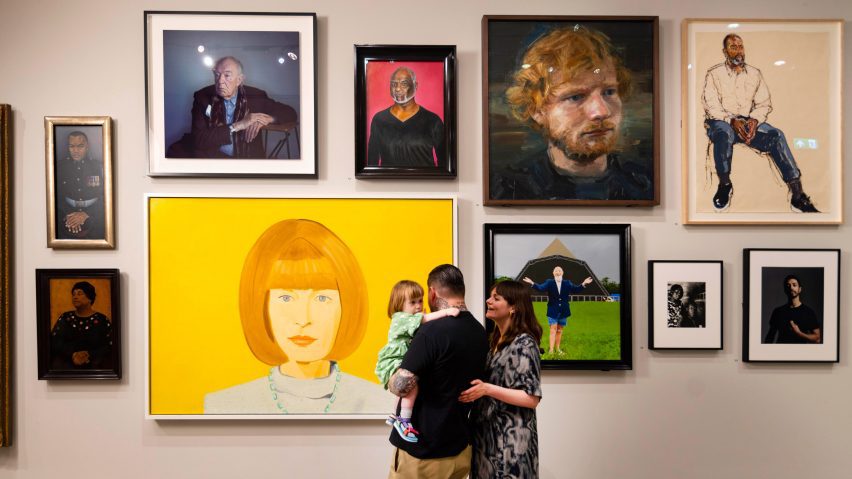
National Portrait Gallery revamp establishes connection to London surroundings
A public forecourt and entrance gates by artist Tracey Emin have been introduced to the National Portrait Gallery in London as part of a major renovation led by local studios Jamie Fobert Architects and Purcell.
The Grade I-listed building just off Trafalgar Square has been transformed to open and connect it to its surroundings, while maximising the accessibility and potential of its existing fabric.
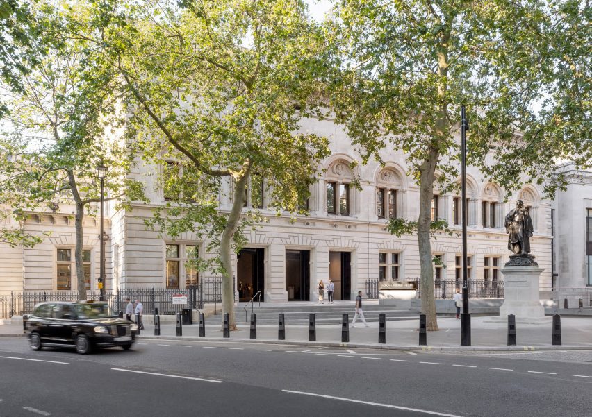
Jamie Fobert Architects and heritage expert Purcell's overarching ambition was to realign the 19th-century building with the visions of its original architect, Ewan Christian.
The team's reconfigurations have created an 18 per cent increase in public space through the introduction of a new entrance and the opening of previously concealed areas.
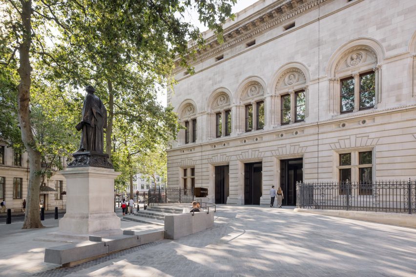
It is the largest renovation to have taken place at the National Portrait Gallery since it opened in 1896. Previous renovations were carried out in the 1930s and in the early 2000s.
"Never has there been a holistic transformation, and this project gave the opportunity to do that," Purcell chairperson Liz Smith told Dezeen on a tour of the building.
"But more than that, it gave the opportunity to look at where the building still had the capacity for change, and where interventions have been made that were less sympathetic, to be able to bring those spaces back into the quality of the rest of the building," added Smith.
According to Jamie Fobert Architects' founder, visiting the gallery was "a fragmented experience" for visitors prior to the overhaul.
"I think for me, what was really important about this project was from arriving in this new public space, into this new hall," Jamie Fobert told Dezeen.
Jamie Fobert Architects and Purcell collaborated with engineers Max Fordham and Price & Myers on the project, as well as studios Nissen Richards Studio and Alex Cochrane Architects.
The design team's ideas for the project were developed using both visitor feedback to the gallery and Christian's original drawings, which enabled them to uncover hidden pockets of space.
A central idea was the introduction of a new forecourt, which helps establish a more welcoming entrance area and a better connection to the city.
The new entrance area bridges an existing lightwell to the building's basement area and features granite steps, a ramp and a bench that guide visitors inside.
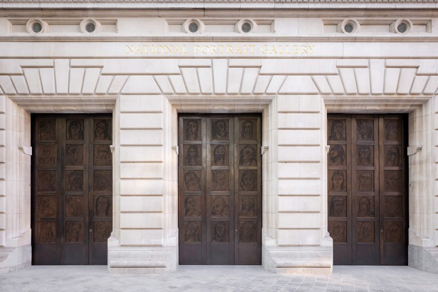
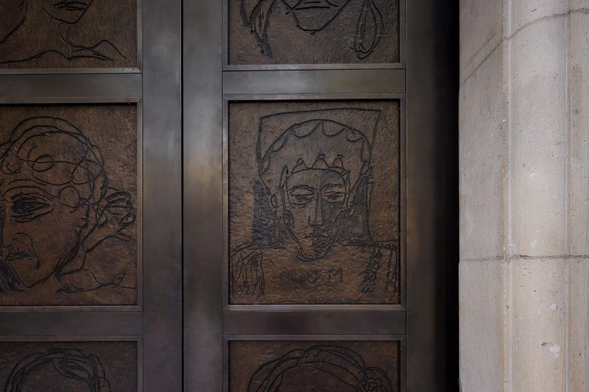
These complement the granite base of the building into which three new doorways have been cut. The doorways are fitted with tall bronze gates inscribed with illustrations of 45 women drawn by Emin.
From here, visitors are guided into the new entrance hall, which was formed through the removal of existing walls and links to a new ground-floor gallery.
Highlights of the entrance hall include a walnut and veneered welcome desk designed by Jamie Fobert Architects and flooring with white mosaics that nod to historic mosaics designed by Christian to signpost the building's circulation areas.
Leading on from the entrance area is a large opening that provides access to the Ondaatje Hall. Here, stairs, escalators or elevators lead to the galleries beyond.
The Ondaatje Hall was constructed in 1999 with a design by Dixon Jones Architects in the courtyard located between the building and the adjacent National Gallery.
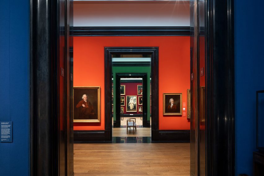
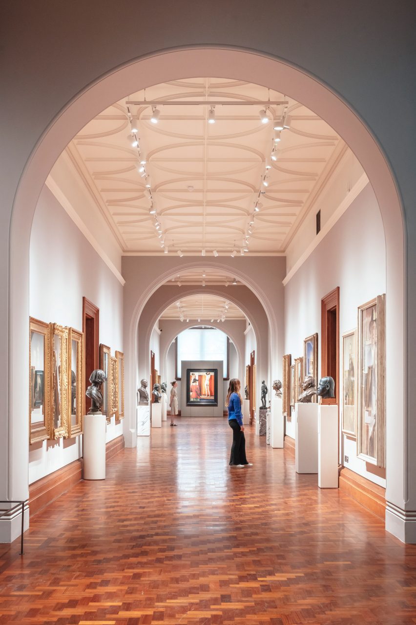
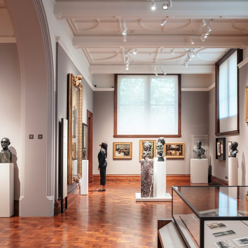
Across the galleries, the design team has reinstated Christian's original designs wherever possible. Bricked-up windows and skylights have been reopened, while bleached-teak flooring has been restored to its original state.
New climate-controlled galleries have also been created in the building's east wing, now named The Weston Wing.
Sitting beside new cafe facilities, these galleries replace what were previously private back-of-house rooms that have been rehoused in an adjacent building,
Here, Jamie Fobert Architects has also added a timber and steel stair that runs from the building's basement to its top floor. Its balustrade is designed as a nod to the bend of Charing Cross Road outside.
Meanwhile, an original basement level that was used as storage has been opened up to create The Mildred & Simon Palley Learning Centre for schools, families and community groups.
Despite being in the basement, its studios and breakout spaces are well-lit thanks to large windows and a glazed double-height space beside the lightwell below the forecourt bridge.
Finishing touches to the project include the uncovering and repairs to terrazzo flooring dating back to 1896.
Display cases with text blocks set in an angled panel designed for accessibility have been added, alongside a series of sculptural walnut benches with armrests – a detail that previous seating in the gallery lacked and that had been requested by visitors.
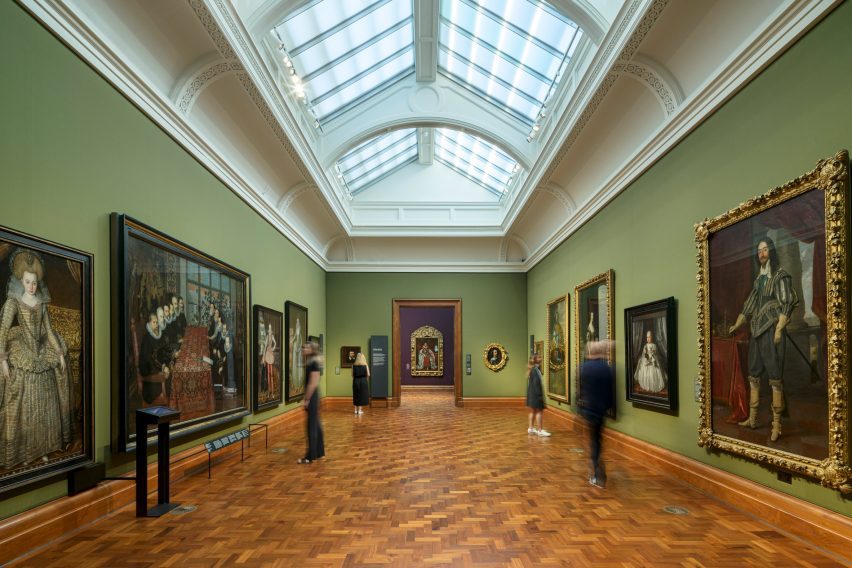
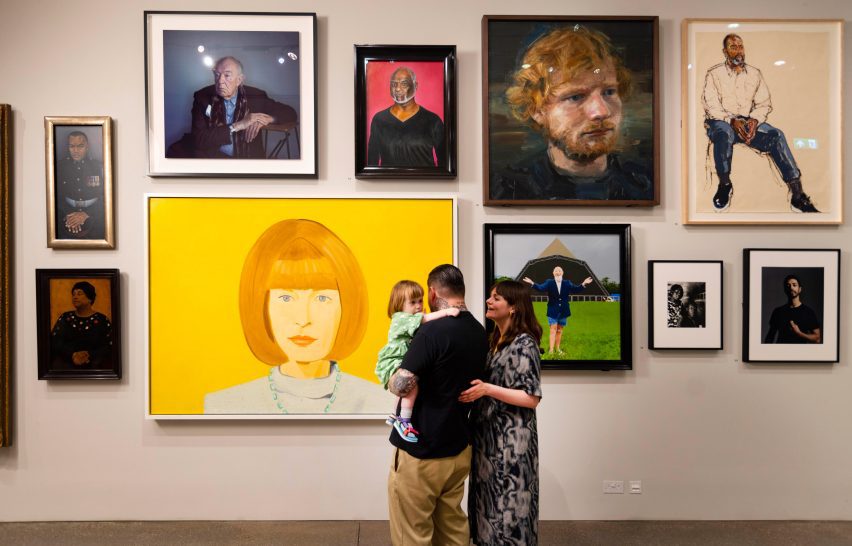
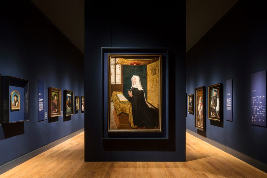
As part of the renovation, the National Portrait Gallery's collection has also been rehung to guide visitors from artwork from the Tudor period to now.
A new logo has also been created by illustrator Peter Horridge based on a sketch by the gallery's first director George Scharf's sketch from 1893.
Next door at the National Gallery, a remodel of the postmodern Robert Venturi and Denise Scott Brown-designed Sainsbury Wing is under development by New York studio Selldorf Architects.
The plans have proven controversial, with the conservation group Twentieth Century Society (C20) stating they will "cause substantial harm" to the Grade I-listed building.
The photography is by David Parry unless stated otherwise.