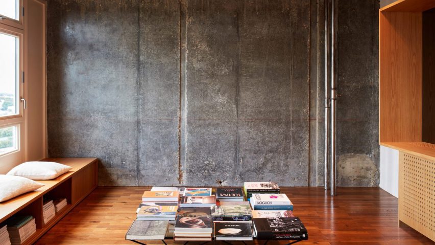
German interior designer Peter Heimer and design studio Buchholzberlin used a restrained material palette of concrete, oak and aluminium when renovating this flat inside London's brutalist Trellick Tower.
The Grade II-listed building, designed by architect Ernö Goldfinger, originally opened in 1972 to provide social housing for the neighbourhood of Kensal Rise but has since become a landmark of brutalist architecture thanks to its distinctive lift tower.
The renovation works were carried out in a privately owned apartment on Trellick Tower's 21st floor that had not been significantly altered in several years and as a result, was host to narrow rooms and lacklustre white walls.
Its owners wanted the open up the 95-square-metre floorplan to create the impression of a "cool concrete loft" while offering better views of the surrounding cityscape.
"Their taste was also trained by contemporary Japanese design, so they wanted to use a reduced range of pure materials," Buchholzberlin told Dezeen.
"Since Trellick Tower is subject to strict preservation requirements, our hands were tied so to speak. But we were able to push through with small improvements."
The wall separating two former children's bedrooms was knocked through to create a larger unified space that now serves as the living area.
The team also exposed the building's original concrete walls, laid oak flooring and installed slender aluminium lights across the ceiling.
A bench seat with inbuilt storage boxes was fitted beneath a row of windows at the front of the room, allowing for uninterrupted vistas of central London and beyond.
The two doors that previously led to the respective children's bedrooms were left in place. Between them now stands a huge, double-faced oak sideboard.
An inlaid mirrored panel reflects the distant skyline and in turn "brings an impression of the city into the apartment's centre", according to the team.
More concrete and oakwood surfaces can be seen in the kitchen, which occupies the former living area. Low-lying cabinetry was installed along the room's back wall, while a large breakfast counter was placed at its centre.
The counter was custom-built to stand at the exact same height as the railing of the apartment's balcony, ensuring that sightlines aren't compromised when the clients sit down to eat.
The former kitchen, meanwhile, was converted into a study with an oakwood desk snaking around the edges of the room.
Its base conceals a network of water pipes that had to be redirected to serve appliances in the new cooking quarters. One side of the desk also conceals a pull-out bed that can be used when guests come to stay.
The principal bedroom was left in its original place but – like the rest of the apartment – was stripped back to expose its concrete walls.
Oakwood was used here to form the base of the bed and its lengthy headboard, which extends along the lower half of the walls.
Heimer and Buchholzberlin also removed the time-worn laminate that once covered the small flight of stairs leading down from the apartment's entrance, revealing the concrete steps beneath.
Trellick Tower is just one example of the striking council estates that can be found across the British capital, which were recently chronicled in a book by photographer Jack Young.
Others include Holmefield House with its graphic tiled facade and the Brunel Estate, which has a monumental slide sweeping through its public pathways.
The photography is by Heiko Prigge.

