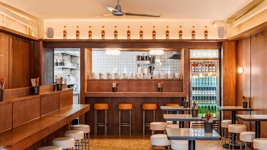
BAO Marylebone draws on "utilitarian design" of Taiwanese dumpling shops
London's latest BAO restaurant is modelled on the liveliness of Taiwan's dumpling shops, with designer Maths opening up its shopfront to "allow people to spill out".
Restaurant chain Bao London's in-house design studio Maths aimed for its latest outpost, BAO Marylebone, to let its visitors interact more with the space outside the restaurant to create a vibrant feel.
"With all our sites, we look to distil an element of Taiwanese culture," BAO co-founder Shing Tat Chung and Maths designer Priscilla Wong told Dezeen.
"Taiwanese dumpling shops are lively – there's a sense of excitement and chaos," they added. "As with a lot of informal eateries in Asia, there are diners pouring into the street."
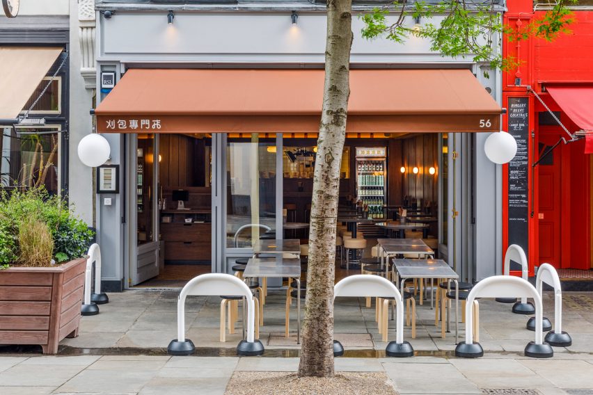
The first change the duo made when taking over the 110-square-metre restaurant, which had previously housed another eatery, was to open it up more towards the street by removing banquette seats that made its front look closed-off.
"The first design move was to open up the shopfront to allow people to spill out and blur the threshold between inside and out," Maths said.
"This helps to create the liveliness that we find in dumpling houses."
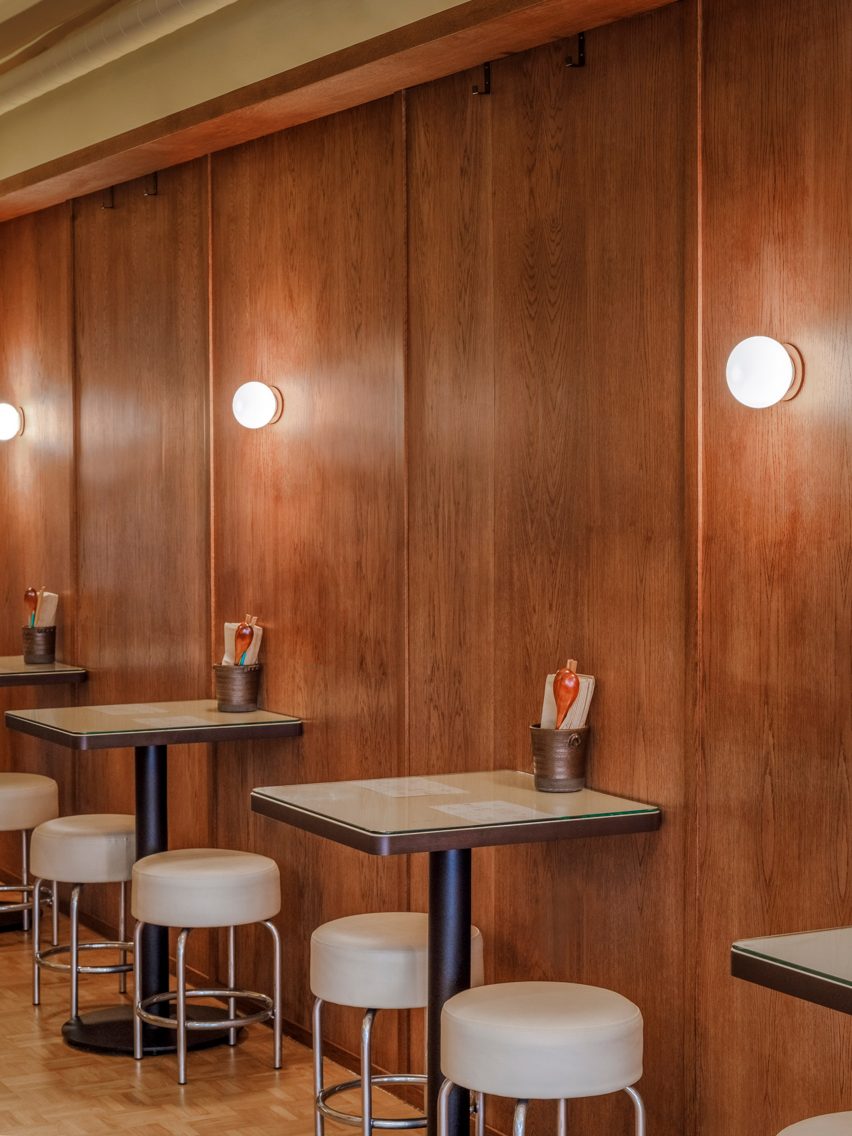
The goal for the interior of the two-storey restaurant, which serves dumplings and quick cold dishes, was to create an intimate atmosphere.
As its existing fit-out had been completed just 18 months earlier, Maths kept the timber-lined walls but added a parquette floor and simple white tiles in the kitchen.
"The main dining space is small, so we wanted to lean into that and create a sense of intimacy, whilst referencing the utilitarian design of dumpling houses," Chung and Wong explained. "The overall material palette helps to strike a balance between the two."
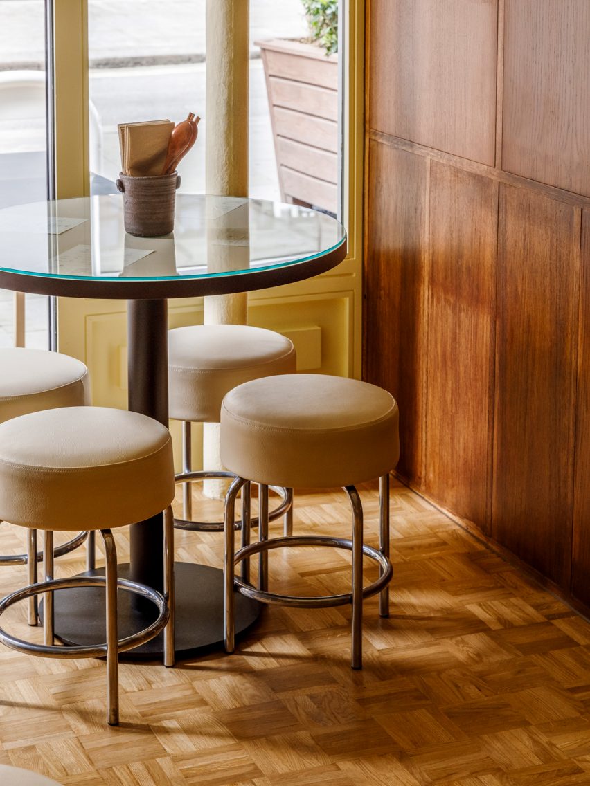
For the outdoor dining space, the designers used brushed-metal terrace tables from Arcalo that are altered to be shorter and complemented by stools from Artek.
Inside, chairs and tables are bespoke and the restaurant is lit by lamps from Flos and Artemide.
BAO Marylebone also features a nod to the open self-serve fridges often seen in Taiwan.
"It's quite common in Taiwan to have open self-serve fridges," the designers said. "Whilst in London, we contemplated whether we could do the same but in the end decided against it."
"To reference this feature, we have a cold drinks fridge in the back corner of the room," they added. "These points of reference, alongside the glass table tops and the softly swirling fans, add to the feel of what we wanted to achieve."
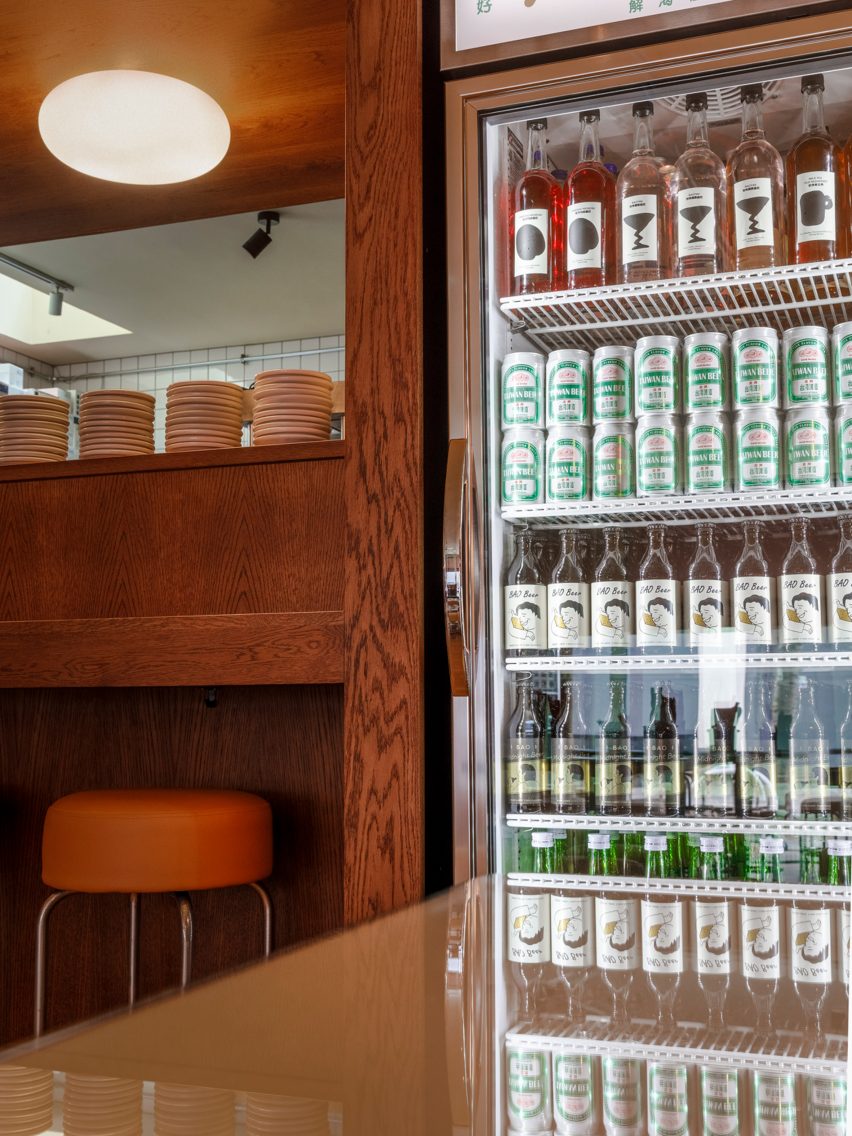
As the primary material used inside the space was the existing wooden walls, Maths wanted to create a colour palette that would complement the panelling.
The studio chose a "buttery yellow colour" for the ceiling, while cream and tan leather add neutral colour details upstairs.
The basement floor, which can be booked by larger groups, has orange banquette seating.
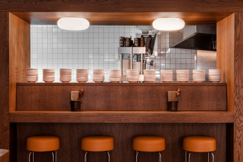
The designers also referenced BAO London's beginnings as a market stall with the design of BAO Marylebone, where the tiled kitchen functions as a focal point.
"We wanted to create a glow at the end of the space – almost theatrical – to draw people in and create a visual focus," Chung and Wong said.
"The first view on entry is the brightly lit kitchen and sharp light of the fridge, which is sandwiched by the dark timber walls," they added.
"When we first started as a market stall, the great satisfaction was that immediate interaction, and feeling part of the restaurant and seeing it feel and come together rather than being stuck in a basement."
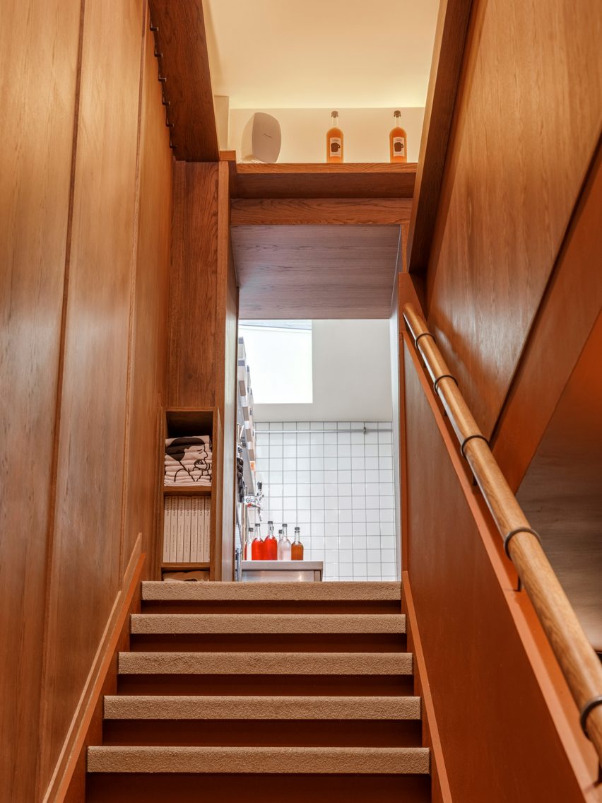
Having the kitchen open also creates a connection between the chef and the diners, the duo said.
"It creates that focus in the room, the buzz, the clatter, the chatter," they added. "It becomes that activation in the small room."
Other recent bao restaurants featured on Dezeen include BAO London's King's Cross branch, which was informed by Asia's Western-style cafes, and Bao Express in Paris, which draws on traditional Hong Kong diners.
The photography is by Ash James.