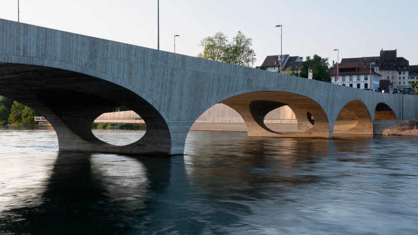
In this week's comments update, readers are discussing a Christ & Gantenbein-designed concrete bridge in Aarau, Switzerland, which features five arches of varying widths.
The 119-metre-long New Aare Bridge, which connects Aarau city centre to a forested area on the other side of the Aare River, incorporates lanes for cars, pedestrians and cyclists.
The sculptural bridge replaces an ageing concrete crossing built in 1949 and was designed by Basel-based Christ & Gantenbein in collaboration with local engineering studios WMM Ingenieure and Henauer Gugler to reference its historic surroundings.
"Begs for pedestrians to run their fingers along those delicious edges"
Commenters were bowled over.
"Elegant, solid, timeless, no showboating," wrote Marius, while Chris Brueckner branded it "quite elegant".
"Fantastic," declared Betty Rubble. "[It] begs for pedestrians to run their fingers along those delicious, crisp edges."
Chuck Anziulewicz caused a small storm in the comments section with the question: "Why can't we have nice things like this in the United States?"
Apsco radiales blamed the "pesky Brits" while Danny De Jayeff had a more simple explanation: "Because we're Americans".
But some commenters weren't quite so besotted.
Walter Astor accused the structure of being "entirely devoid of the design development that makes real architecture".
Whateverandeveramen, meanwhile, thought it was quintessentially Swiss – if a little retro: "Typically Swiss. A brand new bridge that everyone will think was built in the 70s."
What do you think of New Aare Bridge? Join the discussion ›
"One of the best uses of 3D printing in architecture I've seen"
The New Aare Bridge wasn't the only project that elicited a tactile response from commenters this week. A pair of 3D-printed archways designed by Studio RAP left one commenter wondering "don't you just want to run your hands over those beautiful, smooth shapes?"
Studio RAP combined algorithmic design with 3D printing to create the New Delft Blue archways, which frame entrances to a courtyard garden at the centre of the VY Architects-designed PoortMeesters housing development in Delft.
Jeroen van Lith called the project "one of the best uses of 3D printing in architecture I've seen to date".
"Love it. Beautiful. Not an easy feat," agreed Kem Roolhaas.
AlfredHitchcock thought the project harkened back to a better time: "The archway lining is reminiscent of the quality of many European public and apartment buildings made 100 to 150 years ago. It's a shame we don't often see that level of quality, colour, art and attention to detail in most modern buildings."
Blue Wren was more hopeful: "Perhaps this will give architects permission to build beautiful things again."
Are you besotted by New Delft Blue? Join the discussion ›
"Brick is such a great solution when it's done right"
British practice Feilden Clegg Bradley Studios has collaborated with local studio Shatotto Architecture for Green Living to create an "outstanding" boarding school in Bangladesh, where decorative brick-clad buildings fold around outdoor learning areas.
Located in the Bangladeshi capital, Aga Khan Academy Dhaka comprises a series of four-storey volumes that are clad in brick and nestled within a highly-developed urban site bordered by a large motorway.
Commenters thought all projects could learn a thing or two from the "gorgeous" boarding school.
"Outstanding project," wrote Dixie Normous. "The variety of depth on that buttress facade? Fantastic."
CharlieBing agreed, commenting: "So much to like and enjoy. Brick is such a great solution when it's done right. Very special."
"Gorgeous. The monumental brick screenwork in particular," said JZ, while Tony365 admired the "really lovely expression of brickwork".
Are you on the same page? Join the discussion ›
"Essentially just a very expensive lobby"
Readers weren't fully on board with HOK and Practice for Architecture and Urbanism's plans for the renovation of Manhattan's historic Penn Station.
Revealed last week after years of delays, the revitalisation of the transit hub will include a new entrance on Eighth Avenue and a renovation of existing structures.
Mark Weisgerber thought "NYC could do better" than the revamped station's "brutal and simplistic exterior".
Kem Roolhaas took a more resigned view. "Since anything is better than the current design, this automatically qualifies as a good design," they commented.
"Nice facelift," conceded Troels Steenholdt Heiredal, "but [it's] essentially just a very expensive lobby."
But not all commenters were so quick to write off the plans.
"The outside looks like a very nice, contemporary version of the Moynihan Station," wrote Flooo. "The main hall also looks grand (given its circumstances with MSG on top), clear and welcoming. A very nice combination of materials and colours."
Do you think the renovation's going in the right direction? Join the discussion ›
Comments update
Dezeen is the world's most commented architecture and design magazine, receiving thousands of comments each month from readers. Keep up to date on the latest discussions on our comments page and subscribe to our weekly Debate newsletter, where we feature the best reader comments from stories in the last seven days.

