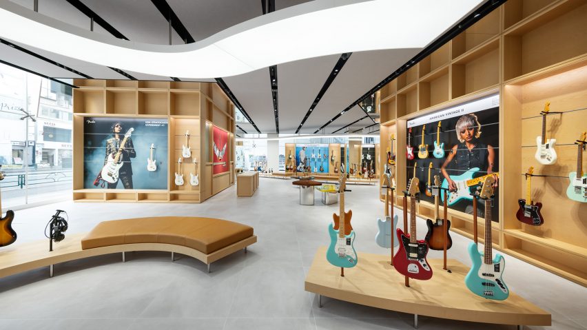
Klein Dytham Architecture gives Fender's first flagship store a welcoming feel
Klein Dytham Architecture has aimed to counter rock music snobbery with its design for guitar brand Fender's Tokyo flagship store, which is meant to feel welcoming to people who might feel judged in other guitar stores.
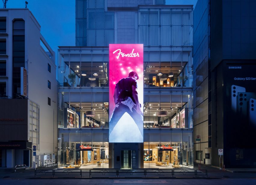
The Fender store sits across the bottom four floors of the glass-walled Ice Cubes building, a 12,000-square-metre space in the neighbourhood of Harajuku that was formerly home to an H&M store.
It is the world's first flagship store for the 77-year-old American brand, which is one of the most recognisable names in guitars and is particularly known for electric models like the Stratocaster.
For the project, Fender asked Klein Dytham Architecture to create a space that would counter the perception of guitar stores as being intimidating, particularly for women and newer players.
It hoped the store would offer a sophisticated and immersive retail experience that would encourage leisurely browsing and communicate the brand's heritage.
Klein Dytham Architecture answered the brief with a store design it sees as creating "a destination of discovery", with gallery exhibits, an event space, a cafe and a "care bar" for repairs.
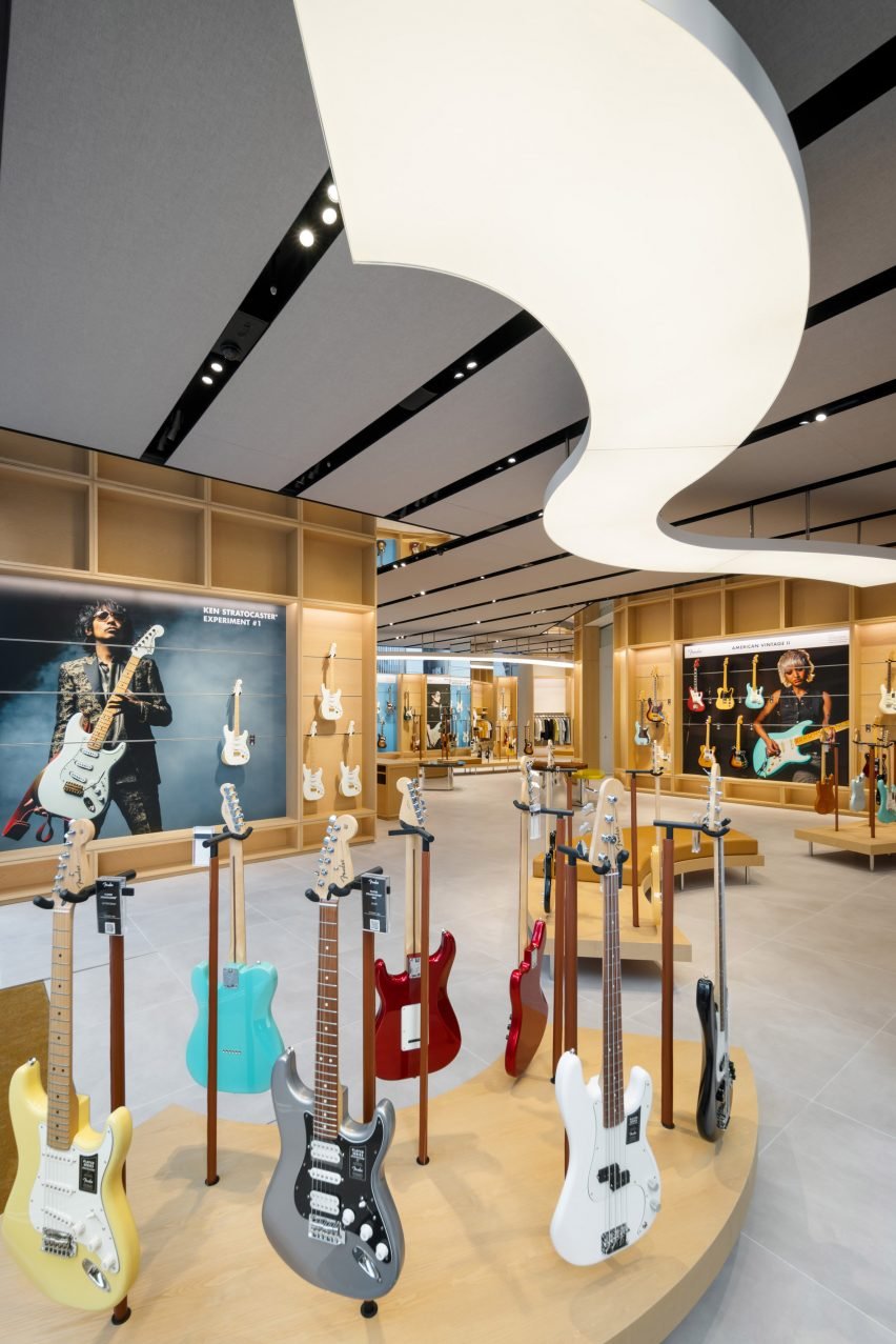
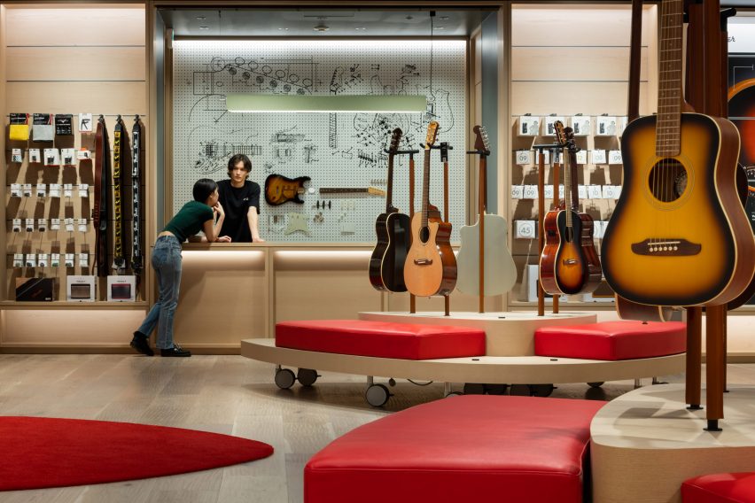
The first floor houses the main browsing area, which features undulating wood benches and display units that are meant to echo the curves and materials of a Fender guitar. These contours are further mimicked in the lighting above.
The area also has custom plectrum-shaped tables where staff can place guitars they have removed from the display to show customers. Clothing racks holding the F is for Fender streetwear collection sit among the guitars.
The second floor, which was realised in a soft grey palette, is primarily an exhibition space called the Artists Gallery.
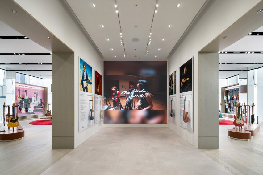
Here, large-scale photos and video shows famous musicians in action, each one alongside a transparent display case housing their Fender of choice.
There are also displays dedicated to Japanese- and American-designed Fenders respectively, and a sound-proofed Amp Room where customers can test run guitars and amps.
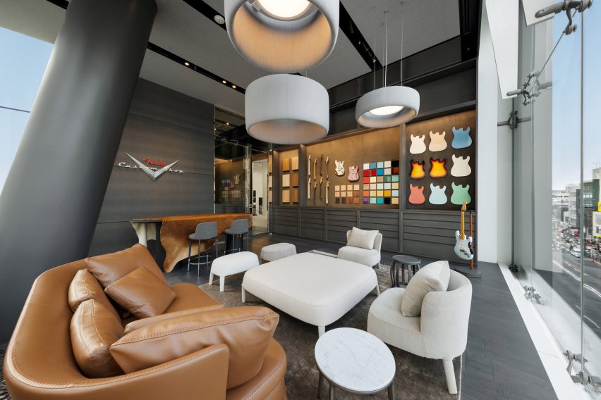
On the darker and moodier third floor, another exhibition space — the Master Builders Gallery — focuses on the work of specific craftspeople, while two VIP rooms and a custom shop are furnished with comfortable couches and provide a setting for discussing bespoke builds.
Also on this floor is a colourful display of 400 guitar finish samples that fills the length of one wall.
The final floor is the basement, which houses an event space, cafe and the Fender care bar, and where Klein Dytham Architecture endeavoured to create a cosier feel with a plectrum-shaped rug and benches.
Tying the floors together is a spiral staircase with a hall-of-fame-style photo gallery on the interior, as well as a three-storey-high vertical LED display on the glass facade outside that will be used for Fender-related content.
"Conceived as a hub and clubhouse for all things Fender, this project takes the notion of a flagship store and experiential retail to beyond the next level," Klein Dytham Architecture co-founder Mark Dytham told Dezeen.
Dytham started the practice with fellow Royal College of Art graduate Astrid Klein in Tokyo in 1991. Some of their recent work includes the PokoPoko clubhouse for the Risonare Nasu hotel in rural Japan and a Cartier store with an intricate wooden facade in Osaka.
Photography by Nacása & Partners.