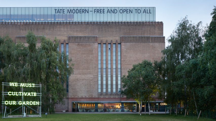
Architecture studio Holland Harvey has overhauled the ground-floor cafe at the Tate Modern in London so it doubles as the gallery's first late-night bar.
Tucked away in the museum's northwest corner, the interior of the Corner cafe was originally designed in 2000 when Herzog & de Meuron created a home for the UK's national collection of modern art inside the disused power station on the Southbank.
Since then, the Tate had made no changes to the space until Holland Harvey was brought on board to refresh the interior at the start of 2022.
"It was quite a cold space," the studio's co-founder Richard Holland told Dezeen. "All very Herzog & de Meuron-y."
"They're amazing at what they do in so many ways," he continued. "But this was not their best food and beverage space."
Holland Harvey stripped back many of the cafe's hard, reflective finishes, sanding away the black gloss paint on the floors to reveal the parquet underneath and removing the mirrored glass that Herzog & de Meuron had used to enclose the building's original riveted columns.
Fluorescent lights were replaced with more muted spots by London studio There's Light, while the dropped ceiling above the bar was rounded off and covered in foam insulation to soften the interior – both visually and acoustically.
Otherwise, many of the cafe's core elements including the servicing as well as the kitchen and toilets remained largely untouched to prevent excessive waste and maintain the integrity of the building.
"You don't really want to mess around with the servicing because 12 feet above your head is a Picasso," Holland said. "So it was pretty light touch."
The biggest intervention came in the form of a newly added riverside entrance, allowing passersby to stroll straight into Corner rather than having to take the long way through the gallery.
At the other end of the open-plan room, a door leads directly into Tate's famous Turbine Hall, effectively linking it with the public spaces of the Southbank.
"The Turbine Hall is one of the most successful public spaces in London," Holland said. "It's one of the few indoor places you can go, where people happily sit down on the floor in the middle of the day."
"And obviously, the Southbank is an amazing public offering as well," he continued. "So this felt like an opportunity to connect the two, which led a lot of the thinking around the design."
With the idea of extending the public realm, many of the newly added pieces are robust and fixed in place, much like street furniture. Among them are the double-sided Vicenza Stone banquettes, which can also serve as impromptu climbing frames for young children.
Holland Harvey created a number of other seating areas throughout Corner to suit different accessibility needs, with a focus on supporting local manufacturers and small businesses while reducing waste wherever possible.
Corner's long sharing tables and benches were made by furniture design studio Goldfinger in west London using trees that were felled by local authorities to stop the spread of ash dieback.
"Every table has the coordinates of where the tree has felled on it, so there's a provenance to the furniture," Holland said.
As a social enterprise, Goldfinger also feeds any profits back into its local community through initiatives such as free monthly meals and woodworking courses for marginalised young people.
The chairs, meanwhile, were salvaged from the gallery's own storage before being refinished and reupholstered, while the smaller tables were made by Brighton company Spared using waste coffee grounds from Tate's other cafes.
These were baked at a low temperature to remove any moisture before being mixed with oyster shells and a water-based gypsum binder.
Although the resulting pieces aren't fully circular since they can't be recycled, Holland hopes they tell a story about the value that can be found in waste.
"We're by no means saying that it's an exemplar project in that sense," he explained. "We were just trying to find opportunities to tell stories through all the different elements rather than just going to the large corporate suppliers."
"And that's really our wider impact: people realising that there's a different way to procure a table. Imagine if all of Tate's furniture moving forward is made by Goldfinger," he continued.
In the evenings, the space can be transitioned into a bar and events space by switching to warmer, higher-contrast lighting, while a section of the central banquette can be turned into a raised DJ booth by pressing a button that is hidden under the cushions.
"This place can get quite wild in the evening," Holland said.
The last significant amendment to the Tate Modern building was Herzog & de Meuron's Switch House extension, which opened to the public in 2016.
The building contains a gift shop designed by Amsterdam studio UXUS, alongside various galleries and a viewing level on the top floor, which is currently closed to the public after Tate lost a high-profile privacy lawsuit brought by the inhabitants of a neighbouring residential tower.
The photography is by Jack Hobhouse unless otherwise stated.

