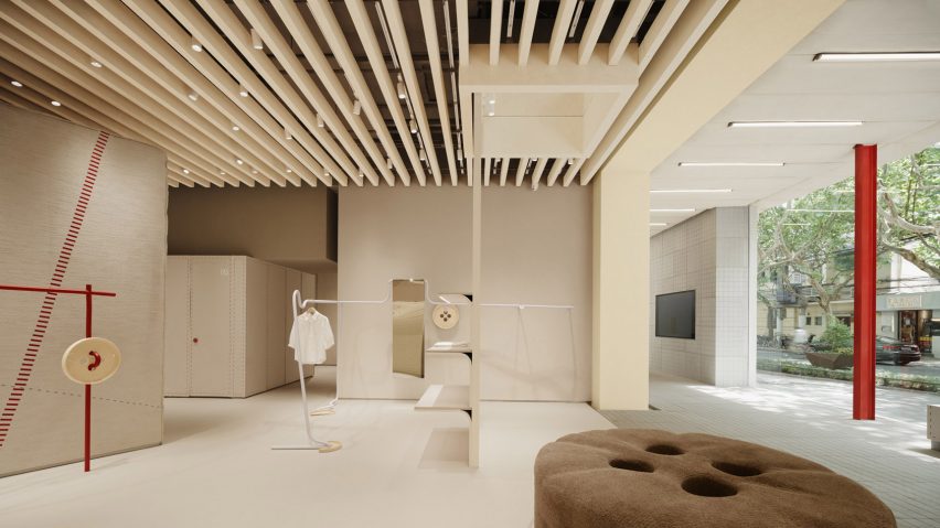
Chinese architecture studio FOG Architecture has completed a shop for local fashion boutique Xiaozhuo on Julu Road in central Shanghai that features oversized buttons and zippers.
The 300-square-metre shop features tactile surfaces and playful motifs that reference the process of tailoring.
FOG Architecture used a glazed facade to open up the front of the shop, allowing plenty of natural daylight into the space while blurring the line between the interiors and the street to create a transitional waiting area.
Beams from an original building on the site were kept and painted red. These support a roof installation comprised of a series of puffy pillows, arranged next to one another and covered in a canvas-like material to create a soft texture.
"The result is an exterior of the shop that looks like a 'small pavilion'," explained FOG Architecture. "The red columns, the flat roof resembling overlapping tiles, and the antique style stone seats all contribute to this spatial image."
"Retail display is the project's preset function but the pavilion-like exterior challenges it and adds the possibility for leisure, entertainment and social," the studio added.
"The front space not only serves as the connection between the shop and the street, but also creates an experimental space that allows contrasting events happen."
The entrance of the shop also features a symmetrical gridded wall. Its design was informed by a skylight in the site's original building, and creates a light-and-shadow effect that adds animation to the wall.
Square tiles were selected as the main material of the floor and wall in the waiting area, while graphic striplights were installed between the gaps in the ceiling to match the straight lines of the gridded wall.
Following the waiting area visitors enter the main area of the shop, where product display and fitting area are arranged on the west side. Packaging, inventory and other supporting functions are located on the east side.
FOG Architecture decided to use the tools and accessories commonly used in tailoring as the main design narrative of the shop, in response to the fashion brand's identity.
These include red seams, oversized buttons and zipper motifs, and sinuous metallic clothing racks designed to look like sewing thread that add a sense of fun and surprise to the off-white backdrop.
"The waiting area and the product display area are in sharp contrast in terms of palette, material, shape, and scale — stone versus fabric, light grey versus off-white, straight lines versus curved surfaces — allowing the former to become a transitional area of functions and styles, connecting the interiors to the exteriors, while guiding customer behaviours by shifting views and texture," the studio said.
The newly polished interior wall is wrapped in a material that resembles a mix of linen and leather and was created by mixing canvas, plush fabric and texture paint.
The curved outline of the canvas-clad fitting rooms serves as the visual centrepiece of the space.
According to the studio, all finishing materials in the shop were sourced from the fashion brand's leftover materials from its production line.
FOG Architecture was founded by Zheng Yu and Zhan Di and has offices in London, Shanghai and Chongqing.
Previously the studio has completed flagship stores for ToSummer in Beijing and Shanghai, as well as Super Seed's Hangzhou store featuring kinetic display.
The photography is by INSPACE.
Project credits:
Design team: Zou Dejing, Huang Yingzi, Wang Shengqi, Zhunag Shaokai, Zheng Yu, Zhan Di
Lighting design: Liben Design, Zhang Xu
Construction: Shanghai Guqin Construction Engineering Decoration Co., Ltd.
Furnishing: Dongguan Lianwei Furniture Co., Ltd.
Structure consultant: Tao Xinwei

