In this week's comments update, readers are discussing the completion of Brooklyn's first supertall skyscraper.
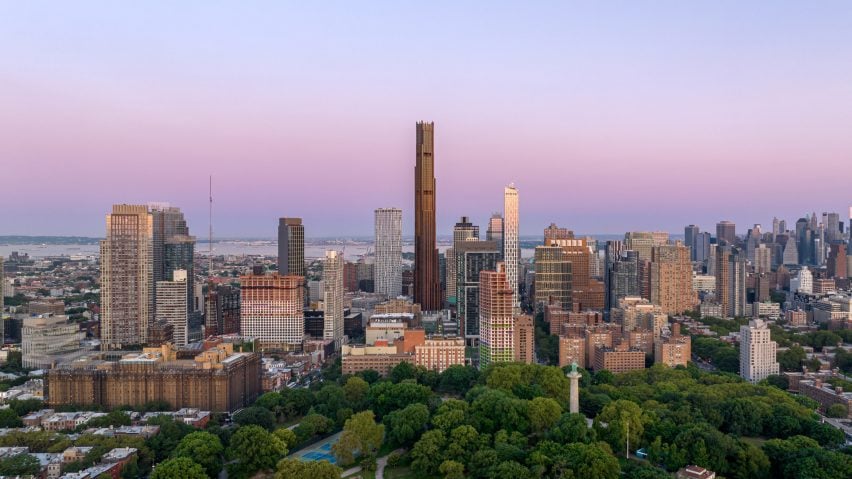
At 93 storeys and 325 metres tall, the SHoP Architects-designed Brooklyn Tower in New York is the tallest building in the borough. Though the mixed-use tower topped out in March this year, its intricate black and bronze facade was only recently completed.
Blackened steel panels run from the top of the skyscraper towards the bottom, where it meets the preserved, historic Dime Savings Bank at its base. Bronze and copper pilasters give definition to the black facade, creating a staggered appearance.
Commenters were split.
"A bit of Gotham about it"
Some thought the supertall skyscraper was a "beautiful" addition to the Brooklyn skyline, others gave it a "one out of 10".
"All it needs is the Eye of Sauron," wrote James Beckett, referencing the comparisons that some New Yorkers are making between Brooklyn Tower and the architecture of the Lord of the Rings films.
Chris saw a likeness between the tower and a different film franchise: "looks great and [there's] a bit of Gotham about it as well."
Floooo called the tower "one of the most beautiful skyscraper additions to New York in a long time", while Snessnyc agreed that "it most definitely is a striking landmark in the best way".
Other commenters weren't quite so generous in their comparisons. "A vertical castle: heavy, defensive, dominating," wrote Jesse Lockhart Krause. "Poor outcome. One out of 10 from me."
"This is a giant step backwards for Brooklyn," warned Jb, while Marius was curious to "see the developer's bottom line".
Future icon or present-day eye sore? Join the discussion ›
"Lots of pleasing quirks and character"
One project that commenters could agree on this week was a "refreshing" family home in Surrey with a steeply-pitched roof covered in red clay tiles.
"Good to see a new house designed in the traditional, vernacular manner, with lots of pleasing quirks and character," wrote AlfredHitchcock. "The staircase, gallery landing and timber partition are particularly lovely."
"This is rather nice and appears to settle restfully in the local context," agreed Smorgasbord. "Good to see some photography showing the house as lived-in, too."
Jb posited that "architecture informed by architecture is refreshing", while Jerry Dickman-Wilkes called the dwelling "wonderful and beautifully executed".
"It's nice to see more liveable places on Dezeen's radar," concluded Design Junkie.
Can you see yourself living in Middle Avenue House? Join the discussion ›
"Unbelievably gorgeous exterior material"
Also providing plenty of fodder for commenters this week was a kiln-like learning centre in Denmark designed by Reiulf Ramstad Arkitekter.
While some commenters praised the centre's "gorgeous" exterior, others wondered whether it bore more resemblance to a "crematorium" than a kiln.
"Kiln-like indeed – it looks like a crematorium," wrote Tosh Fieldsend, while BBOB branded it an "awful-looking building".
"What a beautiful structure," allowed Danny De Jayeff. "Unfortunately, after looking at the interior photos of the light wells, it seems [that the] way they're being used doesn't really match with the more dramatic possibilities that a space like that commands. It looks like a common office interior and [is] quite disappointing."
But the project had just as many admirers as detractors, with JZ praising the "unbelievably gorgeous exterior material".
Design Junkie was on the same page and was "loving the mono-exterior, single-material cladding."
"This looks like a baker's paradise," concluded Niall. "Would love to visit."
Do you think it rises to the occasion? Join the discussion ›
Comments update
Dezeen is the world's most commented architecture and design magazine, receiving thousands of comments each month from readers. Keep up to date on the latest discussions on our comments page and subscribe to our weekly Debate newsletter, where we feature the best reader comments from stories in the last seven days.

