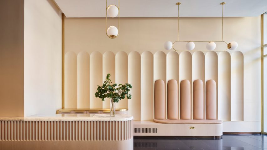
US studio Atelier Cho Thompson has redesigned the shared spaces for an office building in Boston, borrowing shapes and materials from its history for new interior elements.
The project involved reimagining the communal areas at 179 Lincoln Street, a full-block building in the city's Leather District that was constructed as a shoe factory in 1899.
Atelier Cho Thompson looked to this history to guide the design of areas at the margins of the building, including the under-utilized lobby space, a dark central core, and empty pocket spaces on each of five floors – all totalling 8,000 square feet (743 square metres).
"We unearthed and amplified the building's rich history while creating a space that is responsive to the needs of the post-pandemic workplace," said studio c0-founder Ming Thompson.
Work began with removing the layers of previous renovations, including vinyl tile and commercial carpet, which had left areas "dark and generic".
The team uncovered original terrazzo floors in some areas and worked with experts to restore any sections that were damaged.
They also looked to the arched geometry and detailed ornamentation of the building's historic facade for interior design cues.
The arches are repeated in the lobby as grooved patterns across the hand-troweled plaster walls, and again at a smaller scale around the white oak front of the marble-topped reception counter.
"With a modern sensibility, we developed a language of detail that brought elements of the exterior into the building's core," Thompson said.
"In that transformation, we brought a playful spirit, bringing massive forms down to human size and creating juxtapositions of materials, patterns, and scales."
Shiny black floors contrast the pale colour palette used across all other surfaces, while brass – chosen to match the building's mail chute – provides a bright accent on railings, drawer handles and other details.
Lighting fixtures by Katy Skelton comprise globe-shaped components attached to thin brass supports, in a variety of linear configurations.
In other "in-between" communal areas, red brick walls and columns are exposed beneath skylights.
A series of brass-topped counters are scattered through these spaces, creating spots for casual conversation between colleagues.
Banquettes and benches also provide opportunities for group and collaborative work outside of typical meeting rooms.
These are upholstered in dusty pink leather as a nod to the building's shoe-making past.
"This project responds to the changing landscape of office life by offering opportunities that go beyond what we can experience in only working from home," said Thompson.
"With a hospitality approach, the spaces of the project offer a fresh, welcoming, and inclusive place to spend time with colleagues."
Reimagining historic buildings as contemporary workplaces is a common challenge for architects and designers, and refreshing communal or public-facing spaces is typically an impactful place to start.
Similarly, GRT Architects overhauled the entrance to the art deco Fashion Tower in New York, restoring its facade and modernising the lobby.
The photography is by Jared Kuzia, unless stated otherwise.
Project credits:
Client: EQ Office
Architect: Atelier Cho Thompson
Lighting designer: Katy Skelton

