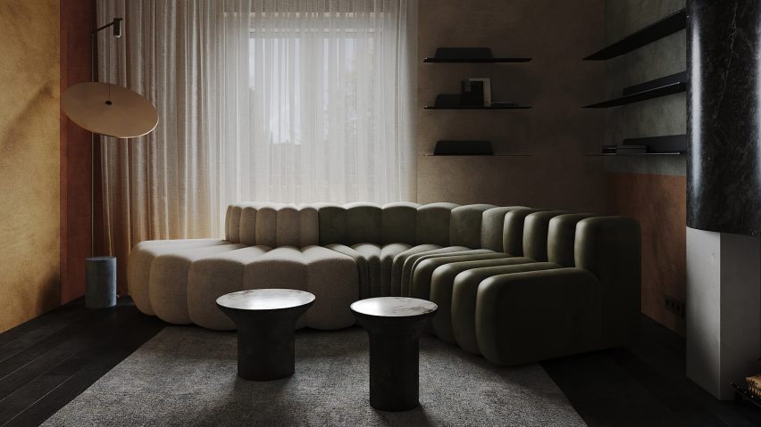
Design studio Puntofilipino has created a richly layered interior full of texture and patina for this Madrid apartment, designed to offer an unexpected take on the client's passion for Danish art and furniture.
Set in a former bank office building in the Salamanca neighbourhood that dates back to 1929, the one-bedroom apartment was conceived as a refuge for the client.
"He was looking for a space of relaxation, silence and solitude," Puntofilipino founder Gema Gutiérrez told Dezeen. "Madrid is a very fast city and his need was to find a place where time stopped."
Puntofilipino set out to design a space that reflects the client's love of Danish style without resorting to Scandinavian design cliches.
Instead, the studio sought to foster a sense of timelessness by balancing modern and historical influences, calling the apartment Radikal Klassisk.
"It's a very modern design and yet also with a slightly historical bent," she said. "There is a perpetual link between the past and the present."
"I wanted to show the client the coexistence and communion between classic and contemporary Danish brands," Gutiérrez added.
"Pieces by designers such as Hans J Wegner, father of modern Danish design, coexist with contemporary Danish brands such as Overgaard & Dyrman – both free of passing trends, timeless."
While the lines and forms are clean and modern, Gutiérrez says the materials themselves, which range from natural stone to terrazzo and wood, "are historically recognised noble materials, used in palaces throughout the centuries".
The work of Danish painter Ebba Cartensen was another influence on the apartment's aesthetic.
The late artist's cubist compositions informed the heavily patinated finishes seen in each room, from the clay-rendered walls to the marbled tiles.
"I looked for the pictorial representation of Ebba Carstensen's painting," said Gutiérrez.
"The patinated finishes express time, distance, and memory – a ground-breaking, elegant and sober aesthetic that goes beyond the concept we have of Danish design."
In the bedroom, Puntofilipino used a darkly immersive botanical wallpaper by Instabilelab with a mural-like scale.
"The client has a predilection for bucolic painting," the studio said. "In addition, the plant motifs give depth to the space."
Here, as elsewhere, the colours are rich and intense, taking their cues from the tonal variations in the stone, metal and wood used in each room.
In the open-plan bedroom-bathroom, a monolithic stone tub takes on a sculptural quality as the central focal point within the space.
"I considered breaking with architectural patterns and giving more prominence to the centre of the room," Gutiérrez said. "The inside of the bathtub, metaphorically, reflects a bench where you could see any work of art in a museum."
The sofa fulfils a similar function in the living room, this time with an emphasis on curves rather than straight lines.
Produced by Danish design brand NORR11, it consists of three distinct elements, each upholstered in a different fabric progressing from off-white bouclé to olive green leather.
"I studied the soleo, the path of the sun, and how it affects colours and materials in the interior," Gutiérrez said. "The gradual transition gives depth and makes you look around the space, a dance through the senses."
Nearby in Salamanca, locals studio Lucas y Hernández-Gil recently completed JJ16 – a compact family home filled with colour blocking and clever storage solutions.
Also in the Spanish capital, Studio Noju has renovated a curvy two-storey apartment in the city's brutalist Torres Blancas tower.
The photography is by Polina Parcevskya and Julie Smorodkina.

