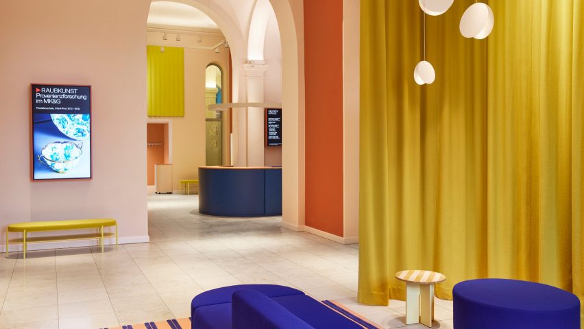
German practice Studio Besau-Marguerre has overhauled the entrance hall of Hamburg's MK&G design museum, using colours to guide visitors through the space.
The brief was to create new zoning in the foyer for better wayfinding and orientation while setting the tone for the rest of the museum with a friendly and welcoming atmosphere.
"We wanted to create a place that allows visitors to relax and draws them into a world of art and design with a new colour scheme and improved acoustics," Studio Besau-Marguerre told Dezeen.
"We wanted it to be a place of tranquillity and warmth, in contrast to the hustle and bustle outside the museum."
The Museum für Kunst und Gewerbe, or MK&G for short, was built in the late 19th century and previously had a plain white foyer with the ticket office and cloakrooms hidden away out of sight, leading to confusion amongst visitors.
"Due to the architectural details, the huge emptiness and the reverberant acoustics, the space looked like a large railway station hall and had no quality of stay," the studio said.
In order to improve visitor flow and create an inviting atmosphere, the area was reorganised in collaboration with German firm SWP-Architekten, resulting in a straightforward and intuitive guidance system.
The new interior concept is marked by the use of contrasting, bold colours – a signature feature of Studio Besau-Marguerre's work.
For this project, the studio developed a unique colour scheme that structures the space using three main tones: vibrant blue, bright yellow and shades of terracotta.
MK&G visitors are now greeted by two bright blue ticket desks upon entry – with the surrounding walls painted in a matching shade for emphasis – while the rest of the room is finished in white.
"Here, visitors first arrive, catch their breath and get their bearings," the studio said.
From there, museumgoers are intuitively led into the two adjoining lounges and cloakrooms, where walls are painted in progressively darker shades of terracotta to draw visitors into the rooms.
Yellow acts as an accent colour found across curtains, acoustic elements and storage lockers, while blue reappears to highlight the seating areas.
"For the colour concept, we were inspired by the historic colour scheme of the coffered ceiling in the vestibule that visitors notice before they enter the main foyer," the studio said.
"We thought it would be nice to reference the historical colours and interpret them in a contemporary way. In this way, we refer to the history of the building and the colours feel natural."
A selection of soft, warm and tactile materials – including wood, wool and hand-tufted carpets – complements the colourful interiors while improving the acoustics of the open space.
Studio Besau-Marguerre designed a number of custom furniture pieces for the space, including the checkout counters, but was also keen to source pieces from up-and-coming German designers.
"It was important for us to use furniture from young manufacturers and designers who work sustainably and with high-quality materials," the studio said.
This includes the cobalt-blue sofas and matching pouffes in the lounges, which were made by Berlin design brand Objekte unserer Tage.
"The sofas harmonise wonderfully with the round arches of the architecture and are a perfect mix of artistic object and inviting, cosy seating landscape," said Studio Besau-Marguerre.
In the media lounge, where books and magazines are on display for the reading pleasure of visitors, the oblong table and matching stools are by Frankfurt furniture brand Stattmann.
"The surface of the tables and stools is treated with a wax that creates a wonderful feel and is very durable," said Studio Besau-Marguerre.
"All the furniture plays with the rounded and soft design language, as well as warm, natural materials, thus contributing to a harmonious, cosy atmosphere."
Not every detail of MK&G's original interior was scrapped. The studio also retained the huge glass chandelier in the centre of the foyer that British artist Stuart Haygarth designed specifically for the space in 2018.
"It was clear from the start that the luminaire had to stay and would fit in wonderfully with our concept," the studio said. "It is very exciting to see how it benefits from the new interior design."
Studio Besau-Marguerre, which was founded by Eva Marguerre and Marcel Besau in 2011, was also responsible for designing the interiors of another key cultural building in Hamburg – Herzog & de Meuron's £163-million Elbphilharmonie concert hall.
Elsewhere, the duo created the exhibition design for Christien Meindertsma's solo show Beyond the Surface at the Vitra Design Museum in Basel, conceived to illustrate the designer's approach to material research.
The photography is by Brita Sönnichsen.

