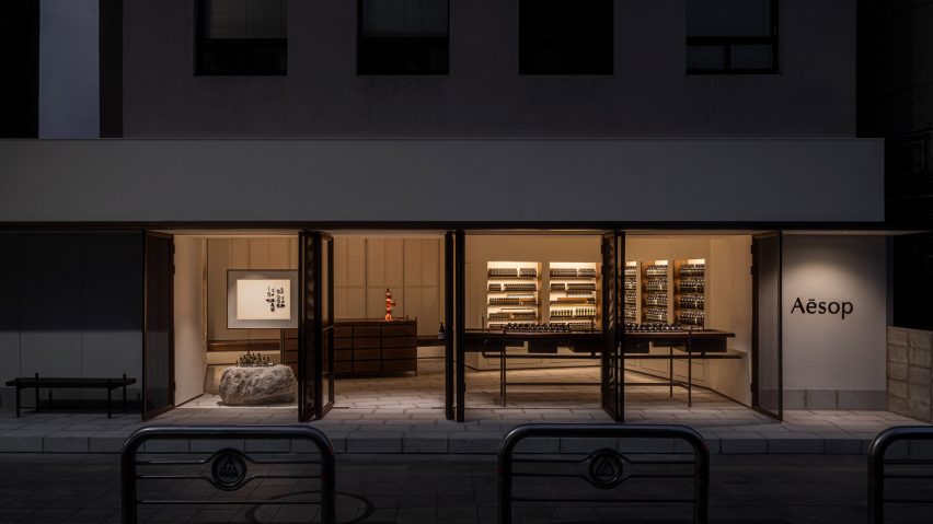
Skincare brand Aesop has collaborated with designer Samuso Hyojadong to create a store in Seochon, Seoul, that features an open facade and an oversized stone plinth.
Positioned in one of the oldest neighbourhoods of Seoul's Jongno-gu district, the Seochon outlet was created to "fit harmoniously within its local context", according to Aesop's design team.
When designing the store, Aesop and Hyojadong took cues from the architecture of jeongjas – traditional Korean pavilions with no walls, which serve as spaces for resting and taking in the surrounding views.
The street-facing facade was created with mesh metal screens that can open out entirely to create a storefront with no walls. Once closed, the woven metal backing creates translucent windows through which passersby observe the softly lit silhouettes of uniform rows of bottles.
"Samuso extended the floorplate outwards to create a threshold that conveys a generous sense of hospitality," the Aesop design team told Dezeen.
"One [jeongja] in particular that inspired us was the Soswaewon in the Damyang region, which was built in the sixteenth century and is surrounded by a verdant garden."
For the store's material palette, the designers referenced the timber and stone that are typically used to build traditional Korean houses known as hanoks.
A large, rough-edged stone plinth displaying clusters of products was positioned at the entrance while various wooden accents were created with timber reclaimed from salvage yards and an abandoned house.
The store was also built on a raised stone platform, which nods to the traditional architecture.
Hanji paper created from mulberry tree bark sourced from South Korea's Gyeongnam province features on the store's walls, which frame central geometric cabinetry and sleek taps made of locally produced aged copper.
The designers were restrained in their use of sanding, sealants and coatings when treating the materials, opting to embrace their "natural imperfections".
"Sensitivity to texture in this store is superlative," reflected the design team. "Samuso wanted each material to express itself directly, without too much human intervention," it continued, referencing the roughness of the stone and the reclaimed timber's undulating texture.
Rosewood was used to create the store's signature fragrance armoire, which is hidden from view until opened out and was conceived as a traditional Korean jewellery box, according to the design team.
"Throughout the store, we were compelled by a desire to dissolve the boundaries between inside and outside, between the naturally occurring and the human-made," concluded the designers.
Known for stores that pay homage to their varied locations, Aesop has an outlet in Cambridge defined by handwoven bulrush shelves that nod to the nearby River Cam and a Sydney store furnished with domestic items to evoke 1960s Australian homes.
The photography is courtesy of Aesop.

