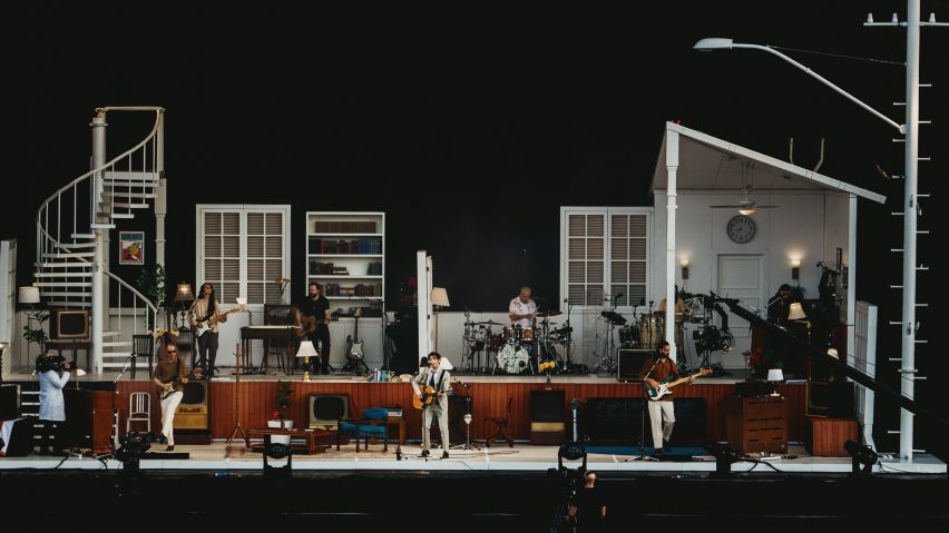
Live music shows are all starting to look "kind of the same" says The 1975's set designer
Relying on social media algorithms for visual inspiration has led to stage designs becoming increasingly repetitive according to Tobias Rylander, the designer behind The 1975's viral set depicting a house.
"All the artists are coming to us as designers with the same references," he told Dezeen.
"We're all looking at the same algorithms on Pinterest and Instagram, and therefore everything starts looking kind of the same and we all want the same thing," he added. "We're all doing what the AI tells us to do."

Rylander believes the theatrical house set he designed for The 1975's latest world tour ended up trending on social media precisely because it broke this algorithmic mould.
"I think the people that kind of crack outside of that shell are the ones that are going to get noticed," he said. "And I think that's what me and [lead singer] Matthew [Healy] did with this show. It's something that no one expected."
Tour will change "dramatically" for second leg
Rylander has collaborated with The 1975 for almost the entirety of the British band's 10-year touring career.
Relying heavily on his training as a lighting designer, he created a string of pioneering shows for the band over the years that used nothing but lights and video projections to create three-dimensional sets.
The latest tour, called At Their Very Best, represents a dramatic departure from this format. Centred around an elaborate set resembling a house, it looks more like it might host a play than a live music performance.
Complemented by a theatrical – though controversial – performance from frontman Healy, the show immediately trended on the platform formerly known as Twitter and has racked up more than 278.3 million views on TikTok so far.
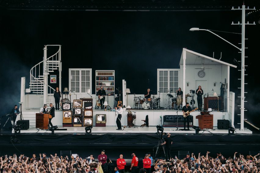
Much like a real theatre set, the house features no internal dividing walls so as not to block sight lines. Instead, different rooms are delineated by freestanding doors, windows and columns.
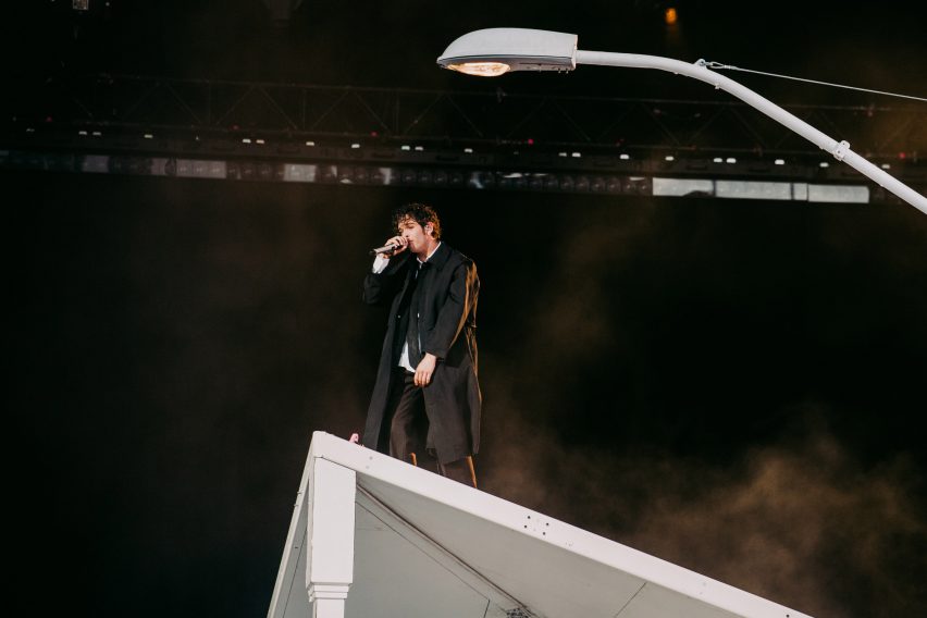
There's even a spiral staircase and a small roof section, sturdy enough to hold up Healy during a particularly dramatic point in the set as he sings I Like America & America Likes Me.
"We wanted scenography for him and the band to interact with and a stage where we could tell a story," Rylander said. "It's really more or less a theatre stage that allows some rock and roll in it."
So far, the set has toured more than 30 countries – including The 1975's biggest show to date in London's Finsbury Park – and is now back in the US where the band is rehearsing for the second leg of the tour, Still At Their Very Best, which kicks off on 16 September.
The show "will change dramatically" for this next lap, Rylander revealed.
"It will be more of what everyone seems to love about this show, which is the theatrical performance that takes place on and beyond stage," he said. "But it's still the same house in the same universe."
Furnishings sourced from band members' homes
Architecturally, Rylander conceived the house to be a sort of everyman's home drawing on a smorgasbord of references, from Healey's own garage to the suburban American homes of Steven Spielberg films.
"Matthew really wanted it to be an invitation into his world and into more or less his home," the designer explained. "But we at the same time wanted it to be kind of generic so it could be anyone's home."
"We looked at a lot of these suburban streets that Spielberg always has in his films, where anyone and everyone can relate to what it was like growing up in that house."
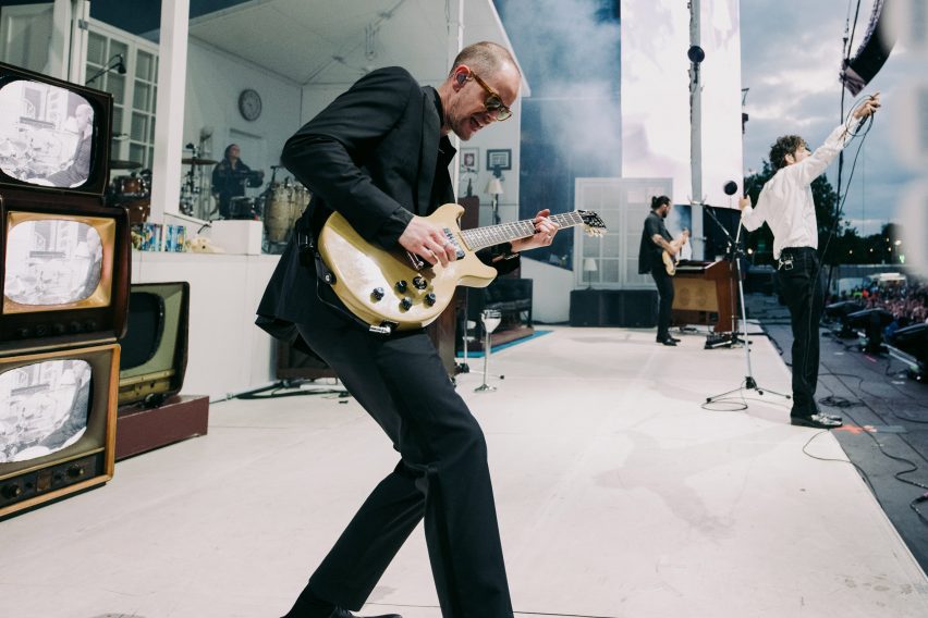
In this spirit, Rylander and the band's creative director, Patricia Villirillo, sourced several chintzy lamps and other trinkets from yard sales in the small town of Lititz, Pennsylvania, where the band was rehearsing.
Over the course of the tour, the band members also filled the set with framed family photos and furnishings from their actual homes.
The result is an eclectic interior featuring classic design pieces like Emeco's Navy Chair alongside ceramic deer bookends and E.T. souvenir cups, while surfaces are finished almost entirely in white.
"We made it even more generic in the way that it's monochromatic," Rylander said. "So everyone can kind of project their own memories onto this house and these rooms."
The 1975 were "guinea pigs" for new modular set-building system
To allow the elaborate set to be quickly disassembled and packed down into touring crates, the structure of the house was created using a new modular framing system by production company PRG.
Designed specifically for touring, the system consists of square aluminium tubes that can be clipped together and stacked into grids to form a kind of scaffold.
This skeleton set can then be clad in different finishes to form everything from the floors to the roof and even part of the staircase.
"Our biggest challenge was to make something like a theatre set that can fold down really quickly and be built really easily," Rylander said.
"The whole house is built using a modular framing system so that it can be scaled, shrink in size, come apart fast and clip together in a modular way," he added.
Once the set has reached the end of its life, these modular parts can be returned to PRG for reuse in future builds instead of going to waste, which is what often happens to custom set builds.
The system was born out of a working group called Redefine Design, which Rylander founded in collaboration with a roster of other set designers during lockdown to address the environmental impact of touring.
"What we all wanted was a modular system that we could build more or less anything out of, that could then come apart at the end of the tour and go back on a shelf and be reused," he said.
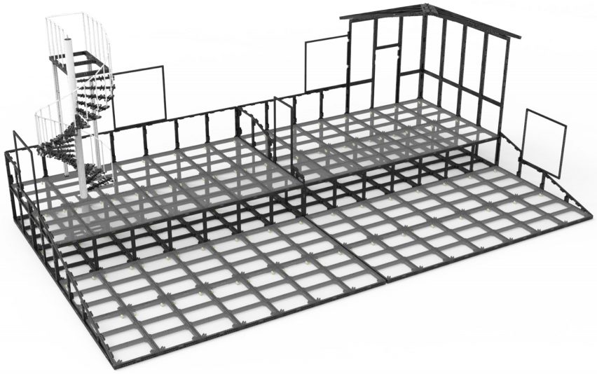
"We were kind of the guinea pigs of this new system," he added.
Currently, the modular frames are still "a little bit more expensive" than a regular set, according to Rylander, due to the added development time required in advance.
But ultimately, he hopes that economies of scale will help to drive down costs so the system can be adopted across the industry to cut down on waste.
"It always comes down to what the artist is willing to do," he said. "You have to think a little bit further. You have to make some compromises. But I definitely think that it's something that we'll see much more of."
Dezeen In Depth
If you enjoy reading Dezeen's interviews, opinions and features, subscribe to Dezeen In Depth. Sent on the last Friday of each month, this newsletter provides a single place to read about the design and architecture stories behind the headlines.