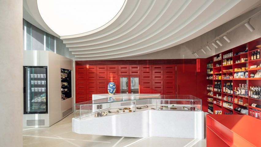
Israeli architecture studio Baranowitz and Goldberg Architects has created Yama, a fishmonger in Tel Aviv with a sculptural interior that was informed by jewellery stores.
The studio completely renovated the space, adding a sculpted ceiling that was designed to "create a ship-bottom-like formation" to underline the connection to the sea.
Yama – which was named after yam, the Hebrew word for ocean – features a display area for showcasing fresh fish as well as prepackaged ready-to-cook dishes made by its owner, chef Yuval Ben Neriah.
The display counters were designed to resemble the shape of a fin and have an all-white finish that contrasts with the fishmonger's colourful walls.
For one wall, Baranowitz and Goldberg Architects created a bespoke clay-red drawer refrigerator that holds prepackaged goods.
With the brief to "redefine the shopping experience that customers are accustomed to", Baranowitz and Goldberg Architects designed the interior to emphasise the value of the product being sold.
"We suggested that rather than working with quantities and nonchalant arrangements of the product with the preparation of the fish being exposed, we wished to emphasize the values of the product within an elegant setting," studio founders Irene Goldberg and Sigal Baranowitz told Dezeen.
"It is this aspect of the carefully set display that promotes the value of what is presented, very much like jewels in a jewellery store."
Steel shelves in the same red hue as the refrigerated drawers hold delicatessen food that goes with the fish.
The studio chose the colour palette to nod to the graffiti-covered walls in the surrounding area – the up-and-coming Florentin neighbourhood in southern Tel Aviv.
"The colour palette is light in its essence, consisting of white and warm grey," Baranowitz and Goldberg Architects said. "It is only the drawer refrigerator and display shelves that bring in the deep and vivid colour of clay-red."
"The purpose of the colour was two-fold: to create an assertive and strong backdrop of the central island and to recall the vitality of the downtown neighbourhood it is located at, with its graffiti art walls and vibrant young population."
Despite designing the store to have a high-end look, the studio used deliberately simple materials as a contrast.
"To balance the experience and merge with the vivid alive-and-kicking neighbourhood the store is located in, the finishes and materials selected for the store are not particularly high-end," Baranowitz and Goldberg said.
"On the contrary, most of them are simple in their essence and consist of concrete flooring, plaster and paint-finished metal," the duo added. "The heart of the store is constructed in stone to elevate the display of the fish specifically on the central island."
To further underline Yama's connection with the ocean, Baranowitz and Goldberg Architects added a decorative coral motif to the door handle leading into the fishmonger.
The studio said it always designs bespoke door handles for its projects since the entrance is "the beginning of the story".
"For Yama, which has a very clean and pared-back design, the door handle is the only part that was given a decorative motif," Baranowitz and Goldberg Architects said.
"We used the graphic design motif that was developed by Anaba studio for all the packages in the fish shop," the studio added.
"The graphic element reminds [us of] elements from the sea, coral reef indeed, which also reminds us of seawater. We like to combine existing elements, it is part of a story of the place."
Other recent Tel Aviv projects include an indoor playground with tree-like columns and a pair of apartments with trees growing through the facade.
The photography is by Amit Giron.
Project credits:
Architects: Irene Goldberg and Sigal Baranowitz
Lighting design: Orly Avron Alkabes
Stone Work: Fervital

