"Enlightened by subtle openings" says commenter
In this week's comments update, readers are discussing a concrete multi-generational home in India and debating news that construction has resumed on Jeddah Tower in Saudi Arabia.
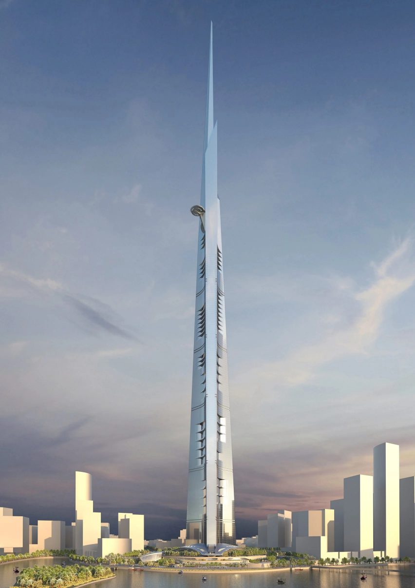
Designed by Chicago-based studio Adrian Smith + Gill Gordon Architecture, the Jeddah Tower is planned to reach a height of 1,000 metres, which would make it the world's tallest building.
While the first images of the prospective skyscraper were released in 2011, and ground was broken in 2013, the project has been harried by constant starts and stops.

"Skyscrapers are so 20th-century"
Commenters criticised the design for its excessive size.
Jb dismissed the project, declaring "skyscrapers are so 20th-century". Bloibl commented "I've often said that what we really need to solve some of humanity's looming problems is a skyscraper".
Kasimir thought the design looks like a copy of Frank Lloyd Wright's Mile High Skyscraper, while Marius pondered whether Frank Lloyd Wright would have been "seduced by Saudi Arabia's money or their ability to realize his fantasy?"
"The Saudis seem to be major exponents of the concept of 'mine is bigger than yours'," wrote Alan Smith in a comment that was upvoted seven times. "It exists in inverse proportion to the concepts of less is more," they added.
Meanwhile, Apsco radiales asked "what the rentable area is on the upper floors?" and Steve hassler suggested that "maybe, unbeknownst to the tenants, it's a rocket."
What are your thoughts on the soon-to-be world's tallest skyscraper? Join the discussion ›

"I love it – it's a happy thing"
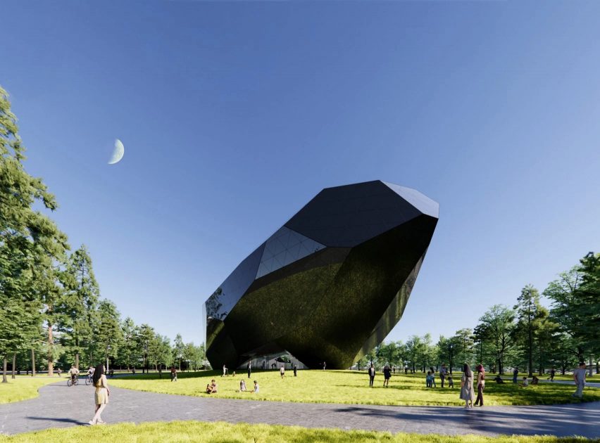
Dezeen readers were divided in their opinions about plans for a space museum and experience centre in China designed by Open Architecture.
Named Space Crystals, the building will have a glossy black exterior and a faceted stone-like shape that rises at one end and points toward the ocean.
"I love it – it's a happy thing, looks like it is going to take off at any moment. Ding-ding, 'all-aboard'," wrote Harry Belafonte 3rd.
Chuck Anziulewicz was on the same page, commenting "I think it's fantastic".
However, AlfredHitchcock was more balanced in their assessment, writing "I don't dislike the form and it does look enticing, but it seems that they came up with the shape and then squeezed the programme inside, with resultant awkward spaces around the edges".
Other commenters, like Heywood Floyd, were more cynical about the design, calling it "lazy and weak – the plan is so bad it's offensive".
Fantastic or offensive? Join the discussion ›

"Enlightened by subtle openings"
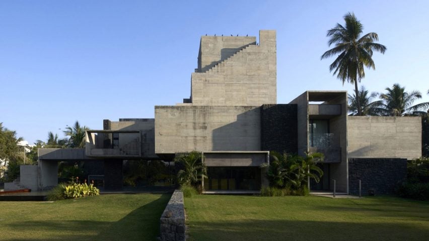
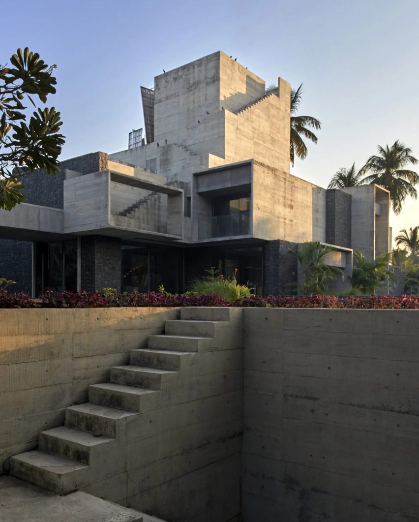
Another project that got readers talking this week was Up to the Sea, a blocky family home in India made up of a network of cubic concrete volumes and staircases.
Nestled into a grassy site in the coastal town of Dumas, the multi-generational home sits on a stone base and was designed by Matharoo Associates to merge traditional Indian design with modern architecture.
Commenters celebrated the project, calling it magnificent, elegant and atmospheric.
Pa varreon was full of praise: "elegant neo-constructivism, beautiful case printed concrete; the spaces are enlightened by subtle openings. Magnificent house. I want to live there".
"Another great pick! Thanks Dezeen, you are bringing architectural joy," they added.
Prado Sellinder agreed, exclaiming "wow. It's so atmospheric. The textures!" HeywoodFloyd called it "a lot of architecture".
On the other side of the debate, AlfredHitchcock thought that "some of the spaces look interesting", but ultimately, "it's concrete overkill".
Concrete monster or architectural joy? Join the discussion ›
Comments update
Dezeen is the world's most commented architecture and design magazine, receiving thousands of comments each month from readers. Keep up to date with the latest discussions on our comments page and subscribe to our weekly Debate newsletter, where we feature the best reader comments from stories in the last seven days.