KOKO Architecture + Design creates interactive children's space for the Met
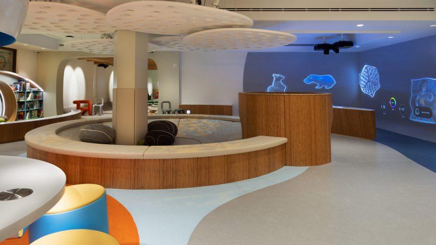
Local studio KOKO Architecture + Design has created a permanent interactive children's play space at the Metropolitan Museum of Art in New York.
Located in the museum's 81st Street Studio, which was formally a library, the space contains a variety of multi-sensory analogue and digital play stations for children aged three to 11 in order to inspire creativity and exploration.
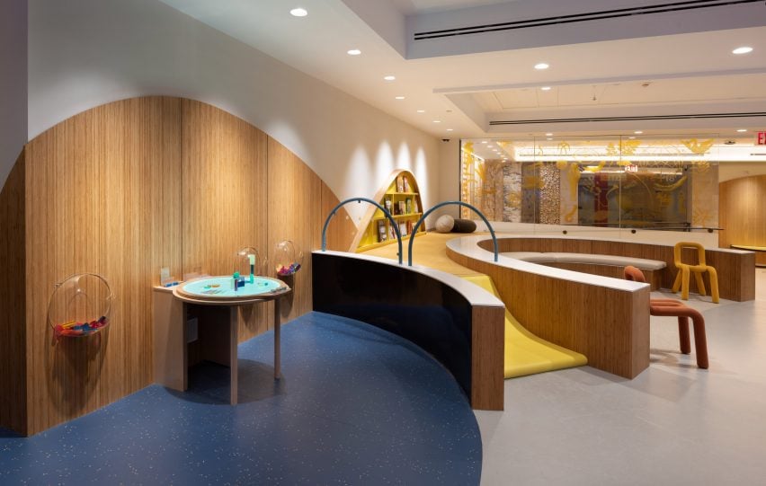
"Unlike in many of our galleries, we want you to touch everything," said Met CEO and director Max Hollein.
KOKO Architecture + Design founders Adam Weintraub and Mishi Hosono incorporated elements of the Met's collection both directly and indirectly into the space.
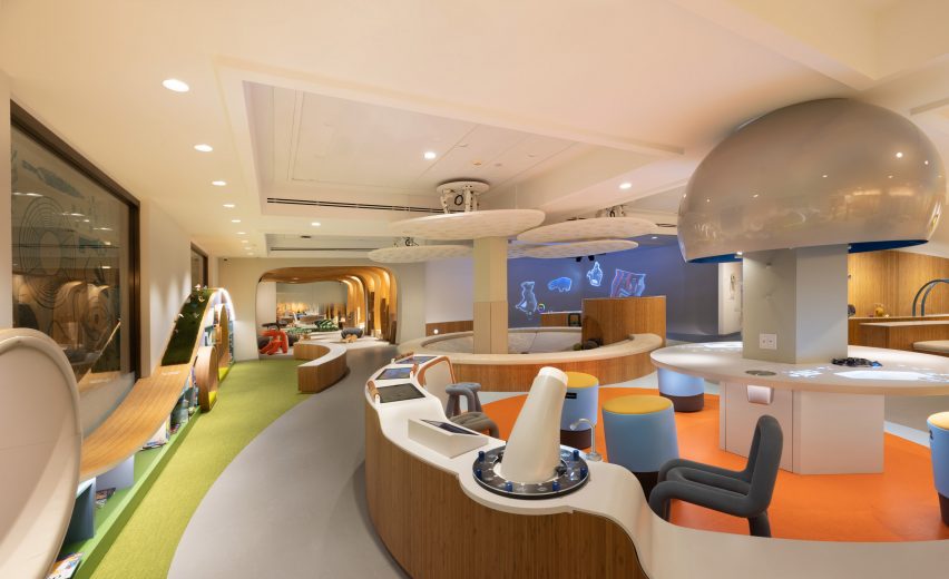
"It was challenging because the Met is encyclopedic, there's so much to draw from," Weintraub told Dezeen. Items were chosen to complement the STEAM (science, technology, engineering, arts and mathematics) teaching philosophy of the centre.
"It was almost overwhelming, but one of the kind of guiding principles was this idea of STEAM with art layers. Every single element had to teach but also tie into the collection."
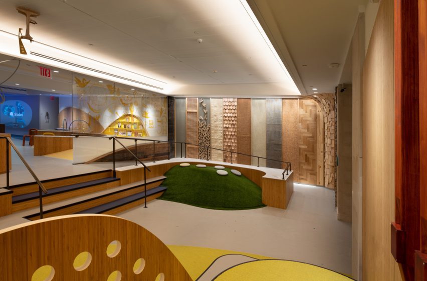
The designers split the 3,500-square-foot (325 square metre) space into two distinct levels, with a staircase, a "material passageway", a faux grass hill and an assortment of musical instruments, designed in collaboration with Yamaha, at the entrance.
The material passage, which runs along the length of a ramp, contains columns of wooden cladding and textures young guests can both touch and smell.
A panel of wooden screening was sourced directly from the museum after the designers were told it would be thrown out. Another wooden lattice texture is a reproduction of a screen found in the museum's Islamic collection.
Weintraub said that the screens will be changed out periodically.
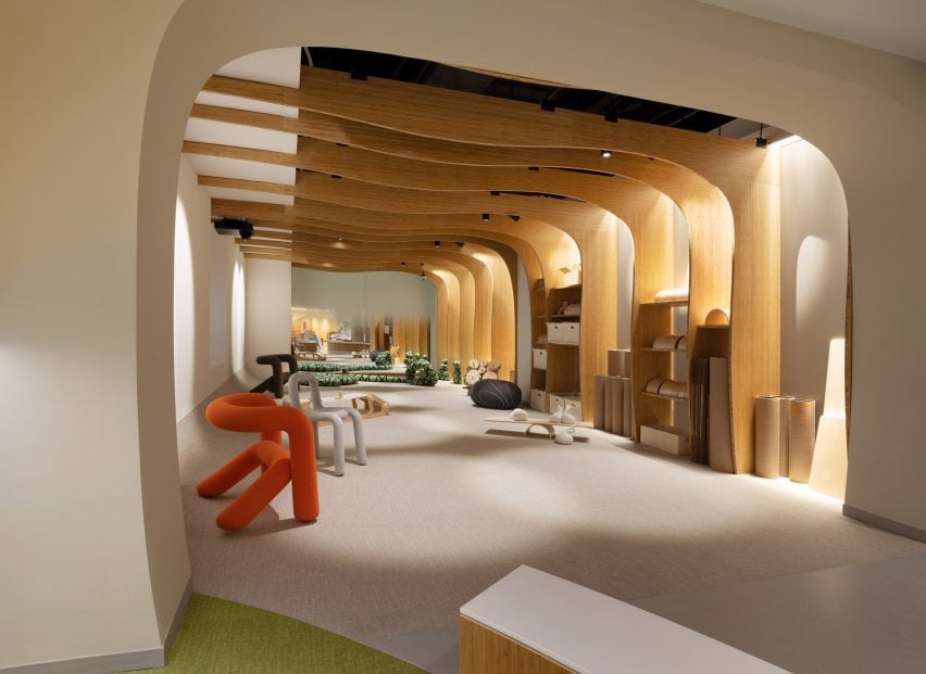
Along with the material passage, a brightly coloured, rippled staircase leads to the next level, which contains seating areas, reading spaces, art-making stations and an interactive digital exhibition.
The studio installed a variety of subtle level changes amidst meandering paths.
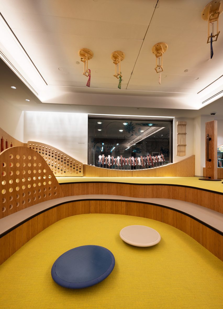
"The idea is that adults can find their child but from a child's eye perspective, it's all these different worlds," said Weintraub. "They can run through them as often as they want."
On the far end of the space, a padded, sunken area provides spaces for children to play.
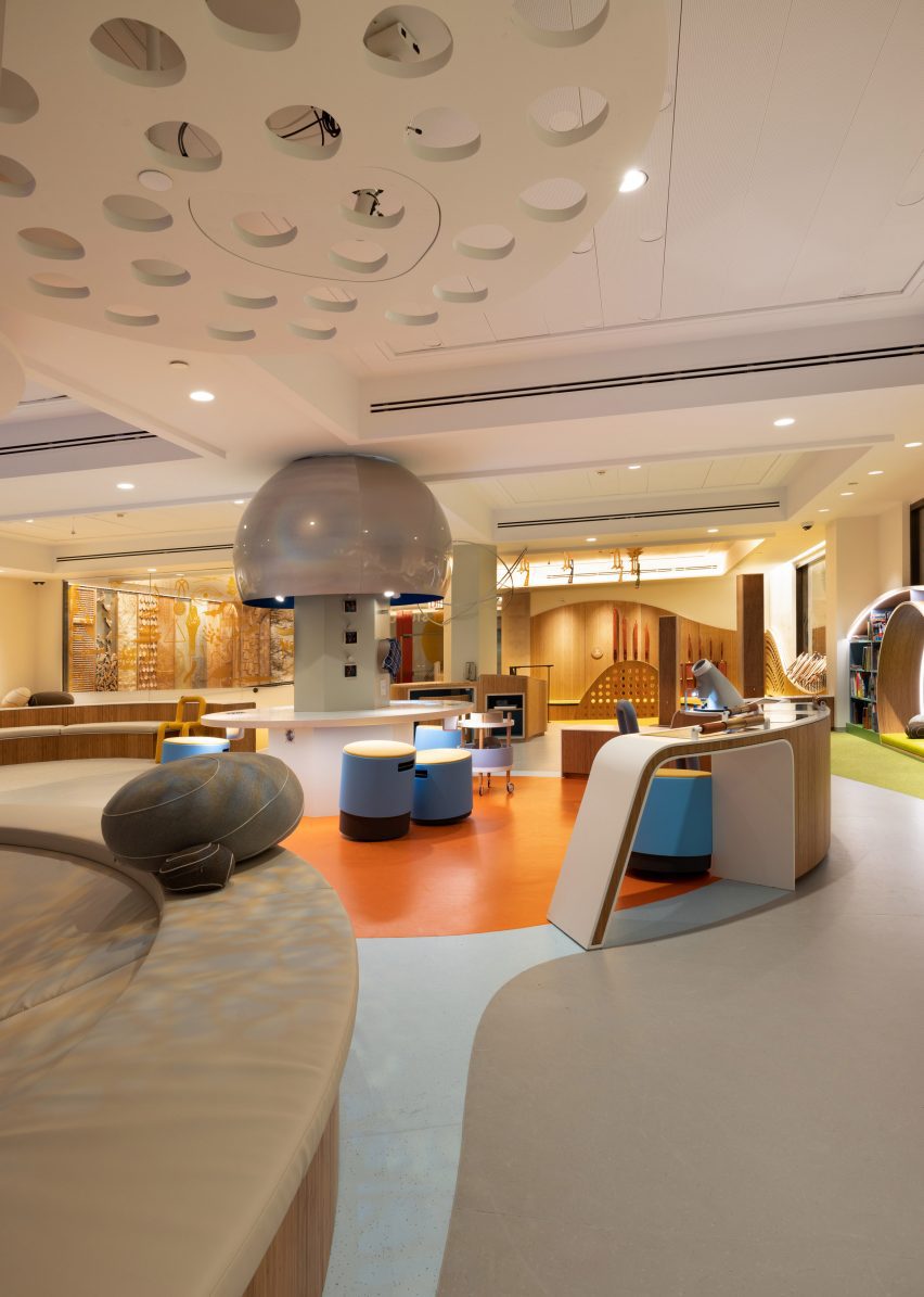
A large projection of tree branches covers the area, which, like other lighting integrated into the space, will change colours depending on the season.
Working with experience design firm Bluecadet, Weintraub and Hosono incorporated digital elements into the space like small circular screens built into cabinetry and arched lighting over reading spaces.
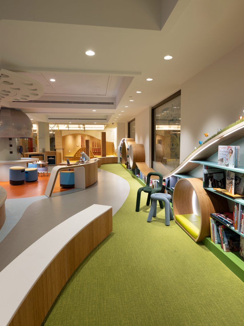
"There's a little subtle magic that is integrated," said Hosono. "It's not too overwhelming, the digital, because, of course, kids are drawn to the screen."
The space is largely clad in light wood panelling, with brightly coloured carpeting and finishing throughout.
"[Hosono] says to us, even though we're designing for kids we're not trying to dumb it down," said Weintraub. "It still has to be sophisticated."
"Even more sophisticated," Hosono added. "Because they are very honest."
KOKO Architecture + Design was founded in 2000 and is based in New York, New York. The studio specializes in early childhood education and children’s spaces.
Recently at the Met, artist Lauren Halsey covered an Eqyptian rooftop installation with LA street art and Frida Escobedo was announced as the architect for a redesign of the museum's Oscar L Tang and HM Agnes Hsu-Tang wing.
The photography is by Richard Lee, courtesy of the Met.