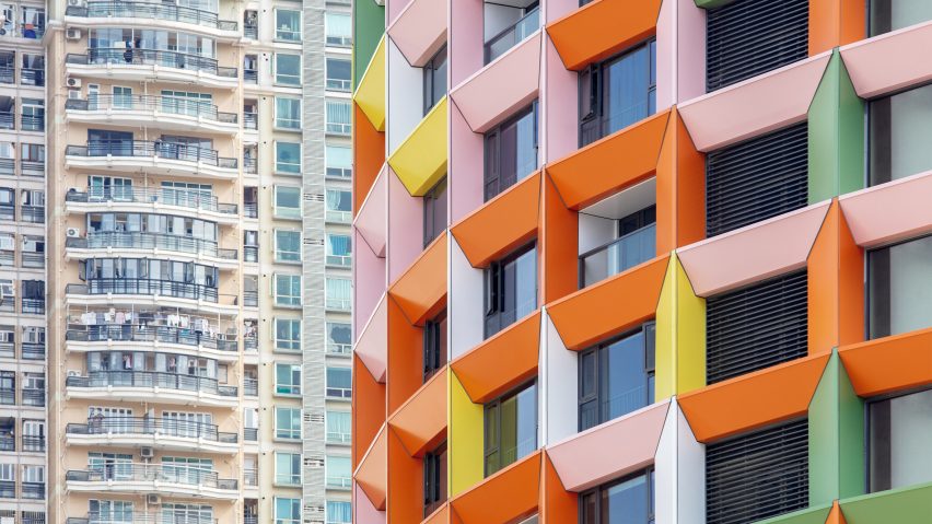
Dutch architecture studio MVRDV has added a colourful gridded facade to a skyscraper in Shenzhen, to create a hotel and centre dedicated to the welfare of women and children.
Aiming to set an example of adaptive reuse in the city, the Shenzhen Women and Children's Centre contains a library, auditorium, children's theatre, therapy rooms and staff offices.
Originally completed in 1994, MVRDV retained the majority of the original structure, which is made up of a 100-metre-tall tower surrounded by a 5,500-square-metre, six-storey structure on the corner of a crossroads.
The studio added a colourful gridded aluminium frame to the exterior, increasing the depth of the facade by one metre to help shade the internal spaces and reduce thermal heat gain.
The bright green, pink, yellow and orange facade fades to white towards the upper levels of the building, where a hotel with 201 rooms is located.
"Retaining and refurbishing a building is more sustainable than demolishing and building anew, particularly when a building is this young and contains as much concrete as this structure," MVRDV founding partner Jacob van Rijs told Dezeen.
"We also wanted to blaze a trail for the city of Shenzhen in repurposing buildings, particularly high-rises, as we believe this is just the beginning of a great wave of adaptive reuse."
The facade colours were used throughout the building to guide visitors and highlight passages to a courtyard.
MVRDV redesigned the main lobby to make it a colourful and inviting space that draws people into the retail spaces in the building, and a separate children's lobby was added to a side entrance, leading to the education and play spaces.
"The whole theme of the building is connected to children's well-being and to fresh, colourful, and fun design solutions," said Van Rijs.
MVRDV topped the building with a "tower crown" that covers a roof terrace, where visitors can enjoy 360-degree views of the surrounding city.
Originally used for car parking, the studio transformed the terrace into a public space with a food court.
An entrance to the metro station was moved from the pavement outside to inside the building, creating a larger public space in front of the centre with colourful circles decorating the paving.
Approximately 24,000 cubic metres of concrete was saved and reused from the original structure and small additions were made to simplify the floor plans.
According to MVRDV, the original structure was built during Shenzhen's first period of rapid growth and due to its rushed construction, it was later deemed not fit for purpose.
It was selected as one of 24 projects to revitalise by the National Development and Reform Commission, aiming to contribute to China's goal to have CO2 emissions peak before 2030 and achieve carbon neutrality by 2060.
"The rushed approach to its original design was immediately clear. Due to persistent fire safety concerns, the commercial units in the plinth were not opened until 2002, and the tower itself remained empty indefinitely," said MVRDV.
"With the changing needs of the building's users, it fell short of environmental requirements, and by 2019 it was clear that the building was no longer fit for purpose."
Dutch studio MVRDV was founded in Rotterdam in 1993 by Van Rijs, Winy Maas and Nathalie de Vries.
Other tall buildings completed by the studio include a pair of L-shaped skyscrapers in Nanjing and a housing tower in San Francisco designed to appear like a canyon.
The photography is by Xia Zhi.
Project credits:
Architect: MVRDV
Co-architect, landscape architect and MEP: SZAD
Facade Consultant: King Glass Engineering
Structural engineer: Yuanlizhu Engineering Consultants
Lighting Consultant: Brandston Partnership Inc.
Interior architect: Jiang and Associates

