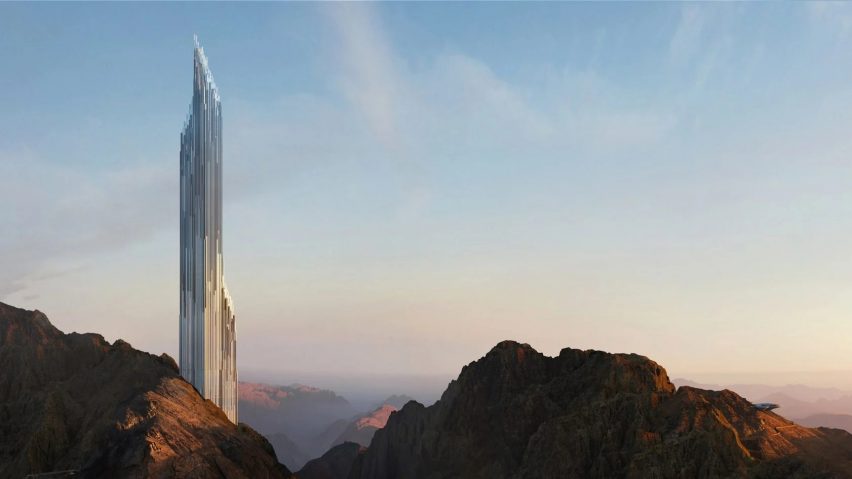
In this week's comments update, readers are discussing renders of a supertall skyscraper designed by UK studio Zaha Hadid Architects for the Trojena ski resort at Neom in Saudi Arabia.
Designed to stand on top of a mountain overlooking an artificial lake, the crystalline skyscraper, named Discovery Tower, will be 330 metres tall.
"Elegant and monumental, this iconic tower will combine high-end retail, dining and the dream-like experience of living in the clouds," said the developer.
But not all commenters were convinced, with some dubbing it "horrendous" and "a fortress of solitude".
"This should be a crime"
"It looks horrendous in that beautiful mountain background. As if you need a skyscraper in the empty desert," wrote A from W.
Petros commented "I am having trouble comprehending the environmental impact of building this thing. And I cannot find a single reason that would justify the effort and money to support the logistics."
This sentiment was echoed by steve hassler, who wondered "how this will contribute to degrading the surrounding nature". They added that "this should be a crime".
Nina Bond approved of the design but didn't agree that the structure should actually be constructed. "We saw it, and we love it...chapter closed," they said. "If we experienced it through this photo, it's done. We don't need it built."
Meanwhile, Paul Nathanson commented "I can't argue about practicality or technological virtuosity. However, I don't need to. It's beautiful. Period."
Do you agree? Join the discussion ›
"What a beauty!"
Beauty was also on the minds of readers discussing Fohlenweg, a house in Berlin that London studio O'Sullivan Skoufogolou Architects created using the walls of an existing bungalow.
The three-storey family home, developed on the edge of Grunewald Forest, features a pale brick exterior divided by a band of limestone.
"What a beauty!" exclaimed dacian.
Scot M agreed: "Beautiful home, beautiful colour palette inside and out."
Tony 365 chimed in to ask "where is the bungalow?" before writing "kidding aside, it's a great-looking building. The woodwork looks fantastic. Brickwork solid."
However, not all readers were totally won over by the design.
"As an object, it is a failure," declared tom roberts. Although, they did acknowledge that "the interior has some moments".
Meanwhile, jb felt that "modernism obliterates the bungalow."
What are your thoughts on this Berlin bungalow extension? Join the discussion ›
"It looks as sickly sweet as a bag of skittles"
Another skyscraper that got readers talking this week was the Shenzhen Women and Children's Centre transformed by Dutch architecture studio MVRDV.
Aiming to set an example for adaptive reuse in the city, MVRDV retained the majority of the original structure, completed in 1994 and made up of a 100-metre-tall tower.
A colourful gridded facade was added to a skyscraper to create the hotel and centre dedicated to the welfare of women and children, containing a library, auditorium, children's theatre, therapy rooms and staff offices.
"Really fun project," commented Jacob Volanski.
However, other readers were unsure about the bright colour palette.
Don Bronkema felt that "orange, pink and yellow conflict" and suggested: "paint over and delist whoever perpetrated this chromatic crime."
"Aka Jean Nouvel's La Marseillaise facade but with uglier colours," commented MRDRV.
While Whateverandeveramen thought "it looks as sickly sweet as a bag of skittles".
What do you think about the multicoloured facade? Join the discussion ›
Comments Update
Dezeen is the world's most commented architecture and design magazine, receiving thousands of comments each month from readers. Keep up to date on the latest discussions on our comments page and subscribe to our weekly Debate newsletter, where we feature the best reader comments from stories in the last seven days.

