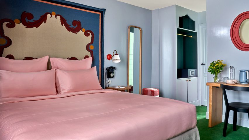
Saturated greens and blues contrast pale pink sheets and playful flower details at Hôtel de la Boétie in Paris, which Swedish designer Beata Heuman created to be "a bit like a stage set".
Set in a 19th-century building, the 40-room hotel in Paris' 8th arrondissement was designed with Heuman's signature colourful interior style.
While it was a renovation of an existing hotel, the designer was able to make large changes to the interior as the building had been altered numerous times since it was completed.
"The building didn't have any original features left and has been re-configured over the years," Heuman told Dezeen. "We spun off the simplicity of the bones that were there, working with strong, simple ideas."
Guests are met by a reception room with a vibrant, bright-red nook for the front-of-house staff and two lamps designed like winding red-and-yellow flowers. A dark-blue leather seat complements the room.
Next to the reception area, Heuman created an all-silver lounge that was designed to have a theatrical feel and is brightened by an orange velvet sofa and a forest-green coffee table.
The colour palette was very deliberately chosen by Heuman, who thought about the wider impact it would have on the space.
"It's about contrast and balance," the designer said. "When you work with rich colours my instinct is to off-set that using simpler materials around it to complement and enhance."
The bedrooms have a saturated colour scheme, with lower-level floors that feature dark blue walls, which change to shades of brown on the ascending floors.
The two top levels have pale, airy blue hues, with classic French cast-iron balconies providing views of central Paris from the top floor.
A grassy green carpet was used throughout the hotel to create a vibrant contrast to the blue and brown hues.
Some bedrooms have been decorated with oversized headboards that were woven as rugs and then upholstered, creating an unusual and eye-catching centrepiece.
These were informed by the inlaid marble floor of the Medici Chapel in Florence and sit above the solid-ash beds, which have been made with pale-pink satin sheets that add to the vibrant feel of the room.
In the bathrooms, Heuman used pale blue and green pastel hues juxtaposed with pink towels to give the rooms a luxurious retro feel, while checkerboard-patterned tiles in yellow and green add a fun touch.
The designer also used her own products to decorate the hotel, including her Dodo Egg Light – an egg-shaped light with green fittings designed to resemble planet leaves.
This decorates one of the ground floor lounge areas, which also features posters for art exhibitions by artists Pablo Picasso and Paul Klee.
The designer used mainly natural materials for the hotel, including wood and brass.
"The solid ash furniture used in all the rooms have a humble quality which anchors the more theatrical elements of the schemes such as the headboards, ensuring the expression stays true to the nature of the building," she said.
Heuman also created the branding for the hotel, which was made for French hotel group Touriste.
"A hotel is about having an experience for a day or two, which means that we have been able to explore a concept and a mood to a greater extent," Heuman said.
"We can treat it a bit like a stage set, which is not the approach I would take when it comes to someone's home."
The project fulfilled a long-time dream for the designer, who had previously never designed a hotel and works more on private home interiors.
"I’ve been wanting to do a hotel for ages and it has been a fantastic experience," Heuman said. "I am drawn to the theatrical, although that is often not appropriate for a residential setting."
"A hotel is an experience for a few nights, therefore you can exaggerate and do more of a 'look'," she added. "In a residential project the design is centred around the personal preferences of an individual client."
Previous hotels by Touriste include Hotel Les Deux Gares in Paris, which has an interior that was created by British designer Luke Edward Hall. Also in Paris, local studio Uchronia created a colourful Haussmann-era apartment as a "chromatic jewellery box".
The photography is by Simon Brown.

