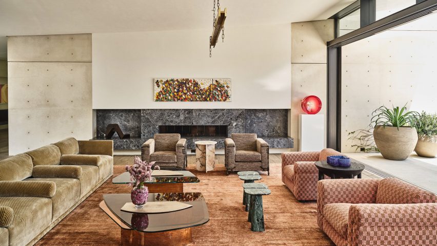
In this week's comments update, readers are discussing a large concrete home in California designed as a "modern ruin", with architecture by Masastudio and interiors by Kelly Wearstler.
The home, which is laid out like a "village" of open and enclosed spaces, was designed for clients who are avid art collectors and have a deep appreciation for contemporary architecture and design.
However, some commenters felt the project was overly extravagant and lacking design direction.
"Lacking any personality"
"With that amount of money, this is really the best you could come up with?" asked Jacopo.
JZ concurred calling the project "excessively expensive".
AlfredHitchcock thought it was "far too tasteful and lacking any personality" and compared it to "an exercise in thoughtless spending and overindulgence".
Commenter Saddened also wasn't a fan of the extravagant scale of the project, describing it as a "template for bad American taste, amplified by an endless budget".
But Ulisses Papa came to the project's defence, commenting that "seldom have I seen a more resourceful, beautiful and serene project being more criticised as in these comments."
Expensive or resourceful? Join the discussion ›
"Perfect location for this dynamic structure"
Readers were divided about the news that Danish architecture practice 3XN has been selected to create a stepped retail building along Baltimore's Inner Harbor.
Design Junkie thought it was a "really cool shape" and Ken Steffes suggested that it was the "perfect location for this dynamic structure".
However, commenter Zee was unfazed by the waterfront structure, exclaiming "just a few curved walls, meh!"
Meanwhile, Peter McK was frustrated about the site decisions. "Once again demolishing a perfectly fit building to create iconography" they lamented.
What's your opinion? Join the discussion ›
"A piece of Las Vegas in downtown Singapore"
Also receiving mixed reviews in the comments section this week was architecture studio WOHA's "garden hotel" in Singapore with planted pool terraces cut into the building's rectangular form.
Ati-st praised the studio's work writing "these guys are experts in using plants as architectonic elements."
Other commenters were similarly impressed. Chip Lynch felt that "it certainly would be nice to overlook the open green spaces from your room in a city setting like this".
However, AlfredHitchcock was struggling to make up their mind. "A piece of Las Vegas in downtown Singapore," they said. "In some ways, it's really quite wonderful, but in other ways it's so indulgent."
"It's certainly more Caesars Palace than Raffles – designed to cater to the flamboyant rather than the sophisticated," they added.
What are your thoughts on the garden hotel? Join the discussion ›
Comments update
Dezeen is the world's most commented architecture and design magazine, receiving thousands of comments each month from readers. Keep up to date on the latest discussions on our comments page and subscribe to our weekly Debate newsletter, where we feature the best reader comments from stories in the last seven days.

