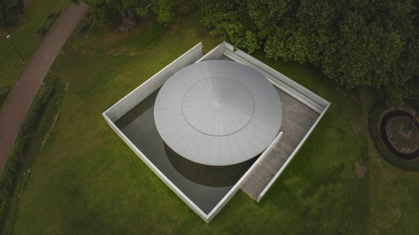
In this week's comments update, readers are discussing an aluminium-disc-topped pavilion in Melbourne, Australia, designed by Pritzker Prize-winning architect Tadao Ando.
Created as the Japanese architect's first-ever project in Australia, the concrete structure is the 10th MPavilion in the city and was intended to be a space to reflect on the surrounding Queen Victoria Gardens.
Readers took opposing views in the comments section.
"If you know anything about concrete, you know this is extraordinary"
Some commenters critiqued Ando's work as a knock-off of architect Mies van der Rohe's Barcelona pavilion.
"Absolutely uninspired," wrote Philip. "Mies gave us the Barcelona pavilion 100 years ago and this is just a clumsy copy".
Tom Roberts was similarly minded, saying: "It is no Barcelona pavilion, which it tries so hard to emulate."
Alfred Hitchcock felt that Ando had let his usually high standards drop. "How dull, lifeless and frankly lazy coming from an architect who has previously designed so many masterful works," they wrote.
However, other commenters were totally blown away by the "masterpiece".
"Pure and essential Ando – a masterpiece and another symbolic signature from maestro Tadao," wrote Pa Varreon.
"Masterful, the work is just stunning" echoed Mr Marsden. "If you know anything about concrete, you know this is extraordinary," they wrote.
Clumsy or masterful? Join the discussion ›
"A delicate box"
Another project that got readers talking this week was Edge House by Studio Prototype, a house with a hexagonal footprint built in an area of Amsterdam with relaxed planning regulations.
Milton Welch thought it "looks like a delicate box".
"The site is awkward, but the house is even more, for no reason," commented Souji. "A mess of sharp corners with too much glass," they added.
Alfred Hitchcock felt the same, writing "imposing a geometric form like this has certainly made for some awkward-shaped rooms and spaces". They went on to argue that "the project looks like a design mistake".
However, Apsco Radiales felt this was a bit of an exaggeration: "A design mistake? Bit harsh, I think. I could live in it – the materials and workmanship look good".
Could you live in this hexagonal house? Join the discussion ›
"Yet another vapid atrocity the world doesn't need"
Dividing commenter opinion was the news that Saudi Arabian mega project Neom has revealed its latest region, Epicon, a tourist destination that will feature two jagged skyscrapers by 10Design.
"Just why?" asked Jacob Volanski in a comment that was upvoted eleven times. "How on earth are they trying to sell this as 'sustainable'? What on earth are these pointless horizontal spikes?"
"The pointiest, most pointless architecture I've beheld in a while," wrote Jim Angrabright in agreement.
According to Steve Hassler, it is "yet another vapid atrocity the world doesn't need".
One of the only readers to give some balance to the critique was Igor Pismensky who said "love the look, but I won't be around when it's all completed (if ever)".
Do you agree? Join the discussion ›
Comments update
Dezeen is the world's most commented architecture and design magazine, receiving thousands of comments each month from readers. Keep up to date on the latest discussions on our comments page and subscribe to our weekly Debate newsletter, where we feature the best reader comments from stories in the last seven days.

