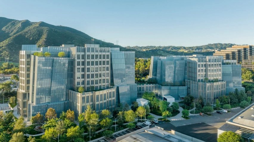
In this week's comments update, readers are discussing an extension of media company Warner Bros' headquarters in Burbank, completed by LA architecture studio Gehry Partners.
The complex features two distinctive facades – glass intended to evoke the form of icebergs is interspersed with steel facades modelled on the art deco-style buildings of early Hollywood.
"The dystopian corporate hellscape building is finished"
Some readers weren't fully convinced by the design. "Whether you reference it as an iceberg, rock formation, or crystal cluster, it is still a boring, heavy-handed clunker," wrote Marius.
"Ah yes, the dystopian corporate hellscape building is finished," said Richard Nelson. "Do you like it, corporate overlords?" they asked.
Daniel Shirk was a little less scathing. For them, the complex was "pleasant but nothing great – Gehry on autopilot".
Pleasant or hellish? Join the discussion ›
"The overall effect is intriguing"
Readers struggled to reach a consensus about the Azabudai Hills development in Tokyo by Heatherwick Studio, which is defined by curving roofs topped with greenery.
There was too much going on for Idracula, who asked "what am I looking at?". "Too many parts to this puzzle," they concluded.
Marius chimed in to say "Italian pizza toppings are kept simple to showcase their quality – grand philosophy". The project also left a bad taste for Blau, who thought "the whole thing is heinously overcooked".
Adding some nuance to the discussion was JZ. They acknowledged that "it looks like a mess and will require an immense amount of maintenance". However, ultimately they resolved that "the overall effect is intriguing".
Meanwhile, Heywood Floyd reminded their fellow commenters that "we've certainly seen more offensive ideas executed less confidently". They went on to say: "I feel like everyone is just pilling on Heathwerwick at this point".
Which side are you on? Join the discussion ›
"Diamonds, on Park Avenue? Groundbreaking"
Readers were also discussing the news that Foster + Partners has completed the framing for JPMorgan Chase headquarters at 270 Park Avenue.
"Diamonds, on Park Avenue?" asked Franc Lea. "Groundbreaking" they mocked.
Ken Steffes was also unimpressed by the design's lack of originality: "Wow, another steel and mirrored glass box with an exoskeleton – how creative".
"It's big, that's for sure" commented Souji. However, they thought "the design is so weak – switching the old SOM building for this is a shame".
Do you have a different take? Join the discussion ›
Comments update
Dezeen is the world's most commented architecture and design magazine, receiving thousands of comments each month from readers. Keep up to date on the latest discussions on our comments page and subscribe to our weekly Debate newsletter, where we feature the best reader comments from stories in the last seven days.

