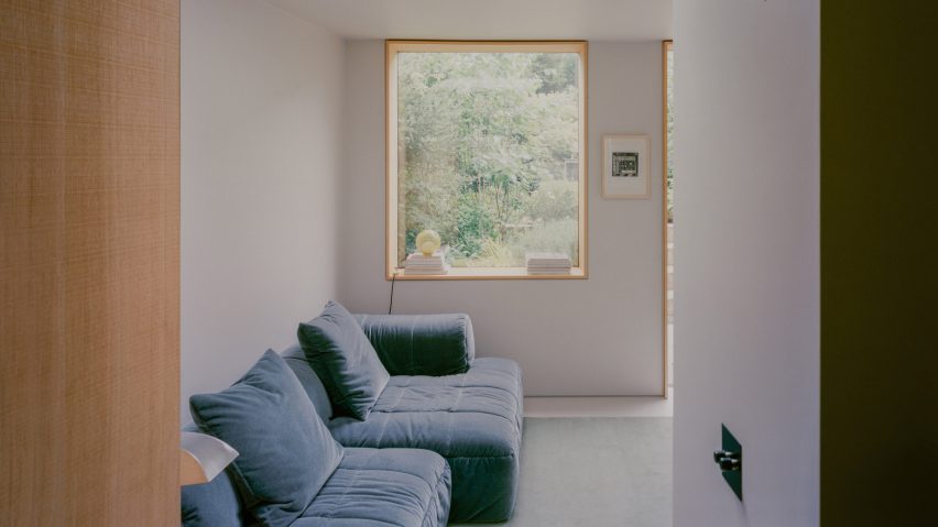
Muted tones and textured material finishes define the spaces of this mid-terrace Georgian home in north London, overhauled by local studio Paolo Cossu Architects.
Named Nelson Terrace, the renovation and extension in the Colebrook Row conservation area of Islington showcases the contemporary art and furniture collection of its client.
Commissioned by a young fashion designer, the subtle alterations to the house create distinct living and entertaining spaces, introducing a more a contemporary layout to the Georgian property.
Paolo Cossu Architects' design also adds a new rear extension on the home's basement level, creating a generous open-plan living, dining and kitchen space.
The ground floor has also been reimagined to create a dual-aspect atelier, allowing the client to work from home.
The studio used a restricted palette of materials and colours throughout, allowing the client's art and furniture to take centre stage.
"We wanted to add something that was playful. We did not want to have a very formal house," studio founder Paolo Cossu told Dezeen.
"It was all about colours, finishes and textures and contrasting materials and then details that were almost like accessories," he continued. "[The client] wanted to have it almost like a blank canvas for his objects that he displayed."
The house was in poor condition when purchased, due to an ill-conceived refurbishment carried out in the nineties.
Paolo Cossu Architects' design subtly adjusted openings throughout the home, removing cluttered partition walls in some areas and reinstating corridors in others.
"The ground floor was an open plan, and we reinstated the corridor," Cossu explained. "We removed all the new partitions and we tried to restore what was left. We didn't touch the staircase. The staircase was covered and we exposed it."
Internally, the studio made considered adjustments to the layout of the house, highlighting changes through the application of colour or introducing a new material treatment.
A small palette of primary colours, including cornflower blue and wine red, have been applied to specific elements such as banisters, thresholds, and architraves. These hues were selected by the client to give a personal touch to the home.
In the new basement rear extension, a bespoke kitchen of rough-sawn oak sits at the centre of the plan, connecting the dining room and living space.
Connections to the outdoors are prioritised, with the extension giving direct access to the garden, and a semi-circular skylight that introduces light and shadow and gives views of the sky.
The client's home studio is positioned on the ground floor, giving a clear separation between work and social spaces. The studio showcases a mixture of different lighting fixtures, including pieces from Valerie Objects.
A highlight of the interior is a new mirrored doorway that leads to the main bedroom on the first floor, created by exposing the original structure in the wall.
"There was an idea for playing with the exposed original structure of the house," said Cossu. "When we started demolition, [the client] really liked the frame of the building, the framing of the walls, and we wanted to have them exposed."
Paolo Cossu Architects is a London studio founded by Cossu in 2007. A previous project by the studio inserted a chunky oak staircase in a renovation of a Victorian terrace in east London.
Other recent examples of London house extensions include a "country house in miniature" by Gundry & Ducker, and an extension to a basement flat designed to feel like a "cabin in the woods" by Polysmiths.
The photography is by Lorenzo Zandri.

