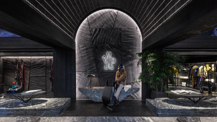
Promotion: Swiss firm Küchel Architects has revealed its design of fashion brand Moncler's St. Moritz store, which features burnt and brushed oak wood to evoke rugged Alpine landscapes.
Located in the Alpine town of St. Moritz, 1800 meters above sea level, the store occupies a first-floor location along the town's central thoroughfare, Via Maistra. It is the Italian label's largest mountainwear flagship store dedicated exclusively to the Moncler Grenoble line.
Küchel Architects' concept revolves around the idea of bringing the surrounding alpine landscape inside. Customers enter the 300-square-metre store through a cave-like entrance with a double-height barrel vault ceiling flanked by two large stone walls intricately carved by a stonemason.
The vaulted ceiling extends inside the store where the brand's logo is displayed on a wall crafted from wooden panels arranged in a mosaic-like pattern. A display table hand carved from a large block of granite features rough sides and a polished top that resembles a mirror.
The store is divided into two wings that sit on either side of the entrance area, united by a large, roughly treated stone bench. Made from Maggia Valley granite stone, the bench serves as seating and a catwalk for mannequins that runs the length of the store.
Within each wing, four niches are dedicated to different product types, allowing visitors to see multiple product types from the central space.
The rugged feel of the space is enhanced by a dark brown oak end-grain floor and burnt and brushed oak wood walls. The Japanese technique used to create the charred wood is called Shou Sugi Ban and is a hallmark of Küchel Architects' projects.
"This treatment not only imparts a dark colour to the wood but also allows for versatile customisation of its appearance," explained Küchel Architects."In this specific case, a shiny finish and stronger visibility of the wood grains was achieved through a stronger brushing process, making it a crucial element."
Designer Arnd Küchel meticulously organised the direction of the wood grain, selecting the panel sizes and incorporating waves that were sanded into the wood to create additional texture and visual interest.
The store features four ocolus light domes encircled by larch wood shingles – a reference to the local vernacular – that enhance the perception of the double-height area.
According to the architects, the wooden-clad structural beams serve as the "rhythmic backbone of the shop", splitting it into five distinct sections.
"These elements not only establish a rhythm but also play a pivotal role in delineating the upper floor screens, contributing to a well-organised and visually dynamic environment," said the architects.
Bespoke metal shelves moulded to the ends of supporting columns mirror the organic contours that define the store's overall aesthetic. These rounded shelves feature integrated light rails designed to highlight products without overwhelming the room with excessive brightness.
Other features include life-sized metal tree sculptures that stand at either end of the space set against cast metal walls and mirrors carved into 2.5-metre-high granite blocks.
Iron tree branches of various sizes were hand-forged using 3D models of locally foraged branches. Placed throughout the store they serve as hangers and display fixtures for displaying merchandise.
Also featured are Arnd Küchel's distinctive Mushroom lamps, which were produced from cast iron and set in sturdy stone bases to make them appear as if they are growing out of surfaces.
"We don't just see ourselves as architects; we also consider ourselves designers, a facet we substantiate through projects like this one," said the architects. "Every detail, from the flooring, the furniture to the smallest doorknob, has been conceptualized, modelled, prototyped, and meticulously crafted by us."
"Experimentation with materials and light is integral to our creative process, allowing us to create something unprecedented."
To view more about Küchel Architects's projects, visit its website or Instagram page.
Partnership content
This article was written by Dezeen for Küchel Architects as part of a partnership. Find out more about Dezeen partnership content here.

