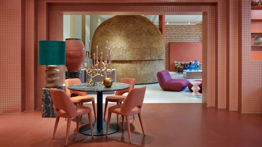
A curvilinear thatched hut has been paired with terracotta-hued tiles at the Amsterdam store for homeware brand Polspotten, which was designed by local studio Space Projects.
The studio created the store to straddle a shop and an office for Polspotten, a furniture and home accessories brand headquartered in the Dutch capital.
Characterised by bold angles and arches, the outlet features distinctive terracotta-coloured walls and flooring that nod to traditional pots, Space Projects founder Pepijn Smit told Dezeen.
"The terracotta-inspired colours and materials refer to the brand's first product, 'potten' – or pots," said Smit, alluding to the first Spanish pots imported by Erik Pol when he founded Polspotten in the Netherlands in 1986.
Located in Amsterdam's Jordaan neighbourhood, the store was arranged across a series of open-plan rooms, interconnected by individual geometric entryways.
Visitors enter at a triangular opening, which was cut away from gridded timber shelving lined with multicoloured pots that mimic totemic artefacts in a gallery.
The next space features a similar layout, as well as a plump cream sofa with rounded modules and sculptural pots stacked in a striking tower formation.
Travelling further through the store, molten-style candle holders and Polspotten furniture pieces were positioned next to chunky illuminated plinths, which exhibit amorphously shaped vases finished in various coral-like hues.
Accessed through a rectilinear, terracotta-tiled opening, the final space features a bulbous indoor hut covered in thatch and fitted with a light pink opening.
The hut provides a meeting space for colleagues, according to the studio founder.
"The thatch, as a natural material, absorbs sound as well," explained Smit.
Next to the hut, Space Projects created an acoustic wall illustrated with "hieroglyphics" of Polspotten products, which references the gallery-like theme that runs throughout the outlet.
"The store was inspired by Polspotten's use of traditional techniques combined with a collage of their reinterpreted archetypes," said Smit.
Elsewhere in Amsterdam, Dutch practice Studio RAP used 3D printing and algorithmic design to create a "wave-like" facade for a boutique store while interior designer Linda Bergroth created the interiors for the city's Cover Story paint shop to streamline the redecorating process for customers.
The photography is by Kasia Gatkowska.

