"So many moves in a small project" says commenter
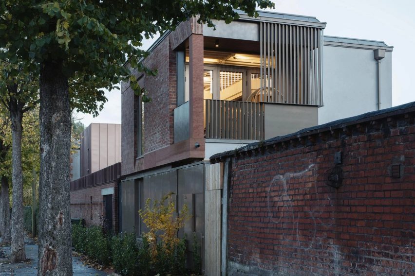
In this week's comments update, readers are discussing a compact infill home in Dublin with red brickwork and perforated metal panels, completed by Irish architecture studio Gró Works.
Located on Dublin's southern perimeter, the home was designed to reflect both the nearby Victorian redbrick terraces and the more "utilitarian" quality of the backstreet it overlooks.

"This won't be utilitarian enough for the functionalists"
Several commenters were won over by the industrial feel of the design. D Bannon called the project "a striking structure and a beautifully designed home".
"Beautiful project, congratulations to all involved," echoed Gary Tynan. Commenter Tony M was also a fan of the project, writing "I like this building, in particular, the visible roof beams".
However, JB warned that "this won't be utilitarian enough for the functionalists". They continued: "this architect will have their modernist ticket revoked if they don't smarten up and strip back".
Meanwhile, for JZ, there was too much going on: "so many moves in a small project. I appreciate each one separately but all added up, I think they reached a tipping point".
Can you see yourself living in this Dublin home? Join the discussion ›

"Is there a Londis? I don't see a Londis. Where will I get milk?"
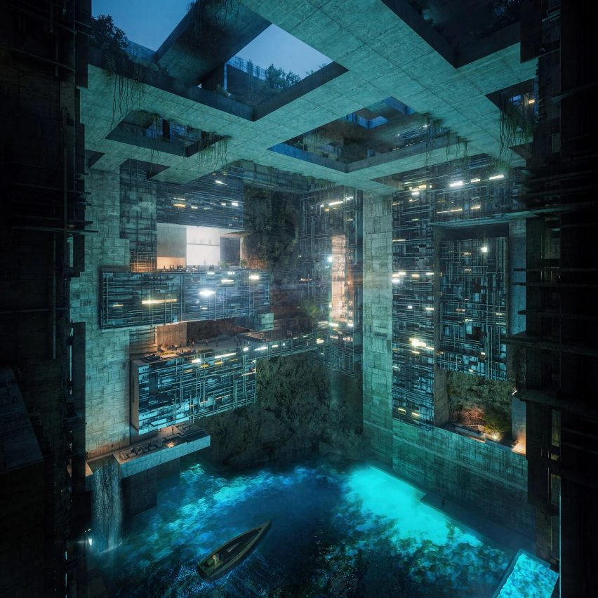
One story causing a stir in the comments section this week was mega-project Neom's reveal of Aquellum, an "ultra-luxury upside-down skyscraper" inside a mountain, designed by architecture studios LAVA and Name Architecture.
Dezeen commenters were quick to see the "dystopian" themes of the latest Neom project. "All these Neom renders are going to be a great source of material for the next Black Mirror series," wrote Gytis Bickus.
Zea Newland agreed, replying "wouldn't it be hilarious to find out that Neom was actually a viral campaign to promote a dystopian science-fiction movie," while Scott Chegg branded it "the stupidest one yet", adding "Neom is just a meme".
Muckers270 had other concerns, asking "is there a Londis? I don't see a Londis. Where will I get milk?"
On the other side of the argument, MA Milián felt the design had been heavily critiqued out of spite. "All the negative and terrible, harsh criticism is mostly from Americans who are jealous," they wrote in a comment that was downvoted five times.
What do you think of Aquellum? Join the discussion ›

"Looks like a stack of children's blocks"
Also providing plenty of fodder for commenters this week was a skyscraper made up of 13 staggered cube volumes designed by Portuguese studio OODA for the Hora Vertikale residential development in Tirana.
Some commenters were unsure. "I like each block individually," wrote Leo. "Stacking them seems less convincing," they added.
"Another Jenga-inspired building," wrote John Lakeman, while Souji wondered "why the need to create the feeling of uneasiness? Cool for concept art or a video game, not for an actual city".
But despite this, the project had its fair share of admirers as well as detractors, with commenter Frank branding it "very interesting work".
Rob Rohena was full of praise, writing "I love this, very whimsical and unpretentious – looks like a stack of children's blocks". What's more, they felt it was "a nice departure from the overly gaudy luxury Manhattan skyscrapers or bland glass box office buildings".
Does the OODA design work for you? Join the discussion ›
Comments Update
Dezeen is the world's most commented architecture and design magazine, receiving thousands of comments each month from readers. Keep up to date on the latest discussions on our comments page and subscribe to our weekly Debate newsletter, where we feature the best reader comments from stories in the last seven days.