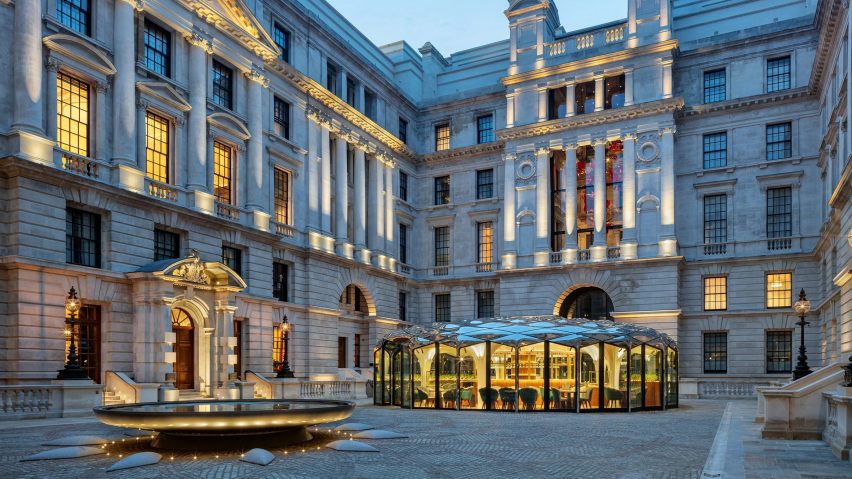
In this week's comments update, readers are discussing a mirrored cafe pavilion and courtyard at the site of The Old War Office in Whitehall, London.
Designed by DaeWha Kang Design, the circular pavilion has a glass facade and mirrored stainless-steel roof panels.
"A modern addition to an ancient classic"
Readers were divided. Some were in awe of the design, with Ken Steffes describing it as a "beautiful structure placed in the perfect location". JZ agreed, calling it a "fantastic intervention".
"Aside from the jarring interior furniture and carpet, this is wonderful," wrote Gytis Bickus. "A modern addition to an ancient classic," they continued. Meanwhile, Design Junkie found it to be a "beautiful little jewel box".
Souji felt the modern design was "out of context" with its surroundings.
Bob Richmond was far less generous in their assessment. "Hideous – utterly hideous – and it will be dated upon completion, another example of tawdry bling come to town".
Hideous or beautiful? Join the discussion ›
"I detect notes of kerosine in this lovely Chianti"
Also sparking debate in the comments section this week was the news that Rafael Viñoly Architects has unveiled plans for an international terminal at Florence Airport in Italy that will be crowned by a vineyard.
Some commenters were unconvinced by the rationale. "Is it architecture to combine two things that have no relation to each other?" asked commenter Rd.
Concerned reader Anon wondered "won't the wine be dosed with aviation and vehicle fuel residue?"
Others were also intrigued about how the vineyard's location might have an impact. "Mmm, I detect notes of kerosine in this lovely Chianti..." joked Noirmout.
"Can't wait to pour myself a glass of Château-Control-Tower" quipped in Jean-Yves Rehby.
What do you make of the airport-vineyard's prospects? Join the discussion ›
"Superficial formalistic gimmickry"
Another story that got readers talking this week was news of plans for the latest region in the Neom development – Dutch studio OMA's design for a wildlife park surrounded by three hotels and a visitor centre.
Commenters were largely unimpressed. "It's disappointing to see that OMA is involved in this sham," wrote Leo. This sentiment was echoed by Dixie Normous, who also found it "disappointing to see real offices do this nonsense".
Dac-attack was astounded at the implausibility of the project, writing "I can't believe they think any of this is feasible".
"Wow, our best and brightest have now stooped to the level of lazily building dystopian sci-fi sets," wrote Architect Incognito.
Walter Astor didn't hold back, and called the design "superficial formalistic gimmickry and visual nonsense".
Do you agree? Join the discussion ›
Comments Update
Dezeen is the world's most commented architecture and design magazine, receiving thousands of comments each month from readers. Keep up to date on the latest discussions on our comments page and subscribe to our weekly Debate newsletter, where we feature the best reader comments from stories in the last seven days.

