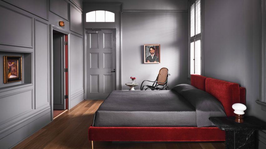
Ten rooms that make clever use of the "unexpected red theory"
An interior design trend born out of a viral TikTok video, championing the addition of red "in places where it has no business", is the focus of our latest lookbook.
The "unexpected red theory" was coined by Brooklyn-based interior designer Taylor Migliazzo Simon in a video that has had over 900,000 views on TikTok.
Simon describes it as "adding anything that's red, big or small, to a room where it doesn't match at all" with the result that "it automatically looks better".
The theory suggests that red is as versatile as a neutral colour because it can work in almost any palette of colours and materials, either as an accent or complementary tone.
Here, we look at 10 home and hotel interiors that show how it's done, either in the form of architectural fittings and finishes like a balustrade or floor surface or in the form of statement furniture.
This is the latest in our lookbooks series, which provides visual inspiration from Dezeen's archive. For more inspiration see previous lookbooks featuring homes with indoor slides, colourful renovations and innovative New York City lofts.
Hotel Saint Vincent, USA, by Lambert McGuire Design
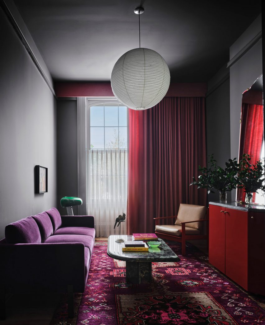
Red is paired with shades of grey and purple in the bedrooms of this hotel in New Orleans, designed by Lambert McGuire Design, which occupies a former 19th-century infant asylum.
The colour can be found on a range of elements, across furniture and textiles, with key pieces including the red velvet bed upholstery. The overall effect heightens the sinister atmosphere conjured by the building's history.
Find out more about Hotel Saint Vincent ›
Walled Garden, UK, by Nimtim Architects
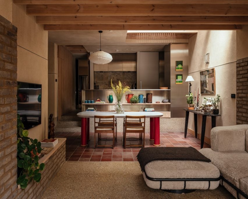
A warm palette of natural materials characterises the interior of this London house extension designed by Nimtim Architects, with the exception of a statement dining table.
This table features four oversized columnar legs with a glossy red finish, providing a visual focal point for the room.
Find out more about Walled Garden ›
W Budapest, Hungary, by Bowler James Brindley and Bánáti + Hartvig
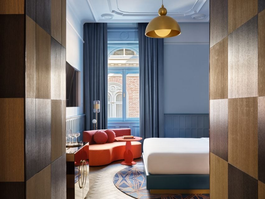
The W Hotel in Budapest is housed inside a grand neo-Renaissance palace, so interiors studios Bowler James Brindley and Bánáti + Hartvig chose most of the details based on the existing architecture.
This led them to combine cool shades of blue, turquoise and green with golden details. But they also added a series of curved red sofas and tables, which result in a more playful feel.
Find out more about W Budapest ›
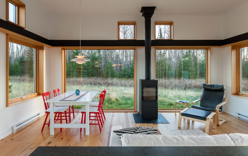
House for Beth, USA, by Salmela Architect
With a series of timber-framed windows, the view takes centre stage in the living room of this rural Wisconsin home designed by Salmela Architect.
The room is otherwise very simple in its decor, but red-painted dining chairs prevent it from feeling too minimal.
Find out more about House for Beth ›
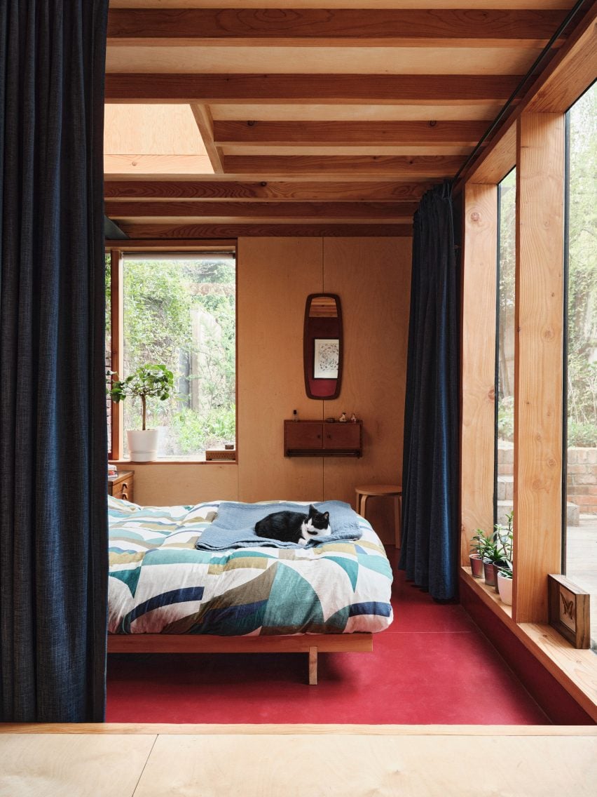
The Secret Garden Flat, UK, by Nic Howett Architect
Red floors and walls both feature in this renovated London home designed by Nic Howett Architect.
The colour provides a warm counterpoint to the dark blue flooring and curtains that also punctuate the exposed wood interior.
Find out more about The Secret Garden Flat ›
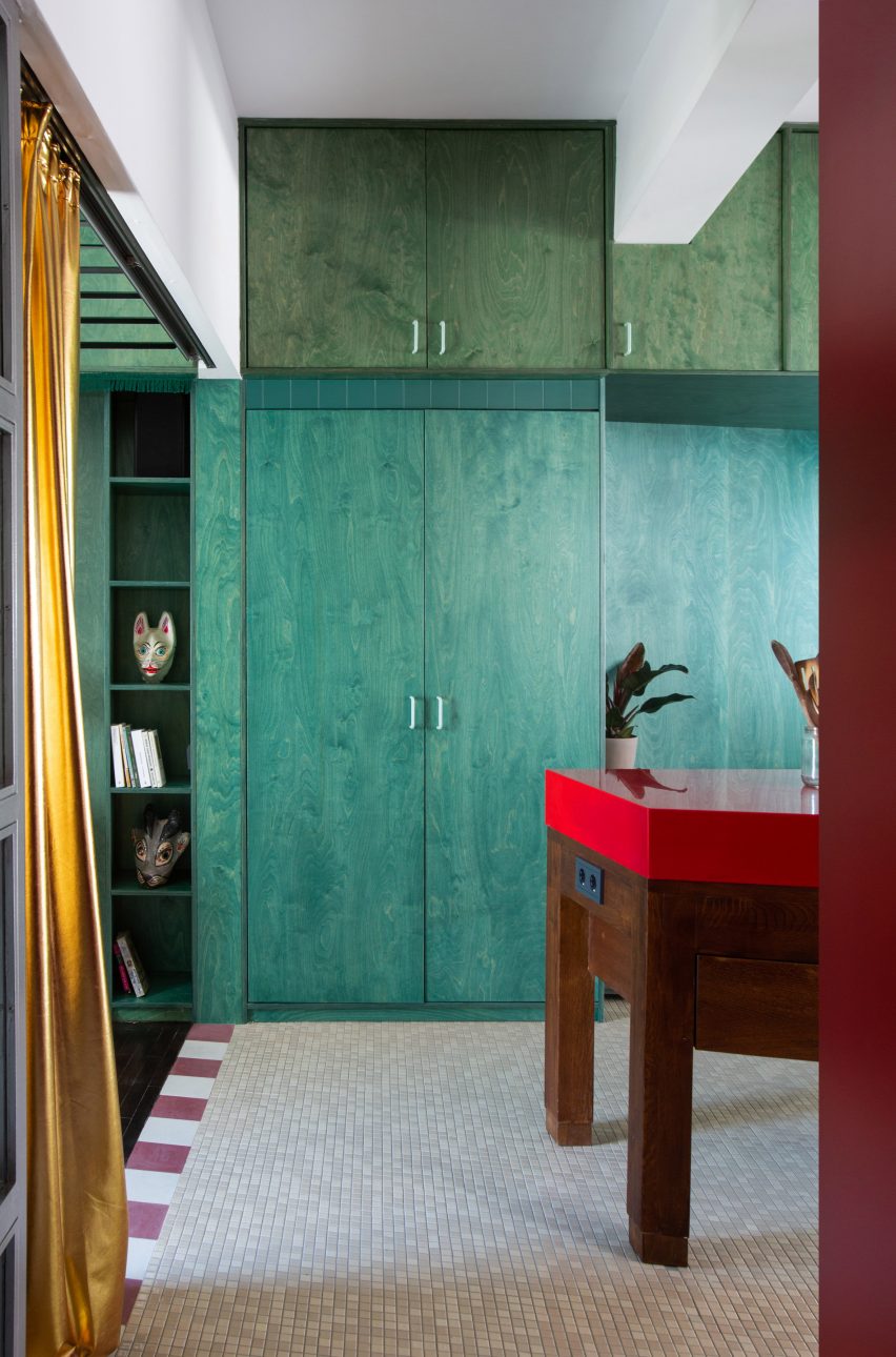
Trikoupi Apartment, Greece, by Point Supreme Architects
Red and green should never be seen together, or so the saying goes. Point Supreme Architects challenged that rule with this apartment interior in Athens.
Standing in front of a stained green plywood storage wall, a kitchen island topped with red Corian becomes the room's standout feature.
Find out more about Trikoupi Apartment ›
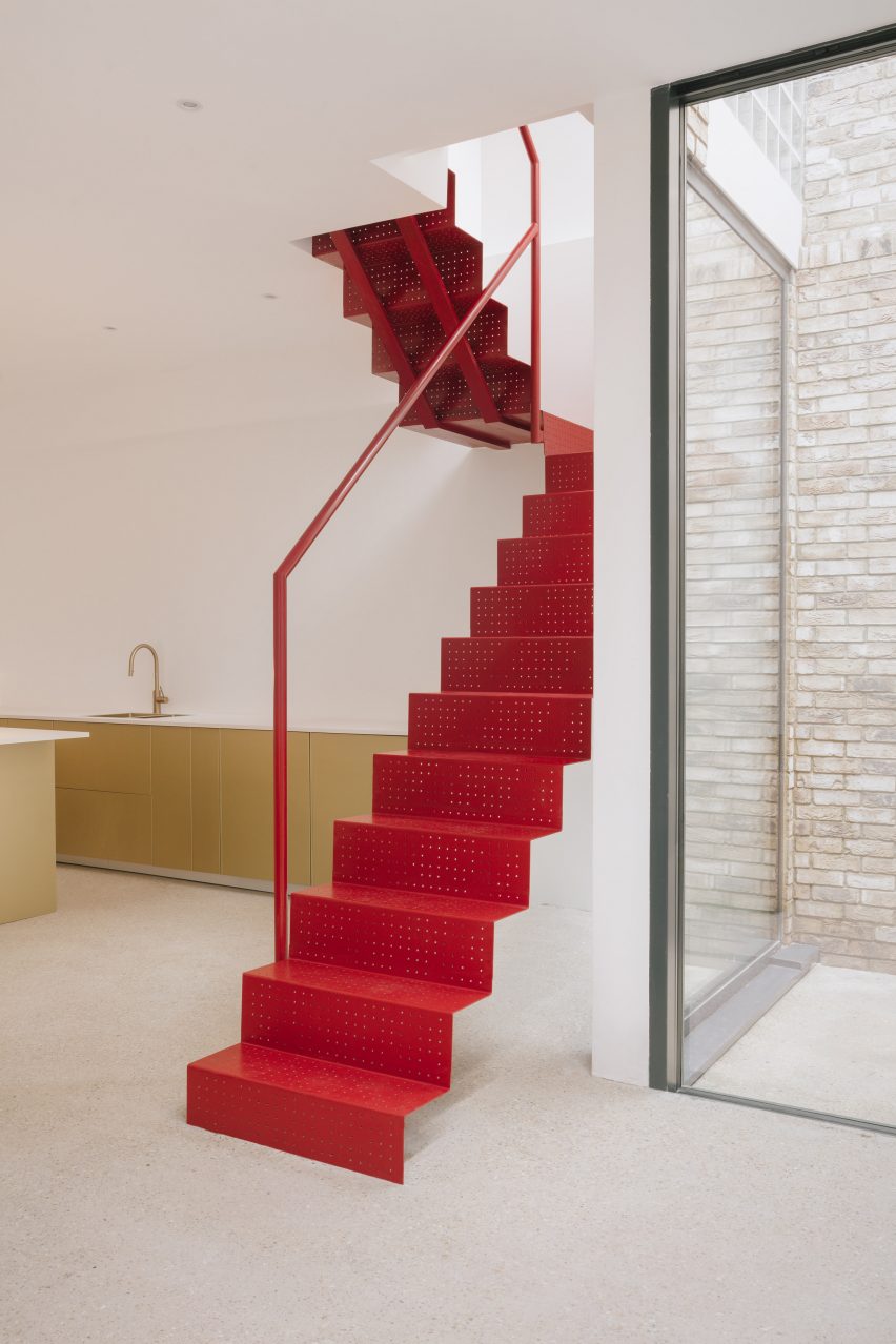
Maryland House, UK, by Remi Connolly-Taylor
London-based designer Remi Connolly-Taylor showed how red and gold can be paired in this design for her own London house and studio.
A folded, perforated staircase in red powder-coated steel provides a counterpoint to the golden kitchen cabinets, making a statement in the otherwise minimal, white interior.
Find out more about Maryland House ›
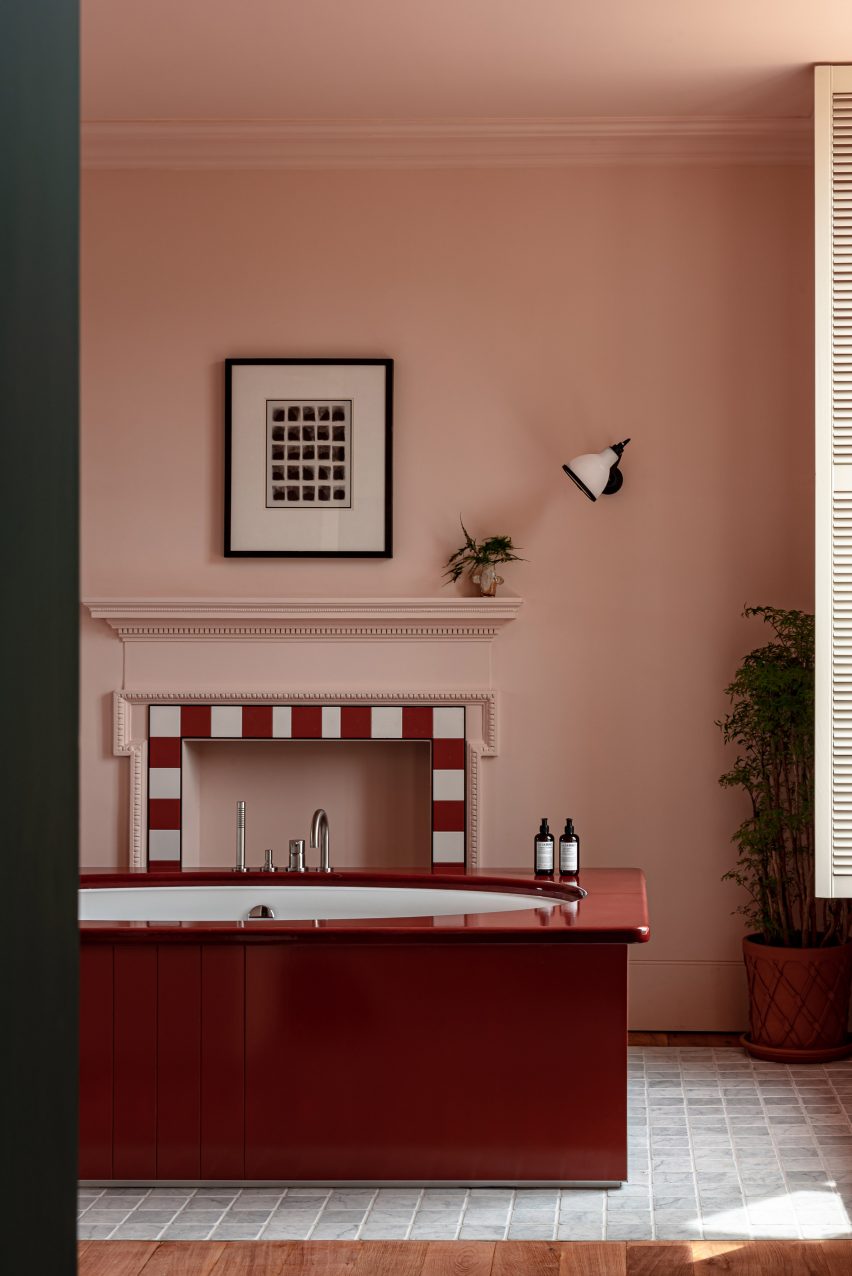
Cowley Manor Experimental, UK, by Dorothée Meilichzon
Designed by Dorothée Meilichzon of French interiors studio Chzon, this hotel in the Cotswolds shows one way of applying the unexpected red theory to a bathroom.
Building on a subtle Alice in Wonderland theme, some of the pink-walled guest bathrooms feature glossy red lacquered bathtubs.
Find out more about Cowley Manor Experimental ›
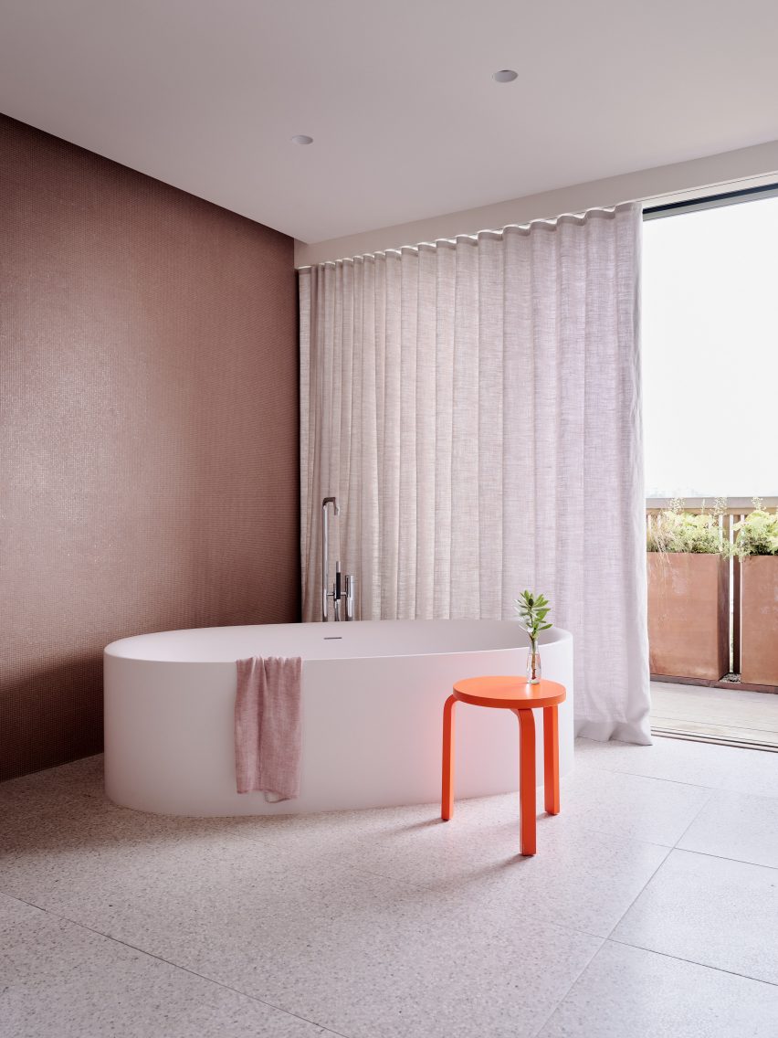
Redwood House, USA, by Studio Terpeluk
This bathroom, located in a Noe Valley home designed by Studio Terpeluk, shows how to apply the unexpected red theory with just one small piece of furniture.
A mid-century-style stool adds a vibrant accent to the muted pink tone of the walls.
Find out more about Redwood House ›
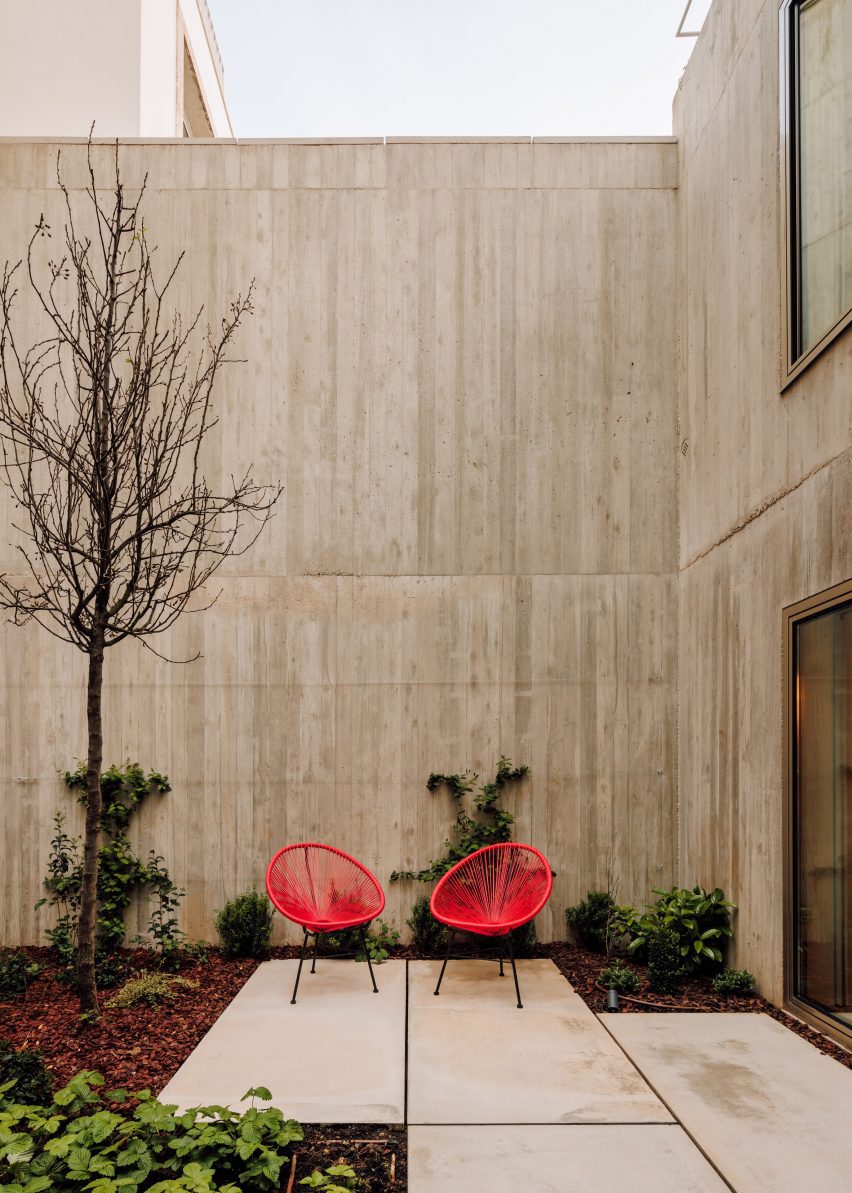
Casa Pousos, Portugal, by Bak Gordon Arquitectos
A courtyard divides the two concrete buildings that form this Lisbon home designed by Bak Gordon Arquitectos.
The space might have felt stark if it were not for the addition of two bright red lounge chairs.
Find out more about Casa Pousos ›
This is the latest in our lookbooks series, which provides visual inspiration from Dezeen's archive. For more inspiration see previous lookbooks featuring homes with indoor slides, colourful renovations and innovative New York City lofts.