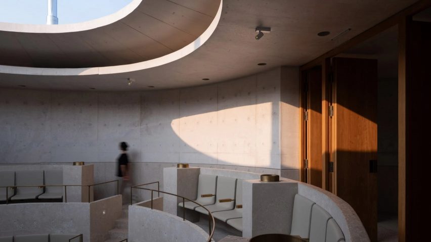
In this week's comments update, readers are discussing a monolithic concrete concert hall in the coastal resort of Aranya in Qinhuangdao, completed by Chinese studio Vector Architects.
Called the Chapel of Music, the three-pronged concrete structure has concave walls, a curving elevated ramp and a circular auditorium with a translucent roof.
"Some of the most interesting work published these days"
Dezeen readers failed to reach a consensus about the structure.
Jb felt the design was outdated, commenting "the 1930s have landed in Aranya". Chelsea Dennison also wasn't a fan and suggested that the project was "poorly designed and executed".
Taking a more diplomatic stance, Igor Pismensky wrote "I like the structure and interior but the ramp looks like an afterthought and not well integrated".
On the other side of the argument, commenter JEA suggested that "Vector is doing some of the most interesting work published these days, regardless of the snark". Z-dog was also in favour of the design, writing "that rooflight construction is beautiful."
Which camp are you in? Join the discussion ›
"Amazing spheres!"
Commenters were also torn about architecture studio Herzog de Meuron's drum-shaped concrete gallery and museum planned for the Al Maha Island near Doha.
"Amazing spheres!" exclaimed Bigbull43, while Rd commented "I really appreciate their more sculptural work like this – the internal chasm is beautiful".
Alfred Hitchcock was on the fence. "I don't dislike it, but it's a shame that it will use so much concrete when it could be mostly natural stone", they said.
Commenter Don Bronkema wasn't all that impressed, calling the building a "mere submarine, unless concrete floats".
What do you think? Join the discussion ›
"Living in this house would drive me mad"
Another project that got Dezeen readers talking this week was a block of two family homes in Japan featuring narrow timber columns inside, designed by IGArchitects.
Called Forest Pillars, the house is wrapped in panels of corrugated metal, with daylight provided almost entirely by a fully-glazed clerestory window beneath the roof.
"Living in this house would drive me mad – it's more like a cave without privacy", wrote Leo. They acknowledged, however, that "the entrance doors are beautiful".
Dik Coates wrote "I like the timber framing, but it does not appear to be that slender".
Another commenter who couldn't make their mind up was Mark Zudini. "I am trying hard to like it but the lack of windows at ground floor is a big one" they wrote. "I do like it in many other ways – it's very poetic, a beautiful container".
Beautiful container or cave? Join the discussion ›
Comments Update:
Dezeen is the world's most commented architecture and design magazine, receiving thousands of comments each month from readers. Keep up to date on the latest discussions on our comments page and subscribe to our weekly Debate newsletter, where we feature the best reader comments from stories in the last seven days.

