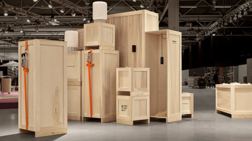
Is it possible to stage a trade fair without producing excessive waste? Dezeen editor-at-large Amy Frearson explores eight approaches that were all on show at this year's Stockholm Furniture Fair.
The trade show format is increasingly under scrutiny, with environmental concerns prompting many to reconsider the material cost of building large exhibition stands that are only used for a few days.
Stockholm Furniture Fair has pointed a way towards how trade fairs might become more eco-friendly. The majority of exhibitions and stands at this year's edition of the fair were designed to reduce waste and promote circularity.
"A new layout to promote less construction"
Hanna Nova Beatrice, director of Stockholm Furniture Fair, said that numerous strategies were set out to reduce the carbon footprint of the fair.
"First and foremost, we updated the halls with a new layout to promote less construction," she said.
Nova Beatrice and her team also drew up "very strict guidelines" that were applied to all of the in-house exhibitions, and worked closely with exhibiting brands to help them find more sustainable solutions.
"We had many discussions about how fairs can be more sustainable, promoting less construction and less waste, both within the organisation and with our exhibitors," she explained.
Here's a look at eight approaches that featured:
Create island stands without walls
The new fair layout made it possible for some brands to create "island stands" formed simply of a floor surface that could be easily repurposed or recycled.
Brands adopting this approach included Hem, whose stand was defined by bold chequerboard flooring. The result was a space that became a de facto public plaza.
Use products to frame space
Swedish outdoor furniture brand Nola put its own spin on the island stand by making clever use of one of its new products, the Moiré pavilion by designer Mattias Rubin de Lima.
By installing two of these pergola structures, Nola was able to create a simple frame for its stand. This was accompanied by a floor formed of recycled bricks, making the space feel like a garden patio.
Build an installation rather than a stand
The fair organisers encouraged some brands to find ways to exhibit using no construction at all. "Think Lars Von Trier's Dogville, which used only tape to divide the different areas," Nova Beatrice explained.
One of the most successful examples came from Pholc. The Swedish lighting brand worked with design agency Nineties to create a multilayered scenography out of stacked packing crates.
Creatively repurpose an old stand
Many Stockholm exhibitors chose to reuse a stand they had already used before, either for a previous edition of this fair or for one of the many others on the furniture design calendar.
One of the most simple and effective approaches came from Swedish furniture brand Lammhults, which reuses the same stand every year but simply paints it in a different colour. For this year, the cobalt blue of 2023 was replaced with a bold shade of red.
Other noteworthy examples included fellow Swedish brand Mitab, which opted for transparency. Its stand featured a counter that made clear how it had used the same stand for the last five years. "This is the same bar we used last year. And we will use next year," read text printed on the front.
Work with waste materials
Minus Furniture made its fair debut with a stand built entirely from recycled materials, in line with the Norwegian brand's ambitiously eco-friendly business model.
Interiors studio Omhu went to great lengths to source everything. Together with a rented scaffolding system, the design included items sourced from construction sites, second-hand stores and municipal waste.
"Not every company wants to put in the work to think in this manner. It takes time and research to demonstrate and source supplies of a circular nature," said Poppy Lawman, designer at Omhu.
Find a new home for everything
All of the fair's own exhibitions were designed for circularity, which meant rehoming every component once the fair was over. The Reading Room installation by guest of honour Formafantasma was one of the best examples.
Both the fabric curtain that framed the space and the books displayed inside have been donated to design schools, while the Flos lighting has been gifted to a bookshop. The Artek furniture is meanwhile being sold by retailer Nordiska Galleriet as signed limited editions.
Adapt an old design for a new purpose
The bar and stage installation by Stockholm-based Färg and Blanche was first created for Sweden's Presidency of the Council of the European Union, which took place in the first six months of 2023.
The design duo adapted the components into a new configuration so that they could be reused here, along with flooring that manufacturer Tarkett plans to repurpose at its factory in Ronneby.
Keep things simple
Young brands exhibiting for the first time were invited to make use of ready-made booths designed by designer Nick Ross, rather than building their own.
This "nude edition" was built from recycled materials – an aluminium truss system created freestanding wall modules in untreated MDF – that are now being recycled again.
"The entire area can be disassembled and reused for other events," explained Ross.

